Web Design Goodies Critique #33
Published May 3, 2001 By Joe Burns, Ph.D.
Greetings, Fellow Designers
It seems I am stuck in the U.K. This will be the second
site I’ll critique that calls England home. I guess it’s only
fitting. I’ve been to London three times and hope to
return twenty more. My wife and I have even
contemplated moving there.
All that asidelet’s talk Brasserie.
Now the obligatory release clause statement
>>>>The critique below represents the opinions of Joe
Burns, Ph.D. Feel free to disagree, argue, forget, or
accept anything he writes. The purpose of the critique is
to offer examples that you may use, repair, or forget
when it comes to your own Web site. As always,
remember that there are simply no hard or fast rules to
Web design. Any choice is the correct choice as long as
that choice aids the user and adds to the site’s purpose for
being.<<<<
<<<<<<<<<<<<<<<<<<<<<<<<
Title: The New Street Brasserie
Author: Calvin Dunkley
http://www.newstreetbrasserie.com/
Load Time: 31 Seconds, 57kps modem, cleared cache,
4/30/01 1:55PM.
My Screen Size: 1024X768
Browsers Used: Internet Explorer 5.5 and Netscape
Navigator 4.5
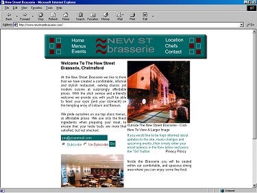
Concept: This is the Web page for the New Street
Brasserie. If you giggled the first time you saw the word
Brasserie, let me assure you, you won’t find that there.
Brasserie is French. It means brewery. I’ll bet you
can get some good food and drink there. The site caught
my eye because of the images it posted. I don’t mean the
pretty pictures of the building either I mean the images
up top. I’ll get to them in a moment.
Praise: Now and again, I just like a site. I just like the
colors. I just like the topic and I find myself playing
around inside. I’ll look at 20 to 30 sites each time I set to
writing one of these critiques. I find that the sites that
keep me clicking around are usually the ones I critique.
This is just such a site.
Here’s another bit of praise I have for the site, I don’t see
any major concerns. There’s nothing that jumps out and
bites me. There’s nothing right off that I would say is a
major concern. What I have for today’s site are some
minor concerns. By that, I mean the concerns can be
fixed quickly and with little effort.
1. Minor Concern: The homepage took a long, long time
to load and I’m usually a fairly patient guy. The reason is
the banner heading across the top of the page. Here’s the
same page as above with the inline images turned off.
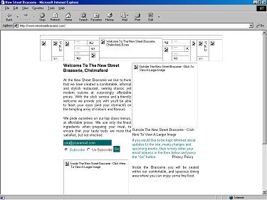
See how the banner across the top is made up of many small images? Well, if I count correctly, there are 25
images showing and six hidden. The hidden six will pop
up when onMouseOvers are performed on the six links.
Is that the only reason for the image being made up of so
many little images?
Suggestion: If so, let me ask you if the effect is really
worth it. The loading of so many images slowed the page
a great deal. Could you not simply make that banner nine
images with six hidden? Maybe you could even make it
one image and set it to an image map.
I believe that load time is very important. Yes, it’s a neat
effect, but is it worth the slow load time?