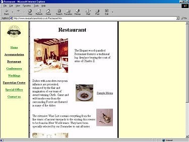
4. Concern: I’ve gone to the Restaurant link for this one. The page looks like this.
Now, here’s what it looks like when the rollover occurs.

Suggestion: Do not set a rollover to a different text font, or to a differing text size. It alters the page and, in a differing placement, could change the look of the page.
One more thing about colors notice that the visited rollover color on this link is black. That’s OK on the yellow stripe, but not in the text part. It disallows the link to be set apart. Yes, I see the underline, but a color is much better at setting text apart as a link.
5. Concern: Some will think this is picky, but I don’t. Your images and your text do not match in terms of size. Let me point it out on the homepage although it happens in other places as well.
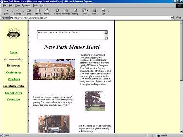
Suggestion: Notice how the image of the manor (again, could be more crisp) is smaller than the text that describes it. The text is taller than the image. It is my opinion that they should be equal, or at least very close to the same size. That diminishes white space and
helps with the overall look of the page. Alter either the image size or the amount of text. Equal them for a better look.
Overall: If this is your first crack at it wow. Nice job. There are some problems, but nothing that cannot be attacked and made better with relative ease. Good luck. I wish I were spending this coming weekend at your manor. I’ve never ridden a horse.
>>>>>>>>>>>>>
That’s that.
Joe Burns, Ph.D.
Always Remember: When it comes to designing your Web site, the
most important person is not you, but your user.
Would you like YOUR site to be reviewed?
Click here
Web Design Archive Home Page