Web Design Goodies Critique #3
Published September 28, 2000 By Joe Burns, Ph.D.
Greetings, Fellow Designers
I now have over 1,500 site owners that have asked to have their sites critiqued. I try to read each of the e-mails I receive regarding a critique request. One asked if I was only going to critique sites that I disliked. Nope. In fact, this critique should put that question. to rest. I liked the site I critiqued today. I liked it too much in fact. I found myself looking at the merchandise rather than writing the critique. Now the obligatory release clause statement
>>>>The critique below represents the opinions of Joe Burns, Ph.D. Feel free to disagree, argue, forget, or accept anything he writes. The purpose of the critique is to offer examples that you may use, repair, or forget when it comes to your own Web site. As always, remember that there are simply no hard or fast rules to Web design. Any choice is the correct choice as long as that choice aids the user and adds to the site’s purpose.<<<<
Title: Green World Sales
http://www.greenworldsales.com/
Author: Mathew Thomason
Load Time: 12 seconds, 57Kps modem, cleared cache, 9/04/00 9:59AM
My Screen Size: 1024X768
Browsers used: Internet Explorer 5.5 and Netscape Navigator 4.5
Concept: This is an e-commerce site built on the premise that by reselling things, you are recycling them. One man’s trash is another man’s treasure, so why not set up a site that allows one man to buy another man’s trash? This is it. The problem is none of this stuff is really trash. Some of it is really neat stuff. I especially liked the model roadster.
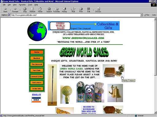
Praise: First off, I always give praise to people who start any kind of business. I have done it myself numerous times and I know what failure and success feel like. I am always impressed when someone takes the leap and jumps in with both feet. In terms of praise, the site loaded quickly even though the home page might be a little too image intensive. I like that the author doesn’t fill the page with animations. Animation draws the eye, and using ten per page just confuses a lot of people. Mathew was smart enough to only use the one: the credit cards. My eye was drawn right to the movement and I knew, without reading anything, that this was an e-commerce site.
The images of the merchandise are photographed well. The detail is nice and the images are in focus. Too often, I see images that look like afterthoughts. I call them eBay shots.
As you move from page to page, the author has retained his shell. As we discussed in the first Design Goodies newsletter, the shell is the basic site design, which should remain consistent across the entire site. The navigation bar remains and the pages all look similar so that the user knows he or she is within the same site.
I like the design. I like the items he had for sale. I would make a couple of changes though.
Concern #1: The documents all start a fourth of the way down the page. You have a banner, some text, a globe and then a green separator line. That separator line should be at the top of the page. All the information above the separator line is unnecessary.
Suggestion: You have a banner ad there – but it is your banner ad. I know you’re using it to suggest that banner space is available if anyone wants to advertise. Lose it. People will come to advertise whether that banner is there or not. There’s no need to slow the page with another ad that promotes the site I am already looking at. I think you can lose everything above that line and move the documents higher up the browser screen.
Concern #2: If I understand it correctly, you have an image that represents each of the categories. For instance, there is a cat tray that represents the cat-lovers page. Yes? If so, I don’t get that from the design.
Suggestion: Make a point of putting the images either in the order of the navigation, or to place a text link underneath each of the images to denote where they go.