Web Design Goodies Critique #2
Published September 20, 2000 By Joe Burns, Ph.D.
Greetings, fellow designers
This week we’ll delve into the world of personal investments with Conrad Capital Management. This site caught my eye for two reasons: the topic and the fact that it has a couple of design elements that are used far too frequently. Literally, a few quick changes could make this site run much faster and smoother.
>>>>The critique below represents the opinions of Joe Burns, Ph.D. Feel free to disagree, argue, forget, or accept anything he writes. The purpose of the critique is to offer advice and information you can use on your own sites by taking a look at real Web sites. As always, remember there are no hard or fast rules to Web design. Any choice is right as long as that design choice aids the user and fulfills the site’s purpose. Any choice is the correct choice as long as that choice aids the user and fulfills the site’s purpose.<<<<
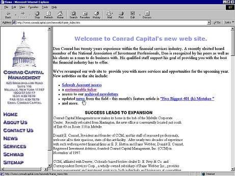
Title: Conrad Capital Management
http://www.conradcapital.com/newweb/
Author: Don Conrad
Load Time: 31 Seconds, 57kps modem, cleared cache, 6/27/00 1:43PM.
My Screen Size: 1024X768
Browsers Used: Internet Explorer 5 and Netscape Navigator 4.5
Concept: Got money? Well, Don would like to help. He’s a personal investment counselor who has made a smart move. He’s put his business on the Web.
Praise: Too often businesses go on the Web because they think they have to, not because they’re offering new information to their customers. Visitors come and find the site is little more than an expanded business card. Don’s site is a little more than that. Yes, you can get his name, address, phone, and e-mail, but Don has gone out of his way to offer the visitor something more than just literature regarding his business. If you follow some of his links, you can get a personal stock ticker, read his newsletters, and learn some mistakes to avoid when playing around with a 401K. Smart move. Don is giving away some of his expertise for free so that you’ll know he’s a smart guy and you can make a more informed choice as to whether Don should handle your money or not. The concept behind the site is well thought out. Don is onto something here. He just made it a little too hard for me to get to the information I’m looking for.
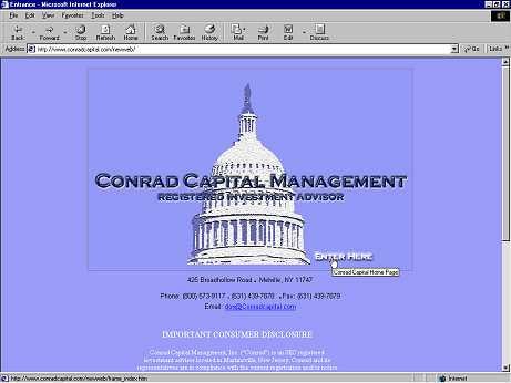
Concern #1: The homepage is a corporate logo. I am asked to click on the logo to enter. Why? Why would you stop me from coming into the site? I understand that some people might suggest it assists in name recognition, forcing the user to view the logo before coming in. But to me, the visitor, this is just taking up more of my time.
Suggestion: Lose the page, Don. Let me go right into the site and get started. Besides, the image I click on to enter is **huge.** It took forever to download. I clicked to go in before it fully loaded, it took so long. Let me state also that if you have me stop at that logo page simply because you want me to read the Consumer Disclosure Information, I won’t. I don’t think most people will either. Make a link to that on the real homepage so that people can click to read it. Always give a choice. Once you force anything, I will pull away from it.