The first part of this multi-part piece provided an overview of the new features of Adobe Dreamweaver CS6. In this article we’re going to explore Dreamweaver CS6 in greater depth.
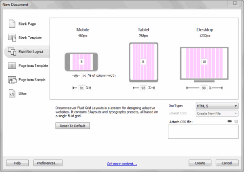
A big challenge for any web designer are the huge number of web devices available which will use their content. Designing for all of those can be both difficult and time consuming. To make the process easier, Adobe created Fluid Layouts, which are starter templates. The purpose of Fluid Layouts is to allow you to create adaptable page layouts. These use a multicolumn design grid. To get started, go to: File: New Fluid Layout.
When you look at the dialog box, you’ll see a series of numbers for each device layout. These represent the number of grids for each device. As an example, when you look at the tablet layout, the size is 768 pixels accross and has eight columns. These represent 93% of the width of the layout. Note that when you look at the figure of 25% below the mobile layout, this represents the gutter between each column and you can change that if you wish. You can set the grids so you have more or less on the layout depending on the nature of your project. Once you’ve decided on the number of grids and gutter, click on the Create button.
Once you do so, a dialog box will pop up, prompting you to save the CSS for this design.
Once you’ve done that, the layout for the mobile device appears in the design view and you can verify this by looking at the screen view icons at the bottom of design view. At this point it’s a good idea to save the file before going further.
When you do you, you’ll get a popup with the message: Copy Dependent Files, which are boilerplate.css and respond.min.js. The boilerplate file is based on the HTML5 boilerplate. These are a set of styles to use a starting point and these ensure that your pages display as consistently as possible across browser types. The respond file offers support for media queries with older browsers. Your fluid layouts depend on these files.
At the moment, the layout that is displaying is for the mobile device, though we’ll switch to the website layout. When building a site, note the light green DIV tag field is placed in the layout by default. You can use this or not.
If you choose to delete it, you’ll need to build your layout by going to the Layout tab, then select the Insert Fluid Grid Layout Div Tag button.
This brings up the Insert Fluid Grid Div Tag dialog box. When naming the different components of your layout you might want to use such names as: Header, footer, sidebar, etc. In this case, I’ll name the first DIV Header and I’ll leave the Start New Row checkbox enabled. This means that the content will cover an entire row and anything that comes after it will begin a new row.
To add new pieces of content, click on the Insert Fluid Grid Div Tag icon. In this example, I’ve added one more row like the first one. With the third row I want to add an article to the text and I don’t want it to span a whole row, but a one of two columns for my layout. When I create the first article DIV, I uncheck the box beside Start a New Row. In the screen shot above, you see a visual cue that lets us know that this row will be changed later.
I’ll add one more article row and that’s where I’ll stop for now. This gives us four DIV tags for our layout. At this point you’re ready to start adding the content and you can do so by simply deleting the content in each DIV tag, then replace that with your new content. I’m going to use some content from a travel blog that I built some time ago.
When moving code over from other files, I recommend that you switch to Code view and paste in the various sections. This ensures that you won’t accidentally delete a DIV tag. If you do, that will play havoc with your structure and you want to avoid that.
This is what a portion of my layout looks like with the code elements pasted into place.
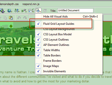
One thing about the green overlay, if you find that it’s distracting, you can turn it off by going to the Visual Aids icon. Deselect Fluid Grid Layout Guides to turn that off. Once all the content is in place, you’ll need to modify each layout. It doesn’t matter where you start because it will update the layout.css fie. In this case, I’ll start with the desktop view.
To change the sizing of each section, highlight the DIV element. When you do so, you’ll notice a blue bounding box around your content. The two of these that I want to draw your attention to are on the left and right of the content.
Sizing the handle on the right allows you to move the content over as in the example above.
If you move the control handle on the left, you’re adding a margin and are spanning columns without actually rezing the DIV.
To resize the next DIV, I move the handle on the right to the left. When I do so, it will automatically move the DIV up because there’s now room for it. At this point you can keep working with the existing style sheet or you can use a different one and change the appearance.
Once you finish the layout in the desktop view, you’re free to start working with the other devices.
What you’re looking at here is a quick overview of what you can do with Fluid Grid layouts in Dreamweaver CS6. There’s much more to cover and I invite you to view the tutorials in more depth to see what Dreamweaver CS6 can do for your layouts.
Stay tuned for the next part of this multi-part series taking an in-depth look at Adobe Dreamweaver CS6.


