CSS3 Trends for 2017
The Web is an environment in a constant state of flux. What’s in vogue one year may be passé the very next. 2016 was a year of tremendous changes in Web design and development. From these changes, we can get a glimpse into what 2017 might bring. Perhaps no facet of Web authoring has been more affected that layout design. Built on the power of CSS3, new page layouts have become more responsive and dynamic than ever before. This article takes a look at emerging CSS3 web design trends for 2017.
Mobile-first Approach Gaining Traction
2016 was a pivotal year for web design because it saw mobile devices become people’s primary means of accessing the Web. I experienced this change first-hand as my clients asked me to make their sites mobile friendly while giving desktop browsers the back seat.
In mobile-first design, content is laid out to fit on mobile and smaller-screened devices first. From there, you work up towards the larger-screened devices. Generally, the small viewport forces designers to do-away with everything but the most essential information and content. Moving to tablets and desktop monitors, extra content is gradually added in, along with additional widgets and other UI features that take up screen real estate.
More Responsive Design
Responsive design is a concept that has been thrown around quite a bit during the last couple of years. We can expect to see a lot more of it in 2017. The reason is simple; it’s just not cost-effective to build separate sites for all of the possible different viewport sizes. A much more sane approach is to utilize CSS3 media queries to tailor the content to the viewport size. A number of really good CSS libraries have cropped up to provide flexible grid layouts that allow a single, dynamic site to adjust its content to best fit in various viewports. Both Responsive Design and grid layouts work hand-in-hand with mobile-first design by delivering more content as the screen size increases.
Here is a media query that sets the appearance of the header and navigation components for screens that are 480 pixels wide or wider.
@media screen and (min-width: 480px) {
   #header .container {
    width: 100%;
  }
  #header h1 {
    padding-left: 3%;
  }
  #nav {
    width: 100%;
    top: 60px;
  }
}
Another incentive for going the Responsive Design route is that Google recently updated their algorithm to boost the rankings of sites that optimize their content for mobile devices. If you care about SEO, you’d be wise to follow Google’s lead.
Increased Emphasis on Key Ideas
This trend has been presented in a number of ways, but what it comes down to is a return to content. Specifically, it’s the emphasizing of key statements or ideas. There was a period where monitor sizes were growing every year. Once upon a time, a fifteen inch monitor was the norm, then it grew to seventeen, eighteen, nineteen, and even 24 inches. Heck, I’ve got dual twenty four inch monitors at work! (I’m old school.) As mobile devices began to proliferate the Web browsing landscape, the pendulum began to swing in the opposite direction. After having spent the preceding few years adding components to our websites such as sidebars, headers, banner ads, sidebar teasers, comments, popups, social media buttons, signup boxes, etc., designers had to start cutting back on extraneous page elements and focus on what’s important – you got it, the content.
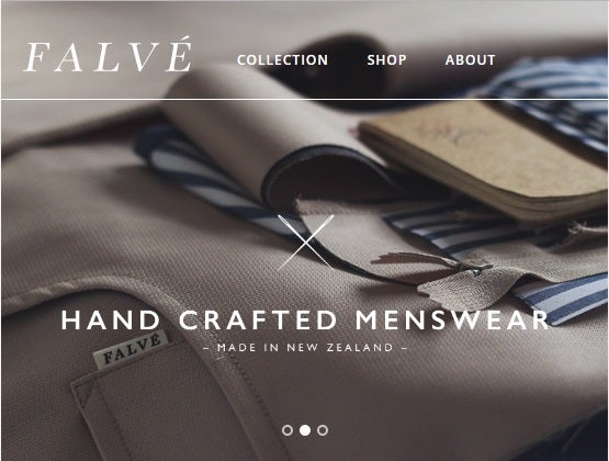
However, the current trend is not simply the reverse of the great screen expansion of the late nineties and early two thousands; modern sites are dedicating the prime screen real estate to key concepts and ideas. These are typically presented in a bold font within a design that is sparse yet infinitely functional. Here’s a New Zealand Menswear site that shows a total of five text elements:

Geometric Shapes, Lines, and Patterns
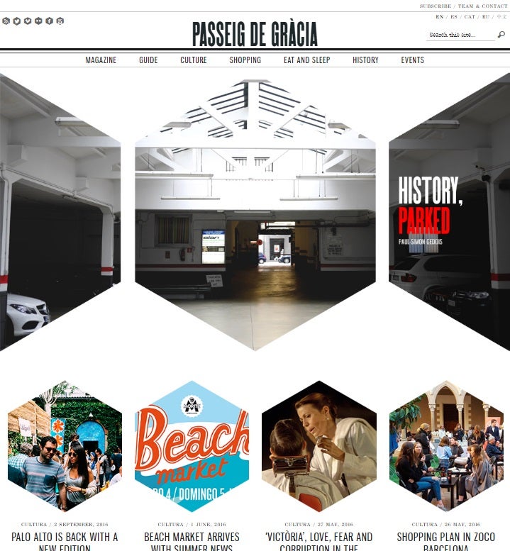
A while back, there was the rounded corners trend. Now, people have grown bored of that and demand more exciting visuals. In 2017, Geometric shapes will be bringing more angularity to page designs. From triangles, trapezoids, to hexagons, all of those fun shapes that you learned about (and later forgot) in grade school are useful once again!

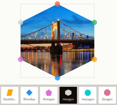
You an convert just about any element into a geometric shape using the CSS clip-path property. It allows you to render complex shapes by clipping an element to a basic shape (circle, ellipse, polygon, or inset), or to an SVG source. To help you with that, there are a number of online tools, such as the excellent and free clippy CSS Clip path maker. It’s extremely easy to use; just select the basic shape and then drag the colored circles to manufacture your exact shape.

The tool will produce the CSS for you:
-webkit-clip-path: polygon(50% 0%, 100% 25%, 100% 75%, 50% 100%, 0% 75%, 0% 25%);
clip-path: polygon(50% 0%, 100% 25%, 100% 75%, 50% 100%, 0% 75%, 0% 25%);
Conclusion
In addition to the trends mentioned above, in 2017 you can expect the Web to continue evolving in many other ways. Other trends to watch for include the increased reliance on pop art and custom photography over stock photos, sites built using templates, color gradients, and animations. Noticed any others? Leave us a note in the comments section!


