
CSS Cross-browser Text Rotation
CSS Cross-browser Text Rotation
All of the major browsers support some kind of text rotation, in order to enable text layout for non-Latin languages like Japanese and Arabic. Having said that, the exact mechanism for accomplishing text rotation differs from vendor to vendor. All support one or more CSS properties that can do the job. Unfortunately, it can be difficult to determine the best properties to employ because of superfluous CSS properties that accomplish the exact or similar things. For a cross-browser implementation, you have to include a number of CSS instructions and additionally, maybe even some JavaScript for positioning.
A Word of Caution
Just because you can rotate text every which way, be sure to think about whether it’s a good idea or not before throwing in a bunch of vertical text in your pages. Several studies conducted on the effects of text rotation on readability, including the following quote from Investigation into the Effect of Orientation on Text Readability in Tabletop Displays confirm that rotating text by as little as 45 degrees can have detrimental effects on reading speed and comprehension:
The Chapman-Cook test involves the presentation of a paragraph, where a single word “spoils the meaning” of the text. The subject is required to identify this word, either by crossing it out, or speaking it aloud. The speed of reading is measured by how quickly this is accomplished. In this experiment, Tinker (1972) found that the reading of text rotated at 45° in either direction was, on average, 52% slower than reading normally oriented text, and text rotated at 90° in either direction was 205% slower on average.
The Elusive CSS Transform Object
The transform object property is an effect that lets you alter the shape, size and position an element. As an object, the transform property has methods to move, scale, turn, spin, and stretch elements any combination can devise. Moreover, it includes both 2D and 3D transformations. The bad news is that Transform is not supported in any browser. Instead, each vendor has their own version of it:
- Internet Explorer supports the -ms-transform property.
- Firefox supports the -moz-transform property.
- Opera supports the -o-transform property.
- Safari and Chrome support the -webkit-transform property.
The method that interests us is the 2D rotate(). It accepts an argument that specifies the number of degrees to rotate the element. It should be in the format of the number followed by the “deg” suffix:
Here is some code to render a DIV at a 270 degree angle:
<head>
<style>
div
{
  width:130px;
  height:50px;
  -ms-transform:rotate(270deg); /* IE 9 */
  -moz-transform:rotate(270deg); /* Firefox */
  -webkit-transform:rotate(270deg); /* Safari and Chrome */
  -o-transform:rotate(270deg); /* Opera */
}
</style>
</head>
<body>
<br><br><br>
<div><h3>Vertical Text</h3></div>
</body>
…which renders the following:
Vertical Text
Supporting Internet Explorer 5.5 to 8
Unfortunately, the -ms-transform object is only supported as of Internet Explorer 9. For older versions dating back to 5.5, you can use Microsoft’s Filter object in some cases. It accepts an iRotation Integer which is limited to the following four values:
- 0: The element is not rotated. (Default)
- 1: The element is rotated 90 degrees.
- 2: The element is rotated 180 degrees.
- 3: The element is rotated 270 degrees.
Here’s an example:
<div style="filter:progid:DXImageTransform.Microsoft.BasicImage(rotation=3);">
  <h3>Vertical Text</h3>
</div>
Multiple filters can be stacked in order to do more than just rotate the text. The following code blurs the text as well:
<div style="width:130px;height:50px;filter:progid:DXImageTransform.Microsoft.BasicImage(rotation=3)progid:DXImageTransform.Microsoft.Blur(pixelradius=2);">
  <h3>Vertical Text</h3>
</div>
Vertical Text for Internet Explorer
There are many static and transition filters that you can apply to images and DIVs. Visit the Microsoft Visual Filters and Transitions Referencepage for more details.
Internet Explorer’s Writing-Mode Property
Internet Explorer supports the CSS writing-mode property in order to accommodate non-Latin languages. This property controls the writing direction rendering for a block of content. In addition to the default left-to-right direction, top-to-bottom common of western languages, top-to-bottom, right-to-left rendering mode is also supported. The writing-mode property is really just shorthand for the direction and block-progression properties. All of the major browsers – including IE – support the direction property. As for the block-progression property, it isn’t supported by any browser right now. Unless your page uses a non-Latin character set, you’re better off using the properties listed previously.
Putting It All Together
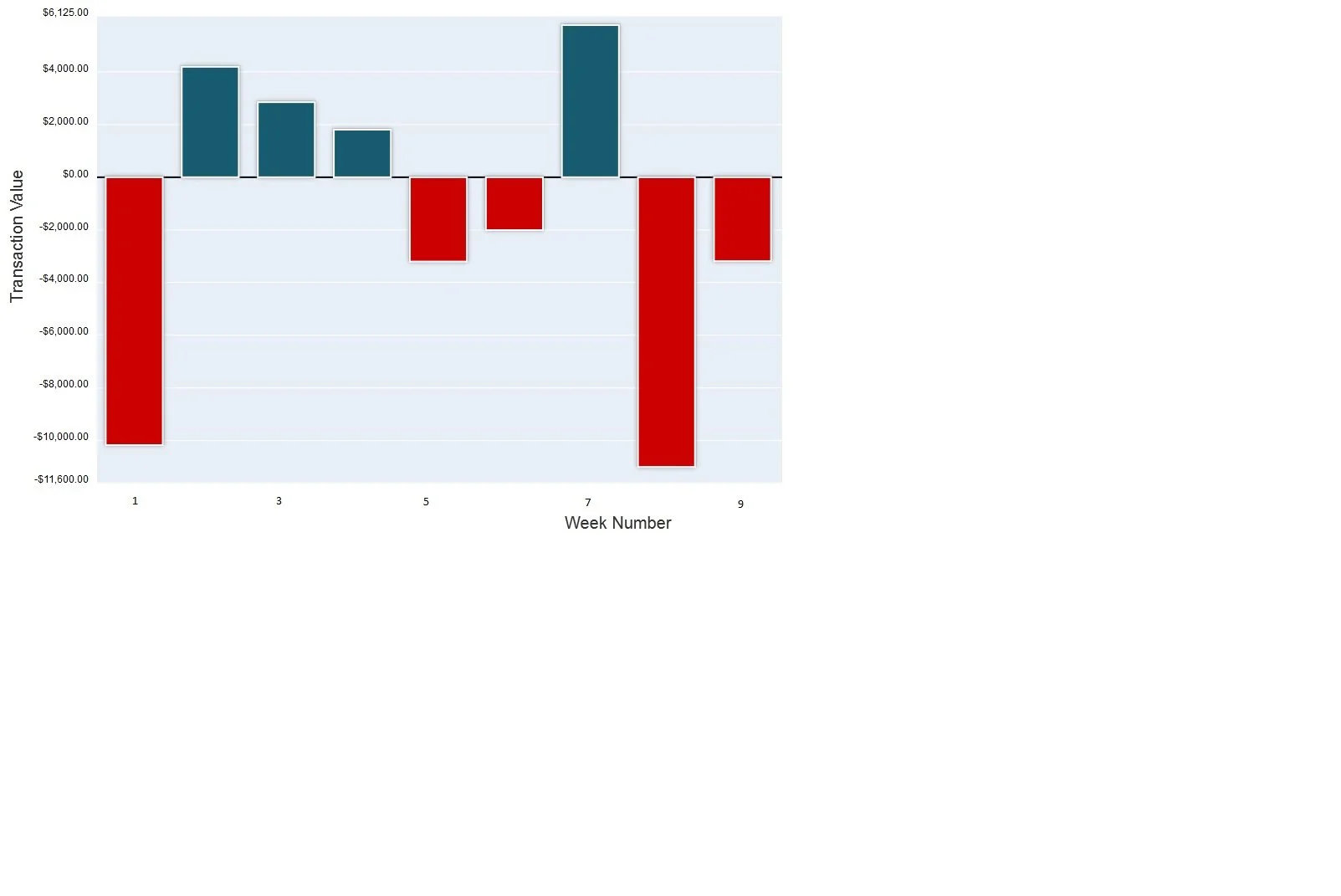
My reason for looking into text rotation was for the dynamic rendering the Y Axes of some financial charts, using JavaScript:
#css:
#perfCompChartYaxisTitle {
  float:left;
  position: relative;
  width: 50px;
  top: 300px;
  border-style: none;
  font-size: 20px;
  -webkit-transform: rotate(270deg);
  -moz-transform: rotate(270deg);
  -ms-transform: rotate(270deg);
  -o-transform: rotate(270deg);
  transform: rotate(270deg);
  filter: progid:DXImageTransform.Microsoft.BasicImage(rotation=3);
}

//JavaScript
var perfCompChartYaxisTitle =jQuery('<span>').attr('id', 'perfCompChartYaxisTitle');
//position for IE
if (perfCompChartYaxisTitle.css('filter').indexOf('DXImageTransform') > -1) {
 with (perfCompChartYaxisTitle) { css('zoom', '1'); css('background-color', 'white'); css('left', '-52px'); }
}
resultsDiv.append(perfCompChartYaxisTitle);
…which produces the following in the browser:

You can see the real chart in my Stock Strategies Simulator app. It’s only in Beta mode right now, but all of the basic functionality, including charts, is in full working order. You can also play with the various CSS transformation properties on the w3schools site.
