This is the third article in a three-part series that documents the tutorial video created by Adobe Fellow Mark Anders, which will help you get started with Adobe Edge, a new animation tool that is currently released in Preview 2. If you missed the first article, you can find it here, and if you missed the second article, you can find that here.
This article picks up where the second article left off and will discuss a third mode of animation not yet covered, which is to create regions in the timeline when you want an animation to take place.
How Do Timeline Regions Work?
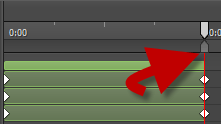
Direct your attention to the gray arrow on the timeline directly below the white arrow.

If you drag that arrow, then you form a region as to where your edits will take place. Mark then defines an area between the start of the bounce and the end of the bounce so that he can add in another effect. The effect he adds in this time is to rotate the box so that it looks like it settles into place as it lands on the gray box.

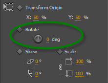
The rotation property is also found in the Properties box. For the start of the rotation, define it at -10 degrees. To finish the effect, copy this section of the timeline, and then from the main menu, click:

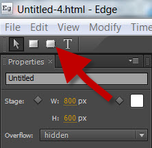
To finish the tutorial, Mark shows how easy it is to copy and paste animations that you already created and to apply it to a new element. First, create a blue-colored rounded rectangle, just as we did at the beginning, but this time click the rounded rectangle button at the top of the Properties box:

Click and drag to create the size of the box. Again, you might notice the purple guidelines, which tell you if you are matching the same height and width of the object closest to it. I will emphasize again at how incredibly easy this allows for creating an object that is the same size as the other objects on the page. After you change the color, then copy and paste the timeline section for the first black box. To select the entire sequence, click on the topmost bar of the element.

To add the same animations to the newest element, just select the new element and paste. Then, Mark suggests changing the rotation of the new box to be the opposite of the black box. To do so, move the timeline marker directly in the middle of the rotation effect. In the following screenshot, I
’
ve highlighted two different sections. From the right, you
’
ll see where to place the timeline marker to adjust the rotation. On the left, you
’
ll see that you can edit the properties from the timeline. You don
’
t have to mouse back over to the Properties box.

When you
’
re finished with your animation, you can Save As and Adobe Edge creates an HTML file, a CSS file and a JavaScript file for you to use in your web site.
Show Me the CSS Code!
The CSS code generated for this sample animation is as follows:
#RoundRect2 {
background-color: rgba(13,25,238,1.00);
top: 214px;
left: 169px;
width: 169px;
-webkit-transform: translateX(-5px) translateY(-483px) rotate(0deg);
-moz-transform: translateX(-5px) translateY(-483px) rotate(0deg);
-ms-transform: translateX(-5px) translateY(-483px) rotate(0deg);
-o-transform: translateX(-5px) translateY(-483px) rotate(0deg);
}
#stage {
background-color: rgba(255,255,255,1);
width: 800px;
height: 600px;
overflow: hidden;
}
#Rectangle {
top: 332px;
left: 169px;
background-color: rgba(6,6,6,1.00);
-webkit-transform: translateX(-5px) translateY(-483px) rotate(0deg);
-moz-transform: translateX(-5px) translateY(-483px) rotate(0deg);
-ms-transform: translateX(-5px) translateY(-483px) rotate(0deg);
-o-transform: translateX(-5px) translateY(-483px) rotate(0deg);
}
#RectangleCopy {
background-color: rgba(197,192,192,1.00);
opacity: 0;
left: 196px;
top: 437px;
-webkit-transform: skewX(46deg) scaleX(0.02) scaleY(0.02);
-moz-transform: skewX(46deg) scaleX(0.02) scaleY(0.02);
-ms-transform: skewX(46deg) scaleX(0.02) scaleY(0.02);
-o-transform: skewX(46deg) scaleX(0.02) scaleY(0.02);
}
.default_end_Default_Timeline #RoundRect2 {
-webkit-transform: translateX(0px) translateY(13px) rotate(0deg);
-moz-transform: translateX(0px) translateY(13px) rotate(0deg);
-ms-transform: translateX(0px) translateY(13px) rotate(0deg);
-o-transform: translateX(0px) translateY(13px) rotate(0deg);
}
.default_end_Default_Timeline #Rectangle {
background-color: rgba(6,6,6,1.00);
-webkit-transform: translateX(0) translateY(0) rotate(0deg);
-moz-transform: translateX(0) translateY(0) rotate(0deg);
-ms-transform: translateX(0) translateY(0) rotate(0deg);
-o-transform: translateX(0) translateY(0) rotate(0deg);
}
.default_end_Default_Timeline #RectangleCopy {
opacity: 1;
-webkit-transform: scaleX(1) scaleY(1);
-moz-transform: scaleX(1) scaleY(1);
-ms-transform: scaleX(1) scaleY(1);
-o-transform: scaleX(1) scaleY(1);
}
Most of you CSS fans will immediately recognize that Adobe sets up the file to accommodate four different vendors: Google, Firefox, Microsoft and Apple; Webkit (Chrome), Mozilla (Firefox), Internet Explorer and Opera. I tested this code in Chrome, Firefox and IE, and believe it or not, the animation worked in all three browsers.
Kudos to you, Adobe, even though Edge is still in preview, it looks and runs great.

