In September of 2010, a visually impaired woman filed a lawsuit against the Canadian government because she was unable to complete the online application for a government job. The obvious morale of this story is that if you own a business website, it had better be follow the W3C’s Techniques and Failures for Web Content Accessibility Guidelines 2.0 (WCAG 2.0). But beyond that basic lesson, it makes you think about the inherent dangers of not following the established guidelines of efficient User Interface design.
We all know how fickle people are on the web. If a form takes too long to fill out or presents any kind of obstacle to the viewer, he or she moves on. Sometimes that becomes the key determinant that makes the difference between a successful online enterprise and a stallwort.
An efficient and user-friendly user interface (UI) design cannot be overlooked if you want to keep your visitors engaged. To that end, I’d like to present to you some design principles that are so important, they are regarded as law!
Fitts’ Law
Paul Fitts was a psychologist at Ohio State University and later at the University of Michigan. He became interested on human factors during his time as Lieutenant Colonel in the US Air Force. In addition to being known as a strong proponent for aviation safety, he developed a model of human movement based on rapid, aimed movement in 1954. Known as Fitts’ Law, it went on to become one of the most highly successful and studied mathematical models of human motion.
Simply stated, Fitts’ Law postulates that the time to select a control is a function of the distance moved and the size of the control. He even calculated that the average time to move a pointing device a distance to a target of size (s) is:
Movement time = k’ + c’ log2(d/s) ; where k’ and c’ are constants.
From this, we can design our page elements as to:
- reduce the distance traveled to increase speed
- make the size of things reasonable; doubling the size of icons will decrease the movement time by a fixed amount
- recognize that toolbar icons (16×16) are slower than regular icons (32×32)
- put high frequency items at the top (e.g., selecting an item at the top of a menu is faster that selecting one at the bottom). There is a 20% to 30% speed difference between the top and bottom items on this menu:

Hick’s Law
William Hick was a British contemporary of Fitts. Originally trained as a doctor, Hick was a founding member of the Experimental Psychology Group as well as the Ergonomics Society. His most famous contribution to experimental psychology was his 1952 paper “On the rate of gain of information”, which later became known as Hick’s law. This paper on the study of human information processing established Hick as a pioneer in both the new sciences of experimental psychology and ergonomics.
According to Hick’s Law, reaction times slow in proportion to the number of choices presented. For example, when faced with 8 buttons, arrayed in a semicircle, responses are fastest when all but one button is covered, and slowest when all 8-responses are available.
While the basic premiss seems intuitive enough, Hick went so far as to establish a formula for the decision time for a simple decision is a linear function of the transmitted information whereby, given n things to choose from:
Decision time = k + c log2(n) ; where k and c are constants.
We can incorporate Hick’s findings into our design by:
- simplifying layouts to improve speed–no extra lines or frames
- minimizing the number of items in a list or menu group for faster decision making
Knowing that showing too many things at once can actually reduce performance, the list on the right is preferable to the one on the left:

Miller’s Number
You may not have heard of George Miller, but you would almost certainly be aware of his 7 ± 2 numbers theory. It states that the number of objects an average human can hold in working memory is 7 ± 2.
George Miller received a PhD from Harvard University in 1946. During WWII, he conducted military research in the area of speech perception. In 1956, Psychological Review published his paper entitled “The Magical Number Seven, Plus or Minus Two”. It went on to become on of the most cited papers in psychology. Four years later, after founding the Center for Cognitive Studies at Harvard with a cognitive developmentalist by the name of Jerome Bruner, he published a book entitled ‘Plans and the Structure of Behaviour’. This paper introduced Miller’s linguistic law, which states that, in order to understand what another person is saying, you must assume it is true and try to imagine what it could be true of. To avoid confusion, some people refer to the 7 ± 2 law as Miller’s Number.
Let’s take a closer look at Miller’s findings.
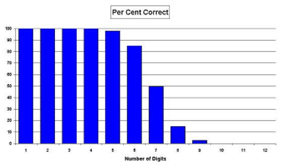
Humans can only handle about five things at a time without error–by about nine, error-free operation is unlikely (hence the 7 ± 2 variance). Miller established the notion that an upper limit, called a channel capacity, exists when humans process information. When this channel capacity is exceeded, input overload occurs.
Increasing the number of items increases errors. The graph below is based on digit span–hearing a number then remembering it briefly while writing it down. Accuracy varies with the number of digits, e.g. “54762” would usually be correct but “724196835” would usually be wrong:

People do handle larger numbers of things but they do so slowly and with increasing probability of error. The following steps will speed operations and reduce errors:
- Show only 5 – 7 items in a list at once, a number that the human can handle efficiently.
- Group controls with about 5 in each, including radio buttons, command buttons, check boxes, and menu items between separators. Use space to divide controls into small groups, trying to keep groups meaningful. For example, one group might be the most frequently used and the second group least used..
- Break down the task UI into a number of logical chunks, such as done by the hyphens and commas below. A human can handle three groups of three digits much more efficiently than one group of nine digits.
- Display large numbers with separators.
Example: Before and After Applying Miller Number
Conclusion
Too many developers try to determine the flow of their pages based solely on user requirements and thier own intuition. This approach almost always produces a suboptimal UI. Draw from the findings of Mr. Fitts, Hicks, and Miller and incorporate their guiding principles in your pages from here on in.
References


