Now that we have discussed the different elements of a form, it’s time to look into putting it all together. The layout of a form is crucial–a bad layout will cause confusion, make the form difficult to use, and drive away your traffic. In this article, I will discuss different table layouts and how to achieve the same results using pure CSS.
There are several ways to design a form. A common way "in the old days" was to use tables. Since the introduction of Cascading Style Sheets (CSS), we have a much better way to layout tables. You are free to use whatever method you want to layout your form, but this is the method I have found that works the best. After creating hundreds of forms, this method has served me well. There have been a few studies on how the eye follows forms and how users fill out forms online. Just search on "web form study" and you will be overwhelmed with the information.
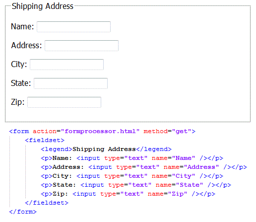
The form we will start off with will be a shipping address form. Figure 1 shows the form with no formatting. As you can see, it’s ugly. It is not too hard to follow now, but as more elements are added later to the form, it will become more difficult.

Figure 1
A Little Better
The first problem is that there is nothing to indicate what these fields are for. There is no grouping. If we have an area for the billing address, what differentiates this set of fields from the billing set of fields? Let’s add some grouping and a header (see figure 2).

Figure 2
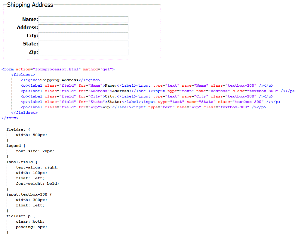
This is better, but the form fields do not line up very well–time to add some CSS.
A Lot Better
In Figure 3 below, we’ve added some CSS to align the fields and make the form labels bold. This gives a nice clean look to the form and makes it easier to follow.

Figure 3
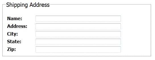
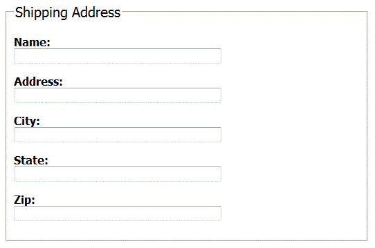
Right justified fields are just one example. Figure 4 shows form fields organized as left justified. Another way to display the form is to place the field labels above the fields as in Figure 5.

Figure 4

Figure 5
Required Fields
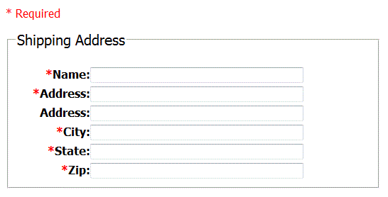
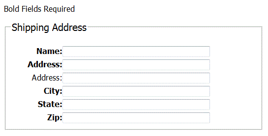
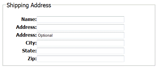
As good as the form looks, how do we know which fields are required and which ones are optional? What if we added another field for a second address line and made it optional? How will the user know what to fill out? There are several ways to show which form fields are required. One way is to use an asterisk ( * ) to denote required fields (figure 6). Another is to use bold field names or labels (figure 7). Yet another way would be to place text in the input area and auto-clear it with JavaScript when the user goes to enter text (figure 8). The only problem with the last approach is that if the user has JavaScript disabled, they will have to clear the text themselves. A way around that would be to use JavaScript to set the text area for input field, but then again, if the user has JavaScript disabled, they won’t know which fields are required or optional.

Figure 6

Figure 7

Figure 8
For the rest of the examples, we will use the asterisk approach.
Getting There
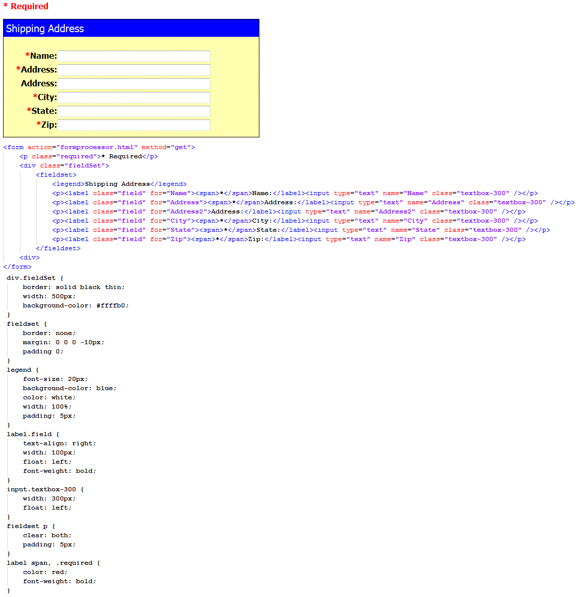
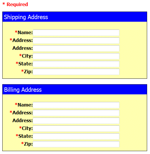
The form is starting to take shape. Let’s add a little more style to the form. In figure 9, we have removed the auto-generated fieldset border and made our own. The legend now has a background as does the form fieldset area.

Figure 9
A Bigger Example
In figure 10, you can see a bigger example of what a form could look like with these elements. The form sections are broken up into their more appropriate areas. Required fields are marked with an asterisk and everything is lined up for easier viewing.

Figure 10
Conclusion
As I stated in the beginning, there are many ways to create form layouts and this is just one example of how this author has done it many times. If this layout does not appeal to you or work for your project, search the web for many other examples. In the next article, we will expand on this form using jQuery to provide even more value to the form.


