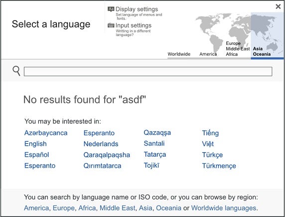
Designing the perfect User Interface (UI for short) is akin to immortality; you can never quite get there. In fact, like immortality, there’s a long way to go. If you find one of your own design “features” in this list, don’t fret. I can remember not so long ago when rottentomatoes.com returned nothing when you misspelled a movie title (that’s #8 on our list). While not exactly a blunder, it does demonstrate that there is always more you can do to help your users.

Non-Standard GUI Controls
Although each platform has its own look & feel, GUI widgets like links, buttons, checkboxes, scrollbars, close boxes [X], etc. are all identifiable and behave in expected ways across platforms. But for some reason, there are some developers who feel the need create an entirely new widget or change the appearance and/or behavior of the standard controls. The result is almost universally user confusion and frustration.

Overly Literal Search
Search engines that are unable to handle typos, plurals, hyphens, and other variants of the query terms not only reduce usability, but annoy your users in the process! And if you haven’t heard, annoyed users tend to go elsewhere. It’s 2015, so put some smarts into your searches already. Thank you.

Unidentified Links
Once upon a time in the early days of the World-Wide-Web, links were always in blue underlined text. Now, links are rarely blue or underlined. The only way that you can identify a link is by hovering your mouse pointer over it and watch if it changes to the pointing hand. Maybe I’m in the minority but I’d rather not have to go searching for links.

Building a One-size-fits-all Site
Unfortunately for you, people view websites and apps on a multitude of screens, which range from huge monitors to a teeny-weeny cell phone viewports. A site or app that looks good on a large screen won’t scale well to a small one. At the very least, you should create two versions of your content: one that fits a wide screen and another with a vertical layout for smartphones.

Assuming High Bandwidth Connectivity
Developers who want to impress their clients tend to load multimedia content in their sites – and why not, it works! The problem occurs when a user in Damascus on an old dial-modem attempts to load your site and/or app. Do such people really exist? You bet they do! This really happened to a mission critical Web app that I helped develop.

Using a Fixed Font Size
CSS style sheets give Web developers the ability to specify a fixed font size such as 20 pixels (font-size:20px;). On small screens your chosen size is likely to be tiny, thus reducing readability for most old people over the age of 40, like me! Use relative sizes as well such as “larger” or “110%”.

Forgetting to add Tab Order to Fields
You’d be surprised how many people use the tab key to traverse across form fields. In the case of familiar apps, there are users who never use the mouse at all. For that reason, it’s imperative that you spend some time working out the ideal tabbing order. You don’t even need to use any fancy scripting; the “tabindex” attribute is all it takes!

Displaying Messages using an Alert Box
While more prevalent a few years back, there are still some Web apps that display user messages via the JavaScript alert() function. The reason? Because it’s easy! Sure it works, but after three validation messages in a row, the user will quickly tire of trying to fill in your stupid form and quit. With so many JS libraries to choose from, there really is no reason not to use in-page notifications.


 Non-Standard GUI Controls
 Overly Literal Search
 Unidentified Links
 Building a One-size-fits-all Site
 Assuming High Bandwidth Connectivity
 Using a Fixed Font Size
 Forgetting to add Tab Order to Fields
 Displaying Messages using an Alert Box


