written by Gary W. Priester
What Are Web Safe Colors?
Web Safe, or Browser Safe palettes as they are also referred to, consist of 216 colors that display solid, non-dithered, and consistent on any computer monitor, or web browser, capable of displaying at least 8-bit color (256 colors). The reason why this palette contains only 216 colors, instead of the maximum 256 colors, is that only 216 out of the basic 256 colors will display exactly the same on all computers.
Why is this? This discrepancy is similar to what happens when a Windows user opens a word processor document created on a Macintosh (or vice versa) and sees a lot of odd characters in place of the expected punctuation marks and other extended characters. While the basic character set of lowercase and upper case characters and numerals map identically on all platforms, each computer platform treats some extended characters, like ampersands, foreign currency symbols, accented characters, and so forth, differently. And so a proper curly quote mark on one computer platform might be a pound sign on another. This happens with colors as well, so what is gray on a Windows monitor, might display pale yellow on a Macintosh browser. In the same way that there are common characters and numbers that are consistent among computer platforms, so there are colors that display the same. These are what we call Web Safe colors.
Before I get any deeper into this, let me backtrack for a moment. Where did Web Safe colors come from in the first place?
In the olden days, (ten or so years ago), most computers were only capable of displaying a maximum of 256 colors at one time. There were many reasons for these color limitations, the high cost of video RAM being the foremost. Most early video/graphics cards had between 128 and 512K of video RAM, or enough to display 16 to 256 colors. To display more colors, more RAM is needed.
The 256 colors were determined by a mathematical formula, rather than their aesthetic qualities. These colors needed to be described in no more than 8 bits of computer information, which by no coincidence is 256. The colors in this basic palette would display solid (and not dithered) on specific platform’s monitors that were capable of displaying 256 colors. This basic palette of 256 colors contains the 216 we now call the Web Safe palette, although in the days when the basic palette was devised the web was not available for the public to use. And as I mentioned earlier, the major computer platform developers did not use all of the same 256 colors.

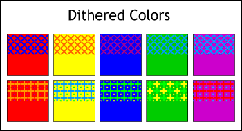
To give the appearance of more colors, and this is especially true of early monitors that could only display 16 pure colors, a process called dithering was used to give the impression of more colors.
Using 16 (4-bit) or 256 (8-bit) colors, the applications generated geometric patterns, like the ones shown here, to give the appearance of more colors. Unfortunately, about the only thing dithering gave the appearance of was what the Australians lovingly refer to as a dog’s breakfast!
Today, even though the price of video RAM is so low that 8 MB-which can display 32-bit color in high resolution without even working up a sweat-is pretty much standard, and 16 or 32 MB video cards sell for under $300 US, there are still a lot of older computers in the world limited to 256 color displays. These color-challenged computers represent the lowest common denominator, and are one of the strongest arguments for Web Safe colors.
So, What Are Web Safe Colors?

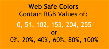
Web Safe colors are defined in terms of RGB values of 0, 51, 102, 153, 204, and 255. These numbers might seem a bit random, but are in fact made up of multiples of 51. OK, you say, where does the 51 come from? Well I was asking myself the same question before I discovered that 51 is 20% of 255. (NOTE: As 0 is considered a value, we say 0-255 instead of 1-256). 102 is 40% of 255, and so on. So out of this randomness comes order. Of sorts.
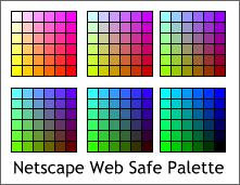
Before the software companies began including Netscape and Microsoft Internet Explorer palettes in their applications, one needed to specify Web Safe colors using the 6-value formula addressed in the previous paragraph. Here’s a chart of how these colors are defined in Netscape’s palette. Six groups of colors (36 colors per group) make up the entire palette. In this example, all squares begin with a common value of 255 red. The blue component starts at 255 for the first row and decreases per row by increments of 51. The green component decreases per column as you move to the right in the same increments. The next set of 36 squares are identical except that the red component in each color is reduced by 51 to 204. The next group have a red component of 153 and so on. The last group of 36 squares contain 0% red.

Now if you want to be compulsive, like me, you can create your own palette of Web Safe colors such as the Netscape palette I have painstakingly recreated for you here. Notice that the Netscape palette starts off with white and ends with black. Each group of 36 colors decreases by increments of 51 (20%) in the red component until you reach the last group which has 0% red overall. The very last color has 0% red, 0% blue and 0% green, or black.

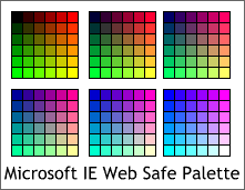
Microsoft could have used the same palette, but nooooooooooo! They had to do it their way. And what is their way? Microsoft starts with black and ends with white. The opposite direction used by Netscape. Are we surprised? This is a little like the question is this glass half full or half empty? In the first group of 36 colors, all colors contain 0% blue. (You might say they are blue component-challenged). The blue component increases by 20% ending at 100% blue in the last group of 36 colors.
The red component in the Internet Explorer palette increases from left to right while the green increases from top to bottom. In each successive group of colors, the initial colors remain the same, but the blue component increases by increments of 20%. The difference then between the two palettes is that the Explorer palette plots the starting value of 0 for both red and green from top left outward, while the Netscape palette plots 0 for the blue component top left and plots 0 for green bottom left.
To my eye, the Netscape palette is easier to use as the colors appear to be arranged more logically. On the other hand, neither palette is ideal.

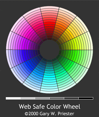
Shown here is my palette, which I just created (because I definitely am compulsive), to see if there was a more organized way to display 216 colors in terms of the color wheel. In my palette I have removed black, white, and the four shades of gray (20%, 40%, 60% and 80% black) that naturally occur and given them their own spot on the bottom. This leaves 210 colors which I have arranged in 14 wedges of 15 colors per wedge. The color in the center of each wedge (the 8th color in) is a pure primary color. As the colors move towards the center of the circle they get darker, and as they move outwards they get lighter. You mathematicians out there are probably guffawing at my crude attempt here, but hey, I’m only an artist. I had to take algebra three times just to get a passing grade!
When Should You Use Web Safe Colors?
Now that we’ve gone through all this compulsive bilge water, you’re probably more confused than ever about Web Safe colors. You do know what they are, how they’re composed, what the differences between the two basic palettes are, what more do you need to know? Well, I suppose you probably need to know how and when to use them.
If your web site has a solid colored background, make it a Web Safe color. That’s your guarantee the color will not embarrass you when it displays on the other computer platforms. And on older computers capable of displaying but 256 colors at a time, and there are still a lot of those relics around, your background will display clean and non-dithered.
If you create a web graphic with an invisible background, make the invisible background color a web safe color. It will work better and produce fewer display problems. In some cases, designating a non-web safe color transparent can lead to a dithered transparency when viewed on some browsers.

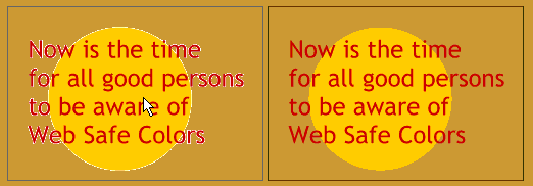
When you create an image or text image that will contain an invisible background color, make the background color the same as your web site (which should be a Web Safe color). Or, pick a Web Safe color that comes very close to your background color or background texture. The reason for this is when your application creates the web image, often it will anti-alias (blend) the edge of the visible image to the background color. If you use a white background, for example, and your site has a red brown background, you may see an annoying light colored fringe around your image such as you can see on the example on the left. Using a Web Safe color, on the other hand, should produce a cleaner image like the one shown on the right.
Use Web Safe colors for text, whether for HTML generated text or for GIF images. The colors will map correctly and will not break up on color-challenged monitors, so will be easier to read.
In A Dither About Dithering?
Finally a word about another kind of dithering, one over which you do have some control. When you create a GIF image, you usually have the option to Dither your colors. Now lucky for us, the dithering methods used in creating GIF images are less intrusive and less obvious than those pictured in the first figure. Dithering produces a smoother transition between colors and helps extend the 216-color range. This is good!

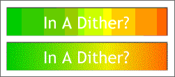
On the other hand, dithering, because it creates lots of new transitional pixels, creates a larger file size. This is not so good! You should use Dithering if your image contains a transition between colors as shown here. The example on top with no dithering shows banding. The file size is 2.2K. Adding dithering as seen on the bottom image, smoothes the transition considerably. However the file size is increased to 4.3K.
NOTE: The GIF file format uses a proprietary compression scheme to keep the size of the file as small as possible. It was created by CompuServe and Unix in the early days when color displays were limited to 256 colors and modems were slow. Instead of describing one pixel at a time in terms of its color, it describes the boundaries of an area and the single color within that area. In cases where there are large areas of certain colors, such as with a non-dithered image, the file size is smaller. When dithering is used, the larger shapes are broken into much smaller shapes requiring more information to be stored in the file and the file size increases.
But wait! What if you like those patterns, like the ones in the first figure? Well, to each his/her own, as they say. If your application supports Ordered dithering, you can create an ugly image just like the one shown on top. Because this method uses solid uniform repeating colored patterns instead of tiny randomly placed pixels, the file size drops from 4.3 to 4K. Wow! But if you compare the two dithering methods, you’ll probably opt for the extra 1/3K file size.
Photographic Images

If you want to be on the safe side, you can export photographic images using Web Safe colors and dithering. The results are not bad, as you can see here. However the file size for this image is 30K. If you have but a few images on your page you might be able to get away with a few dithered GIF images. But unfortunately, persons with color-challenged monitors, usually have bandwidth-challenged modems. So when designing for the lowest common denominator, use color photographic images sparingly.

A JPEG format will produce a better image at a greatly reduced file size, about 15K at 20% compression, but again, our beleaguered visitor with the speed and color-challenged computer is going to see an image more like the left half of the split image shown here.
When To Be Web Safe
Bottom line is this. You have to decide who your audience is and design for her or him. If you are designing for the mass market, including persons with antiquated computer systems and slug-like modems, then better to be Web Safe than sorry. On the other hand, if you are taking to the computer savvy who have more modern displays and faster modems (like us), then you’ll want to read the second half of this article (next month) where we will deal with alternative palettes such as Adaptive and Web-Snap Adaptive, and other adaptations of the 256-color palette that make life for us Web Site Designers and Developers a little more, dare I say, palatable.
This article originally appeared on WebDevelopersJournal.com.
Gary W. Priester is a reformed advertising art director having spent 25 years creating print and TV advertisements to get people to buy products and services they didn’t need. For the past decade, Priester has been a principal in The Black Point Group, a Northern California graphic design firm. He is the author of Looking Good in Color, Ventana Press, and co-author of CorelDRAW Studio Techniques, Osborne/Corel Press. In addition, Gary writes for numerous magazines and Web sites. He lives just north of San Francisco with his artist wife, Mary Carter, their six chickens, five cats, four doves, two finches and one extraordinary canary.

