Google’s AMP project aims to dramatically improve the performance of the mobile Web. It’s a web standard built on existing web technologies whose primary focus is on static content. In the Making AMP Page Elements More Responsive tutorial, we learned how to make individual elements more responsive using the layout="responsive" attribute. AMP pages also permit the use of media queries to control how the page layout looks and behaves, much as you would do on a “regular” web page. Today’s article will cover their usage in AMP pages.
Media Queries in AMP Pages
AMP pages shift the control of page responsiveness away from CSS media queries to individual elements. They do so by adding the layout(="responsive") and media attributes to page elements. As we’ll see in a moment, this does not eliminate the use of CSS to control element sizing.
Limiting an Element’s Size
By default, elements with layout="responsive" will expand to fill the full width of its container, i.e. width=100%. The drawback to this behavior is that the element can stretch beyond its intended size. Consider an image that expands to the width of a widescreen monitor. It won’t look very good. You can improve how such an image would appear by simply restricting the width of the image’s container. For example, by setting a “max-width” rule on the “body” or “main,” you can restrict all images to a specific maximum width.
Here’s an example:
Say that we have an image of some flowers that measures 640 pixels in width with a height of 427 pixels. We want to display the same image on all screen sizes, so we specify the real width and height, and set the layout to “responsive”:
<div class="responsive-img">
  <amp-img alt="flowers"
    src="images/flowers.jpg"
    layout="responsive"
    width="640"
    height="427"></amp-img>
</div>
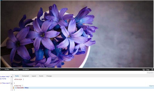
That will scale beautifully…that is until the width of the viewport exceeds the real image width of 640px. From that point on, the same image will grow to fill the entire width of the viewport, all the while becoming more and more fuzzy:
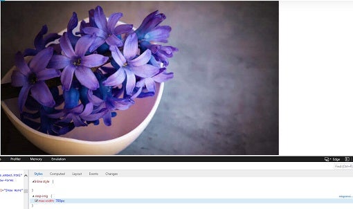
The solution is to set the max-width of the container to 700px via some custom CSS. Now the image won’t stretch beyond its intended size:
<style amp-custom>
.responsive-img {
  max-width: 700px;
}
</style>
Using the Element Media Attribute
In addition to the layout attribute, AMP offers another feature for responsive design: the media attribute. It can be used on any and all elements in the page. The way it works is similar to media queries in your global stylesheet, but only impacts that specific element. It’s particularly useful when you need to either show or hide an element based on a media query.
For example, here we have two images with two media queries: one for viewports less than 649 pixels across, and the other for those of 650 pixels and above.
<amp-img
    media="(max-width: 649px)"
    src="narrow.jpg"
    width=527
    height=193
    layout="responsive">
</amp-img>
<amp-img
    media="(min-width: 650px)"
    src="wide.jpg"
    width=466
    height=355
    layout="responsive">
</amp-img>
Depending on the screen width, one or the other will be displayed.
Matching Images to the Screen Resolution
Images make up a large part of a web page – somewhere in the vicinity of sixty five percent of the page’s total bytes. At a minimum, your images should be visible on various screen sizes and orientations so that the user doesn’t have to scroll or zoom to see the entire image. We’ve now covered that part with the “layout=responsive” attribute. In addition to the basic responsive image, you might want to include multiple image resources to best match images to the screen resolution.
For example, on high-resolution screens such as Retina display, you should provide the highest quality images; however, you’ll also want to provide less detailed images for low-res devices, so as to reduce loading times. In both AMP and non-AMP pages, you can serve the optimal image for that screen resolution (pixel density) by including the “srcset” attribute with the width descriptor ( w ). Note that, in the old srcset proposal, the w descriptor used to describe the viewport width, but now it describes the width of the image source file, which allows the user agent to calculate the effective pixel density of each image and choose the appropriate image accordingly.
In the following example we have several image files that are of different resolutions at the same aspect ratio. We’ve also specified the size to render the image at, depending on the viewport width:
- For a viewport width up to 400px, render the image at 100% of the viewport width.
- For a viewport width up to 900px, render the image at 75% of the viewport width.
- For everything above 900px, render the image at 600px wide.
<amp-img alt="apple"
  src="images/apple.jpg"
  height="596"
  width="900"
  srcset="images/apple-900.jpg 900w,
          images/apple-800.jpg 800w,
          images/apple-700.jpg 700w,
          images/apple-600.jpg 600w,
          images/apple-500.jpg 500w,
          images/apple-400.jpg 400w"
  sizes="(max-width: 400px) 100vw, (max-width: 900px) 75vw, 600px">
</amp-img>
Here is one of the above images showing that the apple-700.jpg image is being displayed:
Conclusion
The AMP spec offers everything you need to make responsive mobile-first pages without having to resort to a lot of generalized stylesheet media queries. For more information on the techniques and examples featured here today, visit the AMP Project site docs on Creating responsive AMP pages.


