

Finally, we get something more important than just a good specification; we gained the implementation of a good specification in the most commonly-used browsers. So far, we have used skins to create layouts with CSS, because until now, there has been nothing specifically aimed at this function. Yes, we have flexbox, but read until the end.
Progress
In the early days, we used tables to make it easier to create a layout, but that invariably resulted in another series of problems. We then started using float instead of tables, which helped pages to be more flexible while using fewer lines HTML code. But the float was not really meant for that. Only those who used it know how sad and limited it was.
To help align and distribute the space between items in a container, the CSS Flexbox Layout was created. The main idea was to give the container the ability to change the width/height and the order of its items to better fill the available space and to accommodate all kinds of display devices and screen sizes. But the beloved flexbox does not solve all the problems and was not designed to solve them either, especially when it comes to complex interfaces.
Today, we are officially in the future and we have supported a really disruptive option in “creating layouts” with CSS.
What is CSS Grid Layout?
It is a W3C specification that provides a new layout template for CSS, with the powerful ability to control the size and position of the elements and their contents.
Yes, but should I use Flexbox or Grid Layout?
Flexbox is fine for one-dimensional layouts — anything that needs to be laid out in a straight line. Checkout the following example:
// HTML
<div class="container">
  <div class="div one"></div>
  <div class="div one"></div>
  <div class="div one"></div>
  <div class="div two"></div>
  <div class="div two"></div>
  <div class="div two"></div>
  <div class="div two"></div>
  <div class="div two"></div>
</div>

// CSS
body {
  padding: 10px;
  -- margin: 3px;
}

.container {
  display: flex;
  flex-wrap: wrap;
}

.one {
  width: calc((100%/3) - (var( -- margin)* 2));
}

.two {
  width: calc((100%/5) - (var( -- margin)* 2));
}

.div {
  background-color: green;
  border-radius: 5px;
  margin: 2px;
  height: 50px;
}
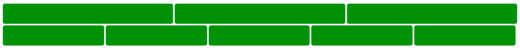
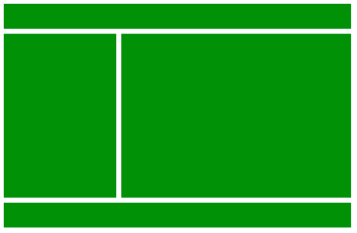
Grid Layout is the right solution when you want to control sizing and alignment in two dimensions:
// HTML
<div class="container">
  <div class="div one"></div>
  <div class="div two"></div>
  <div class="div three"></div>
  <div class="div four"></div>
  <div class="div five"></div>
  <div class="div six"></div>
  <div class="div seven"></div>
  <div class="div eight"></div>
</div>

// CSS
body {
  padding: 10px;
}

.container {
  display: grid;
  grid-gap: 10px;
  grid-template-columns: auto;
  grid-template-rows: 50px 50px;
  grid-template-areas:
    'a b c d'
    'a e f f'
  ;
}

.div {
  background-color: green;
  border-radius: 5px;
}

.one {
  grid-area: a;
}

.two {
  grid-area: b;
}

.three {
  grid-area: c;
}

.four {
  grid-area: d;
}

.five {
  grid-area: e;
}

.six {
  grid-area: f;
}

.seven {
  grid-area: g;
}

.eight {
  grid-area: h;
}

Terminology
Before starting to work with Grid Layout, it is necessary to understand the terms that come with the specification. I will explain each one to facilitate the understanding of later examples.
Grid Lines
These are the lines that define the grid, that can be distributed horizontally or vertically. In the future, we can refer to them by a number or a name that can be defined by the developer.
Grid Tracks
The horizontal or vertical space between two grid lines.
Grid Cell or Grid Item
The space between four grid lines, being the smallest unit on our grid. Conceptually, we can make an analogy with a table cell.
Grid Areas
Any space in the grid; used to display one or more Grid cells/items.
Grid Containers
The direct parent of all items on the grid, the element that receives the display: grid property.
In the example below, .container is the Grid Container:
<div class="container">
	<div class="div"></div>
	<div class="div"></div>
	<div class="div"></div>
</div>
Grid items
These are the items that represent the content of the grid; each child’s direct grid container becomes a grid item.
In the example below, each .div element is a grid item, but the .sub-div is not:
<div class="container">
	<div class="div"></div>
	<div class="div">
	  <div class="sub-div"></div>
	</div>
	<div class="div"></div>
</div>
Defining a Grid
To define a grid, use the new display display: grid or display: inline-grid property values, once one of these properties is defined in .container, all the direct children of that element will automatically become grid items.
The display: grid generates a Grid container with block behavior.
Area Naming
In the grid container we can manipulate the position and behavior of grid items. This can be achieved through the property grid-template-areas, where we can literally assemble our entire layout in just one property. To facilitate and assign more semantics to what we are doing, we name our grid items through the well-known grid-area:
// HTML
<div class="container">
  <header class="div"></header>
  <aside class="div"></aside>
  <main class="div"></main>
  <footer class="div"></footer>
</div>

// CSS
body {
  padding: 10px;
}

.container {
  width: 100%;
  max-width: 700px;
  margin: 0 auto;
  display: grid;
  grid-gap: 10px;
  grid-template-columns: auto;
  grid-template-rows: 50px 330px 50px;
  grid-template-areas:
    'header header header'
    'aside main main'
    'footer footer footer'
}

.div {
  background-color: green;
}

header {
  grid-area: header;
}

aside {
  grid-area: aside;
}

main {
  grid-area: main;
}

footer {
  grid-area: footer;
}
Conclusion
This article was just a brushstroke on some of the features, but believe me, the spec has a lot more to offer. Go to the official doc pagefor more!
About the Author
Diogo Souza works as a Java Developer at PagSeguro and has worked for companies such as Indra Company, Atlantic Institute and Ebix LA. He is also an Android trainer, speaker at events on Java and mobile world.
