


CSS math functions allow mathematical expressions to be used as property values. Each of these mathematical functions can be used in unexpected ways, such as within gradients and color functions, but also in combination with custom CSS properties. Performing dynamic mathematical calculations to set property values can be done using the calc() function, which simplifies their manipulation.
For the realization of receptive elements, the min() and max() functions are very good solutions for setting the specific design that you want to implement in your application.
Read: HTML, CSS, and JavaScript Tools and Libraries
What are CSS Math Functions?
In this CSS web development tutorial, we will explain the math functions min()<, max(), calc() and clamp(). We will explore practical use cases and learn the syntax of each function. Let’s start by explaining each mathematical function separately and using them in concrete examples.
The calc() Function in CSS
CSS syntax: calc(expression)
The calc() function performs mathematical calculations to determine values for properties. You can perform addition, subtraction, multiplication, and division in CSS property values. This function is very useful for developing responsive web pages and applications.
Below is a code example showing how to use the calc() function in CSS :
<!DOCTYPE html>
<html>
<head>
<style>
#demo {
background-color: #4040a1;
position: absolute;
height: 100px;
left: 50px;
width: calc(100% - 100px);
padding: 5px;
display: flex;
justify-content: center;
font-size: 21px;
color: white;
align-items: center;
}
</style>
</head>
<body>
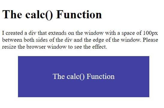
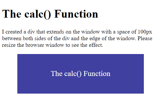
<h1>The calc() Function</h1>
<p>I created a div that extends on the window with a space of 100px between both sides of the div and the edge of the window. Please resize the browser window to see the effect.</p>
<div id="demo">The calc() Function</div>
<p></p>
</body>
</html>
This code results in the following output:
Another example for using the calc() function to create a color palette using HSL, which comes from hue, saturation, and lightness.
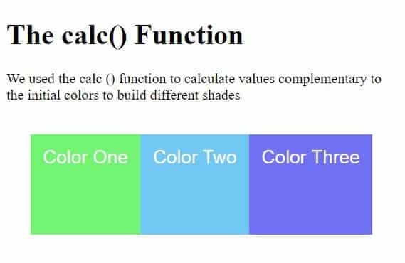
We calculated the complementary values to build different shades. Here is the code example:
<!DOCTYPE html>
<html>
    <head>
        <style>
            .colors {
                display: flex;
                position: absolute;
                list-style-type: none;
                height: 100px;
                left: 30px;
                padding: 5px;
                font-size: 21px;
                font-family: arial;
                color: white;
                align-items: center;
                --base-hue: 120;
                --saturation: 85%;
                --lightness: 70%;
                --rotation: 40;
            }
            .color-base {
                padding: 14px;
                height: 85px;
                background-color: hsl(var(--hue), var(--saturation), var(--lightness));
         }
            .colorOne {
                --hue: calc(var(--base-hue));
            }
            .colorTwo {
                --hue: calc(var(--base-hue) + var(--rotation) * 2);
            }
            .colorThree {
                --hue: calc(var(--base-hue) + var(--rotation) * 3);
            }
        </style>
    </head>
    <body>
        <h1>The calc() Function</h1>
        <p>We used the calc () function to calculate values complementary to the initial colors to build different shades</p>
        <div>
            <ul class="colors">
                <li class="color-base colorOne">Color One</li>
                <li class="color-base colorTwo">Color Two</li>
                <li class="color-base colorThree">Color Three</li>
            </ul>
        </div>
    </body>
</html>
Here is the expected output of running this code:
Read: CSS Sprites: How to Create Image Sprites
The clamp() Function in CSS
CSS syntax : clamp(value1, value2, value3)
The clamp() function restricts a certain value between an upper and a lower limit, based on an established ideal value. It accepts three values and the order matters because the first value is the smallest in the given range, the middle value is the ideal value, and the third is the highest value in the given range. The purpose of this function is to prevent large page titles from taking up too much space in the viewport. Here is an example of how to use the clamp() function in CSS:
<!DOCTYPE html>
<html>
<head>
<style>
.demo {
font-family: arial;
font-size: clamp(15px, 2.5vw, 17px);
padding: 5px;
}
</style>
</head>
<body>
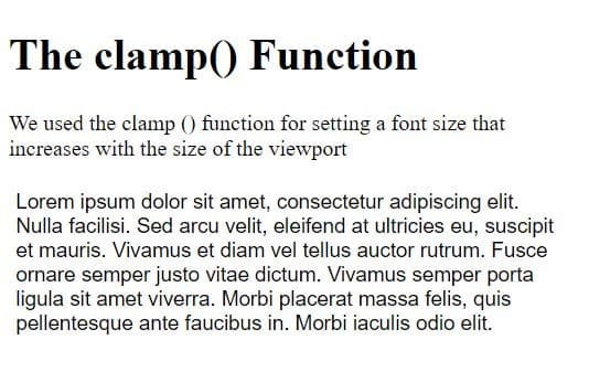
<h1>The clamp() Function</h1>
<p>We used the clamp () function for setting a font size that increases with the size of the viewport</p>
<p class="demo">
Lorem ipsum dolor sit amet, consectetur adipiscing elit. Nulla facilisi. Sed arcu velit, eleifend at ultricies eu, suscipit et mauris. Vivamus et diam vel tellus auctor rutrum. Fusce ornare semper justo vitae dictum. Vivamus
semper porta ligula sit amet viverra. Morbi placerat massa felis, quis pellentesque ante faucibus in. Morbi iaculis odio elit.
</p>
</body>
</html>
In this example, we set a font size that increases with the size of the viewport but does not shrink below the minimum font size or above the maximum font size.
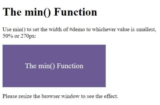
The min() Function in CSS
CSS syntax : min(value1, value 2, …)
The min() function allows web developers to define several values for a CSS property and will choose the smallest value from the given values. The values inside the function must be separated by commas. Here is an example of how to use the CSS min() function:
<!DOCTYPE html>
<html>
<head>
     <style>
         #demo {
             background-color: #6b5b95;
             height: 100px;
             width: min(50%, 270px);
             padding: 10px;
             display: flex;
             justify-content: center;
             font-size: 21px;
             color: white;
             align-items: center;
         }
     </style>
</head>
<body>
     <h1>The min() Function</h1>
     <p>
         Use min() to set the width of #demo to whichever value is smallest, <br />
         50% or 270px:
     </p>
     <div id="demo">The min() Function</div>
     <p>Please resize the browser window to see the effect.</p>
</body>
</html>
If you try to resize the browser window, it will check the screen size and choose the minimum value from the given values. This will set the value as the width for the item.
Read: Styling Text with CSS
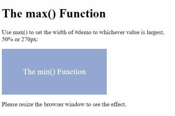
The max() Function in CSS
CSS syntax : max(value1, value 2, …)
The max() function allows web programmers to define several values for a CSS property and will choose the maximum value from the given values. The values inside the function must be separated by a comma. Here is an example of how to use the CSS max() function:
<!DOCTYPE html>
<html>
<head>
     <style>
         #demo {
             background-color: #92a8d1;
                height: 100px;
             width: min(50%, 270px);
             padding: 10px;
             display: flex;
             justify-content: center;
             font-size: 21px;
             color: white;
             align-items: center;
         }
     </style>
</head>
<body>
     <h1>The max() Function</h1>
     <p>
         Use max() to set the width of #demo to whichever value is largest, <br />
            50% or 270px:
     </p>
     <div id="demo">The min() Function</div>
     <p>Please resize the browser window to see the effect.</p>
</body>
</html>
If you try to resize the browser window, it will check the screen size and choose the maximum value from the given values. This will set the value as the width for the item.
Summary of CSS Math Functions
The CSS math functions (min(), max(), calc(), and clamp()) are very useful, powerful, and easy to use in your web pages and web applications. Now that you have been introduced to these CSS math functions in practical examples, all you have to do is use them to build responsive user interfaces (UIs).
Read more cascading style sheets (CSS) web development tutorials.
