


This article will teach you how to use some of the most-used CSS3 animation properties to make your website more attractive. Nowadays, the animation in web design is very common. For a website, it is recommended to use simple, small and discreet animations. The use of large-scale animations can also help your website to be more attractive, but it is not a good idea to start mixing up too many different moving effects as it can turn the website into a complete mess. Another favorable aspect is that applying effects doesn’t slow down the web servers or website, as the use of Flash did some time ago, and there are many ways to obtain them.
Introduction to @keyframes and Animation
An animation allows to an element progressively change from one style to another. To use CSS3 animation, you should first specify the @keyframes for the animation, that is the main component of CSS animations, and represents the CSS rule where animations will be created. Each animation has a different style declaration, as you will see later in this article. When you specify CSS styles inside the @keyframes rule, the animation will gradually change from the current style to the new style at certain times. To get an animation to work, you must bind the animation to an element.
CSS3 Animation Properties
The animation property is used to call @keyframes inside a CSS selector. Animation can have multiple properties:
- animation-name: @keyframes name.
- animation-duration: the duration of the animation from start to the end.
- animation-timing-function: sets the animation speed (linear | ease | ease-in | ease-out | ease-in-out | cubic-bezier).
- animation-delay: the delay before our animation will start.
- animation-iteration-count: the number of times it will iterate through animation.
- animation-direction: gives you the ability to change the loop direction, from start to end, or from end to start, or both.
- animation-fill-mode: specifies which styles will be applied to the element when our animation is finished (none | forwards | backwards | both)
For example: The code below will create a blinking effect, with a one second animation delay, a 10 second total animation duration and infinite linear loop iterations. The animation will gradually change the background-color of the
div {
    width: 200px;
    height: 100px;
    background-color: yellow;
    animation-name: example;
    animation-duration: 10s;
    animation-delay: 1s;
    animation-iteration-count: infinite;
}

@keyframes example {
    from {background-color: yellow;}
    to {background-color: blue;}
}
Next example creates two text animations that slide in two texts, one from left and one from the right edge of the browser window:
<!DOCTYPE html>
<html>
<head>
<style>
p {
animation: 2s slideRight;
}
@keyframes slideRight{
from {
margin-left: -100%;
width: 300%;
}
to {
margin-left: 0%;
width: 100%;
}
}
div {
animation-duration: 5s;
animation-name: slideLeft;
}
@keyframes slideLeft{
from {
margin-left: 100%;
width: 300%;
}
to {
margin-left: 0%;
width: 100%;
}
}
</style>
</head>
<body>
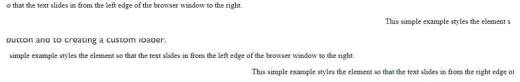
<p>This simple example styles the element so that the text slides in from the left edge of the browser window to the right.</p>
<div>This simple example styles the element so that the text slides in from the right edge of the browser window to the left.</div>
</body>
</html>Here are some screenshots of the HTML script’s animation:
Next HTML script is more complex and contains different kind of animations, from glowing text, to clicking and hovering a button and to creating a custom loader.
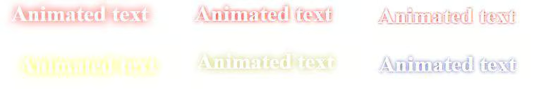
Creating a glowing animation effect applied over text:
.glow {
      animation-duration: 2s;
      animation-name: glow;
      animation-direction: alternate;
      animation-iteration-count: infinite;
    }

@keyframes glow {
        from { text-shadow: 0 0 0px red; }
        to { text-shadow: 0 0 20px red; }
    }

/*@keyframes glow {
        from { text-shadow: 0 0 0px yellow; }
        to { text-shadow: 0 0 20px blue; }
    }
*/
The code above will create a glowing effect, with a 2 second animation duration, infinite iterations iterations. The animation will gradually change the glow-color of the text from “red” to “red” and the text shadow from 0px to 20px, as you can see from the below figure. I also put an example of glowing text from yellow to blue.
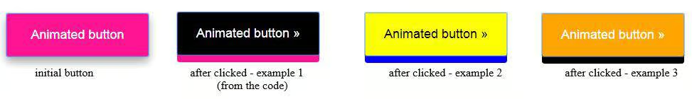
Creating a clicked animation effect applied over a button:
In this section, we will create an effect of a clicked button. The button is 200pxX60px, and beside the general properties as background color, margin etc, contains a shadow box-shadow: 0 8px 16px 0 rgba(0,0,0,0.2); with the attributes below:
- the horizontal offset (required) of the shadow.
- the vertical offset (required) of the shadow.
- the blur radius (required).
- the spread radius (optional), positive values increase the size of the shadow.
- color (required) – takes any color value, like hex, named, rgba or hsla.
.button {
  border-radius: 4px;
  background-color: deeppink;
  border: none;
  color: #FFFFFF;
  text-align: center;
  font-size: 18px;
  padding: 20px;
  height: 60px;
  width: 200px;
  transition: all 0.5s;
  cursor: pointer;
  margin: 5px;
  box-shadow: 0 8px 16px 0 rgba(0,0,0,0.2);
}

.button:active {
  background-color: black;
  box-shadow: 0 10px deeppink;
  transform: translateY(4px);
}
When the button is pressed it changes its color and the box shadow, as you may see in the below figure:
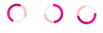
Creating a loader animation:
This loader contains four colors, is 20x20px wide and it rotates 360° with an animation spin of 3 seconds, as you can see from the settings below:
.loader {
  border: 10px solid #f3f3f3;
  border-radius: 50%;
  border-top: 10px solid deeppink;
  border-right: 10px solid mediumvioletred;
  border-bottom: 10px solid pink;
  width: 20px;
  height: 20px;
  padding: 20px;
  animation: spin 3s linear infinite;
}

@keyframes spin {
  0% { transform: rotate(0deg); }
  100% { transform: rotate(360deg); }
}
Now, putting all together, we have the complete HTML script that contains all the animations described above:
<!DOCTYPE html>
<html>
<head>
<style>

/* create the glow animation for text */
.glow {
      animation-duration: 1s;
      animation-name: glow;
      animation-direction: alternate;
      animation-iteration-count: infinite;
    }

@keyframes glow {
        from { text-shadow: 0 0 0px red; }
        to { text-shadow: 0 0 20px red; }
    }


.button {
  border-radius: 4px;
  background-color: deeppink;
  border: none;
  color: #FFFFFF;
  text-align: center;
  font-size: 18px;
  padding: 20px;
  width: 200px;
  transition: all 0.5s;
  cursor: pointer;
  margin: 5px;
  box-shadow: 0 8px 16px 0 rgba(0,0,0,0.2), 0 6px 20px 0 rgba(0,0,0,0.19);
}

.button span {
  cursor: pointer;
  display: inline-block;
  position: relative;
  transition: 0.5s;
}

.button span:after {
  content: '\00bb';
  position: absolute;
  opacity: 0;
  top: 0;
  right: -20px;
  transition: 0.5s;
}

.button:active {
  background-color: black;
  box-shadow: 0 10px deeppink;
  transform: translateY(4px);
}

.button:hover span {
  padding-right: 15px;
}

.button:hover span:after {
  opacity: 10;
  right: 0;
}

/* create the animation and setting properties for the loader */
.loader {
  border: 10px solid #f3f3f3;
  border-radius: 50%;
  border-top: 10px solid deeppink;
  border-right: 10px solid mediumvioletred;
  border-bottom: 10px solid pink;
  width: 20px;
  height: 20px;
  padding: 20px;
  animation: spin 3s linear infinite;
}

@keyframes spin {
  0% { transform: rotate(0deg); }
  100% { transform: rotate(360deg); }
}


html {
  border: 7 px solid top pink;
  padding: 10px;
  background: url(flowers.jpg) no-repeat top center fixed;
  background-size: 200px 281px;
  box-shadow: 0 8px 16px 0 rgba(0,0,0,0.2), 0 6px 20px 0 rgba(0,0,0,0.19);
  color: white;
}

</style>
</head>

<body>

<h1 class="glow" align="center">Animated text</h1>
<div id="example1" align="center">
<button class="button"><span>Animated button </span></button>
<h2 class="glow" align="center">Custom loader</h2>
<div class="loader" align="center"></div>

</body>
</html>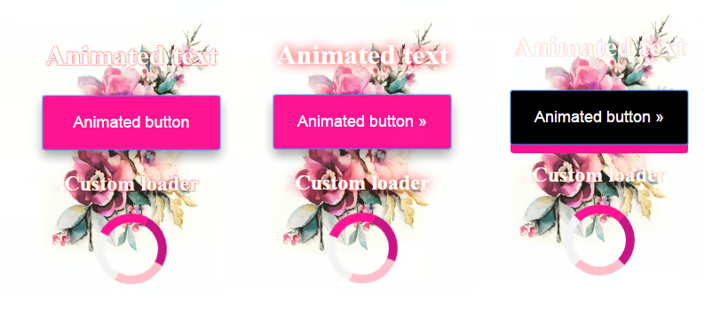
Conclusion
During this article, you have seen the main CSS animation properties that helps you to create attractive animations for your website.
