


The overflow shorthand CSS property fixes what needs to be done when the content of your element is too large to fit in the block formatting. Basically, it’s an abbreviation for overflow-y and overflow-x. It also indicates whether a scroll bar should appear or whether the content is cut. Thus, the overflow-y property indicates the handling in the vertical direction, while the overflow-x property indicates the handling in the horizontal.
The overflow property in CSS is extremely important in the development of websites with an interactive aspect, which contain a lot of content. Look at the examples in this article to be able to familiarize yourself with more streams. The overflow property takes care of what exactly happens to content that breaks outside its limits. For example, take a div where you set the width to be 200px, but it contains an image that is 350px wide. This image will be visible by default and will remain in div.
Syntax
The syntax below is used to define the overflow property, namely:
div {
  overflow: hidden;
}
The overflow property can have several values, such as:
- auto — scroll bars appear as needed, the browser setting how it will manage content and may differ from browser to browser
- scroll — here the content is cut and the required scroll bars are displayed
- visible — in this case, the content is played outside the box
- hidden — in this case, the content is cut, but the scroll bars are not displayed
- clip — exactly as in the case of the hidden property, the content is cut by the element’s fill box. The difference between the two ( the clip and the hidden} is that the keyword of the clip prohibits all scrolling, including programmatic scrolling. The box does not represent a scrolling container, and it does not start from a formatting context. If you want to create a new formatting concept, you can use display: flow-root to do this
- overlay — practically, the value behaves like a clip, but with scroll bars above the content instead of taking up space. This value is only accepted in WebKit (Safari) and Blink-based browsers (Opera or Google Chrome)
Remember, the overflow property can be applied only to the elements in the table, line and block!
Now, let’s deal with the above-mentioned values, creating examples with these values.
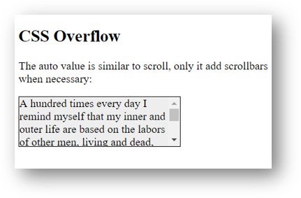
The auto value is close to the scroll value, but it will only add scroll bars when needed. Here’s an example:
<!DOCTYPE html>
<html>
<head>
<style>
div {
  background-color: lightgray;
  width: 230px;
  height: 70px;
  border: 1px solid black;
  overflow: auto;
}
</style>
</head>
<body>
<h2>CSS Overflow</h2>
<p>The auto value is close to the scroll value, but it will only add scroll bars when needed:</p>
<div>A hundred times every day I remind myself that my inner and outer life are based on the labors of other men, living and dead, and that I must exert myself in order to give in the same measure as I have received and am still receiving.</div>
</body>
</html>
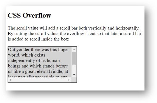
The scroll value will add a scroll bar both vertically and horizontally. By setting the scroll value, the overflow is cut so that later a scroll bar is added to scroll inside the box. Let’s look at an example:
<!DOCTYPE html>
<html>
<head>
<style>
div {
  background-color: lightgray;
  width: 230px;
  height: 120px;
  border: 1px solid black;
  overflow: scroll;
}
</style>
</head>
<body>
<h2>CSS Overflow</h2>
<p>The scroll value will add a scroll bar both vertically and horizontally. By setting the scroll value, the overflow is cut so that later a scroll bar is added to scroll inside the box:</p>
<div>Out yonder there was this huge world, which exists independently of us human beings and which stands before us like a great, eternal riddle, at least partially accessible to our inspection and thinking. The contemplation of this world beckoned like a liberation…</div>
</body>
</html>
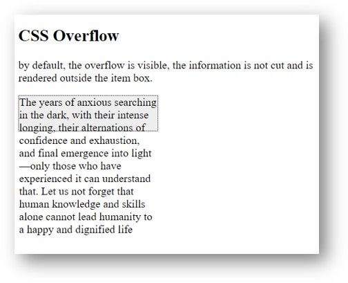
Now let’s talk about the visible valuation, namely the visible overflow. In this case, by default, the overflow is visible, the information is not cut and is rendered outside the item box. Here is an example where we use this value in the rows below:
<!DOCTYPE html>
<html>
<head>
<style>
div {
  background-color: #eee;
  width: 200px;
  height: 50px;
  border: 1px dotted black;
  overflow: visible;
}
</style>
</head>
<body>
<h2>CSS Overflow</h2>
<p>by default, the overflow is visible, the information is not cut and is rendered outside the item box.</p>
<div>The years of anxious searching in the dark, with their intense longing, their alternations of confidence and exhaustion, and final emergence into light—only those who have experienced it can understand that.
Let us not forget that human knowledge and skills alone cannot lead humanity to a happy and dignified life</div>
</body>
</html>
Let’s discuss the value we just mentioned, namely overflow hidden. Once the value is hidden, the retrieval is cut off and all content is hidden. Let’s look at the following example using hidden overflow.
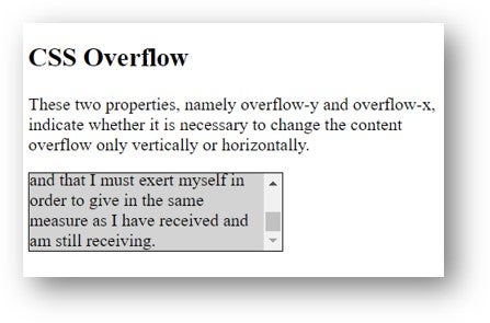
Now, let’s talk about overflow-y and overflow-x. These two properties, namely overflow-y and overflow-x, indicate whether it is necessary to change the content overflow only vertically or horizontally. Therefore, overflow-y indicates what needs to be done with the bottom and top edges of the content and overflow-x indicates what to do with the left and right edges of the content. Here is an example:
<!DOCTYPE html>
<html>
<head>
<style>
div {
  background-color: lightgrey;
  width: 230px;
  height: 70px;
  border: 1px solid black;
  overflow-x: hidden;
  overflow-y: scroll;
}
</style>
</head>
<body>
<h2>CSS Overflow</h2>
<p>These two properties, namely overflow-y and overflow-x, indicate whether it is necessary to change the content overflow only vertically or horizontally. </p>
<div>A hundred times every day I remind myself that my inner and outer life are based on the labors of other men, living and dead, and that I must exert myself in order to give in the same measure as I have received and am still receiving. </div>
</body>
</html>
The overflow property is supported by the following browsers: Google Chrome, Firefox Mozilla, Safari and Opera.
