With people surfing the Web on a plethora of devices these days, it’s important that your site look good on all of them. Unfortunately, the page layout that people have come to expect on a smart TV is not the same as on a smart phone. In the former, the layout tends to flow horizontally whereas mobile devices may view a page in either letter or landscape orientation. Just as browser sniffing was a largely wasted effort, so too is device sniffing. Your best bet is to design your layouts in a fluid manner so that they can adjust to the size of the screen. That layout style is known as responsive design. In today’s article will focus on the web page header. Specifically, how to get your navigation links to go from a horizontal style to a vertical one.
What Should Go in the Header?
Which page components are included in the page header will differ from site to site, but common elements include:
- a logo
- photo
- site, person, or company name
- navigation
- contact info such as a phone number or email
- slogan or quote
Many sites will place the navigation links below the main header, but we’ll include it along with the page title for this exercise. Then we’ll watch what happens to the full-size page when the viewport becomes too small for the header content to be displayed on one line.
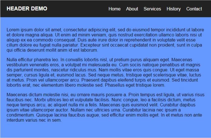
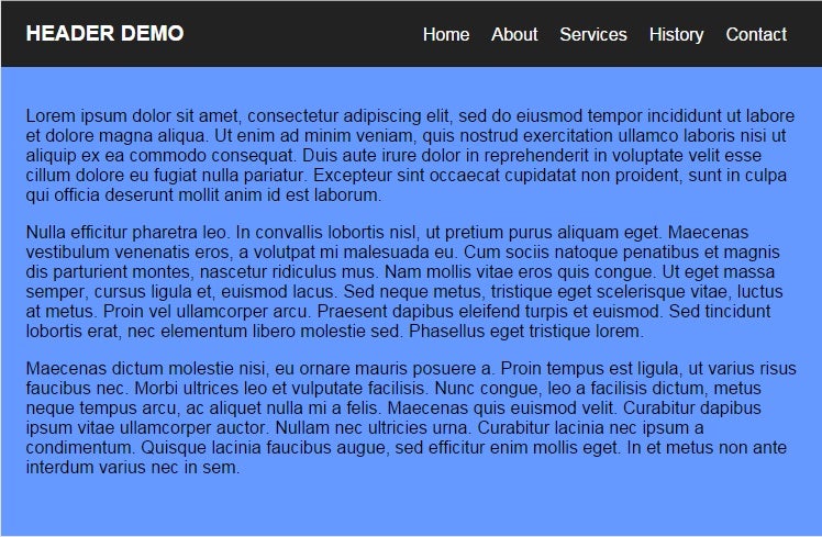
With that in mind, here is the full page will look like:
To make the page responsive, we’ll have it automatically adjust the header elements to fit within a narrow viewport:


As you can see, the look of a mobile site differs from the full-size one in a couple of ways:
- Links are stacked vertically.
- Links are accessed via the “Trigram for Heaven” ☰ character.
Constructing the Basic Page
Unless you want to specifically target mobile devices, you can start by building your standard full-size site.
The header content is easily identified by the <header> element. It represents a container for introductory content and/or a set of navigational links. The links themselves are enclosed within an unordered list, as is commonplace these days.
<!DOCTYPE HTML>
<html>
  <head>
    <meta charset="UTF-8">
    <title>
      Responsive Header Demo
    </title>
  </head>
  <body>
    <header id="header">
      <div class="container">
        <h1>
          Header Demo
        </h1>
        <nav id="nav">
          <ul>
            <li>
              <a href="#">Home</a>
            </li>
            <li>
              <a href="#">About</a>
            </li>
            <li>
              <a href="#">Services</a>
            </li>
            <li>
              <a href="#">History</a>
            </li>
            <li>
              <a href="#">Contact</a>
            </li>
          </ul>
        </nav>
      </div>
    </header>
    <div class="content">
      <div class="container">
        <p>
          Lorem ipsum dolor sit amet, consectetur adipiscing
          elit, sed do eiusmod tempor incididunt ut labore et
          dolore magna aliqua. Ut enim ad minim veniam, quis
          nostrud exercitation ullamco laboris nisi ut aliquip ex
          ea commodo consequat. Duis aute irure dolor in
          reprehenderit in voluptate velit esse cillum dolore eu
          fugiat nulla pariatur. Excepteur sint occaecat
          cupidatat non proident, sunt in culpa qui officia
          deserunt mollit anim id est laborum.
        </p>
        <p>
          Nulla efficitur pharetra leo. In convallis lobortis
          nisl, ut pretium purus aliquam eget. Maecenas
          vestibulum venenatis eros, a volutpat mi malesuada eu.
          Cum sociis natoque penatibus et magnis dis parturient
          montes, nascetur ridiculus mus. Nam mollis vitae eros
          quis congue. Ut eget massa semper, cursus ligula et,
          euismod lacus. Sed neque metus, tristique eget
          scelerisque vitae, luctus at metus. Proin vel
          ullamcorper arcu. Praesent dapibus eleifend turpis et
          euismod. Sed tincidunt lobortis erat, nec elementum
          libero molestie sed. Phasellus eget tristique lorem.
        </p>
        <p>
          Maecenas dictum molestie nisi, eu ornare mauris posuere
          a. Proin tempus est ligula, ut varius risus faucibus
          nec. Morbi ultrices leo et vulputate facilisis. Nunc
          congue, leo a facilisis dictum, metus neque tempus
          arcu, ac aliquet nulla mi a felis. Maecenas quis
          euismod velit. Curabitur dapibus ipsum vitae
          ullamcorper auctor. Nullam nec ultricies urna.
          Curabitur lacinia nec ipsum a condimentum. Quisque
          lacinia faucibus augue, sed efficitur enim mollis eget.
          In et metus non ante interdum varius nec in sem.
        </p>
      </div>
    </div>
  </body>
</html>
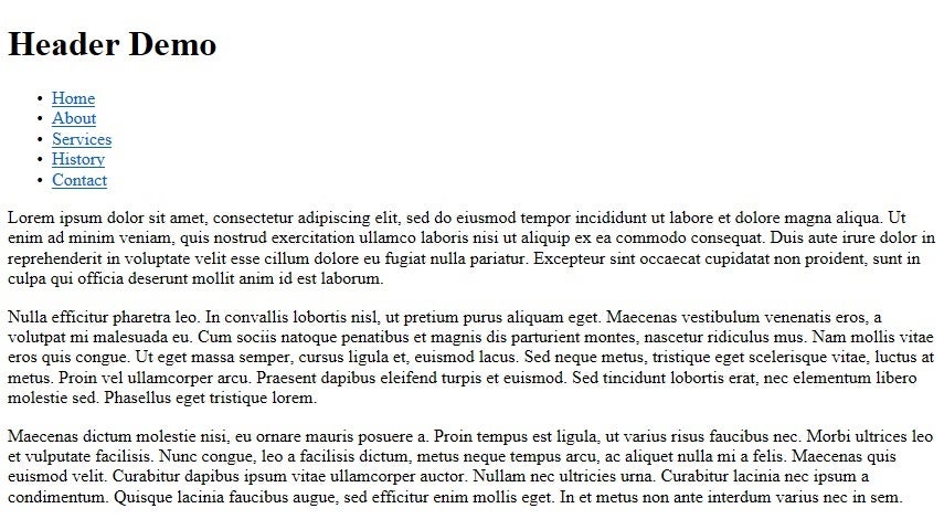
Browsers should present the above markup as a plain ole vanilla page:
All appearance-related attributes should be set using CSS, ideally within a separate file:
body {
  background: #6699ff;
  margin: 0;
  padding: 0;
  border: 0;
  font-size: 100%;
  font: inherit;
  vertical-align: baseline;
}
.container {
  position: relative;
  margin: 0 auto;
  width: 94%;
  max-width: 1100px;
  font-family: helvetica, sans-serif;
}
.content {
  position: relative;
  padding-top: 80px;
}
.content p {
  margin-bottom: 10px;
}
#header {
  z-index: 2;
  position: fixed;
  width: 100%;
  height: 60px;
  line-height: 60px;
  background: #222;
  color: white;
}
#header h1 {
  top: 0px;
  margin: 0px;
  text-transform: uppercase;
  font-size: 1.2em;
}
#nav {
  position: absolute;
  right: 0;
  top: -15px;
  height: 60px;
}
#nav ul li {
  float: left;
  list-style: none;
}
#nav ul li a {
  display: block;
  color: white;
  text-decoration: none;
  padding: 0 10px;
}
Feel free to play around with the above rules to see what effect changes have on the document layout.
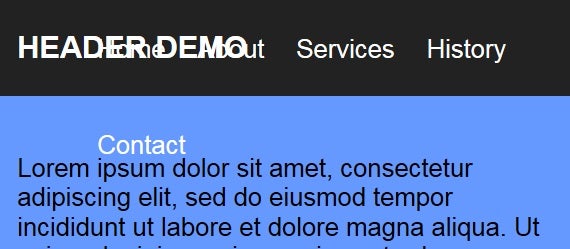
You should notice immediately that it looks quite good on a desktop monitor, but not so much in a mobile browser!
Adding in the Responsiveness
The key to making your pages responsive is to include media queries in your CSS. Introduced in CSS3 media queries use the @media rule to include a block of CSS properties based on a condition. They can evaluate a couple of useful attributes that pertain to responsiveness, including the min and max width of the viewport.
For our simple demo, we’ll change the layout to fit within a viewport width of 599 pixels or less. Note that rules that are applied regardless of viewport size that are duplicated by the @media block are effectively overridden by the latter:
@media (max-width: 599px) {
  #header .container {
    width: 100%;
  }
  #header h1 {
    padding-left: 3%;
  }
  #nav {
    width: 100%;
    top: 60px;
  }
  #nav:before {
    content: '\2630';
    display: block;
    position: absolute;
    right: 3%;
    top: -50px;
    line-height: 40px;
    font-size: 1.4em;
    cursor: pointer;
  }
  #nav ul {
    background: #222;
    width: 100%;
    margin: 0px;
  }
  #nav ul li {
    float: none;
  }
  #nav ul li a {
    padding: 10px 3%;
    line-height: 20px;
    border-top: 1px solid #333;
  }
}
To test out the responsiveness, gradually drag the right edge of the browser window so that the viewport becomes progressively smaller. At some point, just before the navigation links begin to overlap the site title, the layout should change to the mobile one.
Conclusion
In the good old days, all you had to worry about was making a page look good across all the major browsers. Today, there are devices of all sizes to contend with. With the popularity of wearable devices exploding, there’s bound to be even more challenges on the horizon. The one comfort is that job security seems to be assured!


