The : hover selector is used to select the elements contained in the website when we move the mouse over these elements. The selector can be used for all elements, not only for links. The : hover CSS pseudo-class is triggered when the user moves the mouse over a web page content item.
Styles defined by pseudo-class assets will be overwritten by any subsequent class, namely: link,: active or: visited, that has at least one equal attribute. So, to tie the appropriate styles, use the rule : hover after : link and : visited, but before : active, as defined by the command LVHA-order: : link -: visited -: hover -: active.
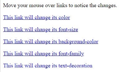
Example of links with different styles:
<!DOCTYPE html>
<html>
<head>
<style>
a.model1:hover, a.model1:active {color: purple;}
a.model2:hover, a.model2:active {font-size: 210%;}
a.model3:hover, a.model3:active {background: yellow;}
a.model4:hover, a.model4:active {font-family: arial;}
a.model5:visited, a.model5:link {text-decoration: none;}
a.model5:hover, a.model5:active {text-decoration: underline;}
</style>
</head>
<body>
<p>Move your mouse over links to notice the changes.</p>
<p><a class="model1" href="default.asp">This link will change its color</a></p>
<p><a class="model2" href="default.asp">This link will change its font-size</a></p>
<p><a class="model3" href="default.asp">This link will change its background-color</a></p>
<p><a class="model4" href="default.asp">This link will change its font-family</a></p>
<p><a class="model5" href="default.asp">This link will change its text-decoration</a></p>
</body>
</html>
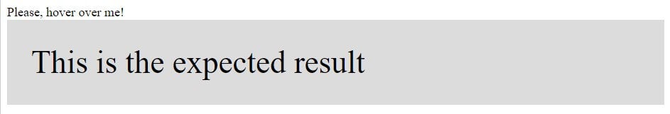
An example of an effect on a <span> element in order to display a <div> element :
<!DOCTYPE html>
<html>
<head>
<style>
div {
  background-color: Gainsboro;
  padding: 30px;
  display: none;
  font-size: 40px;
}
span:hover + div {
  display: block;
}
</style>
</head>
<body>
<span>Please, hover over me!</span>
<div>This is the expected result</div>
</body>
</html>
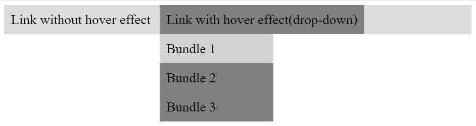
Another example in which we will display a drop-down menu on mouse hover:
<!DOCTYPE html>
<html>
<head>
<style>
div {background-color: Gainsboro;}
div a {
  text-decoration: none;
  color: black;
  font-size: 24px;
  padding: 12px;
  display:inline-block;
}
ul {
  display: inline;
  margin: 0;
  padding: 0;
}
ul li {display: inline-block;}
ul li:hover {background: Grey;}
ul li:hover ul {display: block;}
ul li ul {
  position: absolute;
  width: 200px;
  display: none;
}
ul li ul li {
  background: Grey;
  display: block;
}
ul li ul li a {display:block;}
ul li ul li:hover {background: LightGrey;}
</style>
</head>
<body>
<div>
  <a href="1">Link without hover effect</a>
  <ul>
    <li>
      <a href="1">Link with hover effect(drop-down)</a>
      <ul>
        <li><a href="1">Bundle 1</a></li>
        <li><a href="1">Bundle 2</a></li>
        <li><a href="1">Bundle 3</a></li>
      </ul>
    </li>
  </ul>
</div>
</body>
</html>
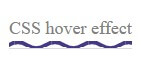
Another example with another style:
<!DOCTYPE html>
<html>
<head>
<style>
 body {
  align-items: center;
  display: flex;
  height: 100px;
  justify-content: left;
}
a {
  border-bottom: 1px solid Gainsboro;
  color: Grey;
  padding-bottom: .15em;
  text-decoration: none;
}
a:hover {
background-image: url("data:image/svg+xml;charset=utf8,%3Csvg id='squiggle-link'  xmlns_xlink='http://www.w3.org/1999/xlink' xmlns_ev='http://www.w3.org/2001/xml-events' viewBox='0 0 20 4'%3E%3Cstyle type='text/css'%3E.squiggle{animation:shift .3s linear infinite;}@keyframes shift {from {transform:translateX(0);}to {transform:translateX(-20px);}}%3C/style%3E%3Cpath fill='none' stroke='%23453886' stroke-width='2' class='squiggle' d='M0,3.5 c 5,0,5,-3,10,-3 s 5,3,10,3 c 5,0,5,-3,10,-3 s 5,3,10,3'/%3E%3C/svg%3E");
  background-position: bottom;
  background-repeat: repeat-x;
  background-size: 30%;
  border-bottom: 10;
  padding-bottom: .5em;
  text-decoration: none;
}
</style>
</head>
<body>
<a href="#">CSS hover effect</a>
</body>
</html>
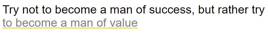
Here is an example in which the lower bound of the default line increases and becomes the background of the on hover link:
<!DOCTYPE html>
<html>
<head>
<style>
 :root {
  --Color: Khaki ;
}
body {
  align-items: center;
  display: flex;
  font-family: arial;
  font-size: 35px;
  height: 100vh;
  justify-content: center;
}
a {
  background:
     linear-gradient(
       to bottom, var(--Color) 0%,
       var(--Color) 100%
     );
    background-position: 0 100%;
    background-repeat: repeat-x;
    background-size: 5px 5px;
  color: grey;
  text-decoration: none;
  transition: background-size .2s;
}
a:hover {
  background-size: 4px 50px;
}
</style>
</head>
<body>
<p>Try not to become a man of success, but rather try  <a href="1">to become a man of value</a></p>
</body>
</html>
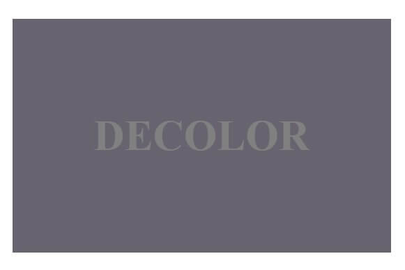
Here you will see an example of how color intensity fades. This is an excellent way to enhance functionality or to draw attention to an important element on the page :
<!DOCTYPE html>
<html>
<head>
<link href="http://fonts.googleapis.com/css?family=Lato:900" rel="stylesheet" type="text/css">
<style type="text/css">
body > div
     {

            margin:121px 149px;

            width:483px;
            height:298px;

            background:#676470;
            color:Grey;

            font-family:Lato;
            font-weight:900;
            font-size:3.4em;

            text-align:center;
            line-height:298px;

            transition:all 0.3s;

        }

        .decolor
        {
            opacity:0.5;
        }
        .decolor:hover
        {
            opacity:1;
        }
</style>
</head>
<body>
<div class="decolor">DECOLOR</div>
</body>
</html>
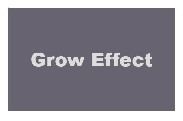
From now on, you can use CSS3 transformation to increase the width and height of the element:
<!DOCTYPE html>
<html>
<head>
<link href="http://fonts.googleapis.com/css?family=Lato:900" rel="stylesheet" type="text/css">
<style type="text/css">
body > div
     {

            margin:121px 149px;
            width:483px;
            height:298px;
            background:#676470;
            color:Gainsboro ;
            font-family:Helvetica;
            font-weight:900;
            font-size:3.4em;
            text-align:center;
            line-height:298px;
            transition:all 0.3s;
        }
        .grow:hover
{
        -webkit-transform: scale(1.3);
        -ms-transform: scale(1.3);
        transform: scale(1.3);
}
</style>
</head>
<body>
<div class="grow">Grow Effect</div>
</body>
</html>
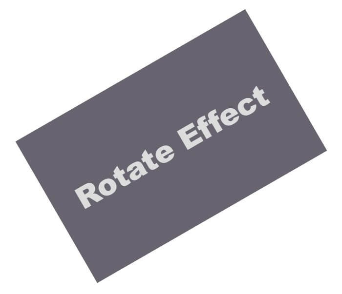
CSS transformations have a number of different uses, and one of the most used and better is the rotation of an element:
<!DOCTYPE html>
<html>
<head>
<link href="http://fonts.googleapis.com/css?family=Lato:900" rel="stylesheet" type="text/css">
<style type="text/css">
body > div
     {
            margin:121px 149px;
            width:483px;
            height:298px;
            background:#676470;
            color:Gainsboro ;

            font-family:Helvetica;
            font-weight:900;
            font-size:3.4em;
            text-align:center;
            line-height:298px;
            transition:all 0.3s;
        }
     .rotate:hover
{
        -webkit-transform: rotateZ(-30deg);
        -ms-transform: rotateZ(-30deg);
        transform: rotateZ(-30deg);
}
</style>
</head>
<body>
<div class="rotate">Rotate Effect</div>
</body>
</html>
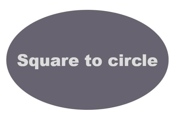
Another quite popular effect performs the transition of a round element to a square one and vice versa:
<!DOCTYPE html>
<html>
<head>
<link href="http://fonts.googleapis.com/css?family=Lato:900" rel="stylesheet" type="text/css">
<style type="text/css">
body > div
     {
            margin:121px 149px;
            width:483px;
            height:298px;
            background:#676470;
            color:Gainsboro ;
            font-family:Helvetica;
            font-weight:900;
            font-size:48px;
            text-align:center;
            line-height:298px;
            transition:all 0.3s;
        }
     .circle:hover
{
        border-radius:70%;
}
</style>
</head>
<body>
<div class="circle">Square to circle</div>
</body>
</html>
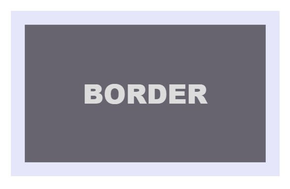
Another interesting style is the ghost button, a button without a background and a heavy border. So, we can of course add a border to a simple element, but that will change the position of the element. We can solve the problem using the dimensions in the box, but a much simpler solution is the transition in an edge using a shadow in the box:
<!DOCTYPE html>
<html>
<head>
<link href="http://fonts.googleapis.com/css?family=Lato:900" rel="stylesheet" type="text/css">
<style type="text/css">
body > div
     {
            margin:121px 149px;
            width:483px;
            height:298px;
            background:#676470;
            color:Gainsboro ;

            font-family:Helvetica;
            font-weight:900;
            font-size:48px;
            text-align:center;
            line-height:298px;
            transition:all 0.3s;
        }
     .border:hover
{
        box-shadow: inset 0 0 0 25px Lavender ;
}
</style>
</head>
<body>
<div class="border">BORDER</div>
</body>
</html>
Browser support: Google Chrome, Microsoft Edge, Firefox, Opera, Safari.
Conclusion
So, as you can see from the examples contained in this article, CSS3 has great potential in creating beautiful effects. We hope we can avoid using JavaScript for simple effects and we can rely on 100% CSS in all browsers. I hope you enjoyed the examples mentioned and that they will inspire you in your future projects.


