


In my last article, I took an existing web page that was created using table tags and I updated it to use divs in the CSS. Well, it turns out that the client who requested the work liked it so much that they wanted the same web page on a second site of theirs, except they wanted the pages updated to match the color scheme of the other site. Basically, they wanted the same pages formatted two different ways. Luckily, using CSS makes this very easy to do. This article will run down the different divs that make up the page and discuss some of the trickier elements, along with some CSS tips, tricks and reminders.
These tips include:
- How to add a background color to only the side margins while leaving the background color for the middle content area white.
- How to accommodate for all major browsers without proprietary code.
- How to provide different styles for links that are on the same page.
- How to get the exact color from a web page so that you can apply it to your own.
Mimicking a Web Page: Creating a Clone of a Page Using CSS
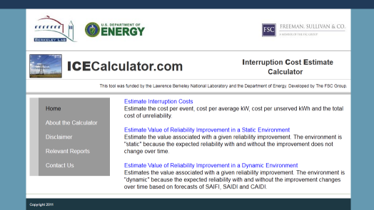
To get started, I was asked to mimic this page (a screenshot of the final result is at the end of this article):

The first thing that I noticed was the light blue background color. That is easy enough to do like this in the CSS:
body {
background: #6599b1;
}
However, this adds a background color to the entire page, which is something that you don’t want. What you want is to add a background color to only the side margins. To accomplish this, you need to put all of your divs into a container. The container div defines the width of all divs that go inside the container and positions the container in the center of the page.
#container {
width: 900px;
margin: 0 auto;
padding: 0;
}
In your HTML, the code for adding the container div looks like this:
<div id=”container”>
Don’t forget the place the closing </div> at the end after all of the content. For all of the divs that you want inside of the container, and to effectively block out the blue background so you can assign a different color background, make sure to nest the content divs into the container divs. For example, the div for the logos looks like this:
#container #logos {
background-color: #ffffff;
border-top: 1px solid #ffffff;
border-bottom: 1px solid #ffffff;
border-right:none;
border-left: none;
width: 100%;
height: 95px;
padding: 10 0 10 10px;
}
The HTML to insert that div looks like this:
<div id=”logos”>
Note that you do not have to include the #container for the #logos design elements to work. However, to block out the blue background color that was defined in the body, you do need to define your borders, even if there are none. It’s also important to set the width to 100%. This will help you later when you view your pages in both Internet Explorer, Firefox, Chrome and Safari. Internet Explorer will treat the spacing between elements differently than the other browsers.
It’s important to view your web pages in all major browsers before you declare it finished. At this point, there is only one div defined, so you won’t see any differences in width; it’s when you start adding additional divs to the page that you’ll start to notice they all don’t have the same width. That is why it’s important to set the width to 100%.
But what if you have two different divs that appear in the same row? When that happens, you can’t set the width to 100%. Let’s take for example the row of text that appears below the logos. In this row, there’s an image, the title of the page and the breakdown of the acronym. To arrange this properly on the page, you’ll need three new divs.
The first div is for the image and the first block of text, the second div is for the text on the right side of the page and the third div is a second container, which sits inside of the first container. Here’s the CSS code for the second container:
#container #header {
background-color: #ffffff;
border: 1px solid #666666;
border-bottom: #ffffff;
border-right: none;
border-left: none;
padding: 10 0 10 10px;
float: left;
width: 100%;
height: 60px;
}
Note that the div starts with the first #container and #header defines the secondary container. Also note the importance of defining the borders, the width and the height. To place the header text within the #header container and the primary #container, you do this:
#container #header #text1 {
background-color: #ffffff;
border-top: 1px solid #ffffff;
border-bottom: none;
border-right: none;
border-left: 1px solid #ffffff;
width: 440px;
float: left;
}
#container #header #text2 {
border-top: 1px solid #ffffff;
border-bottom: none;
border-right: none;
border-left: none;
width: 310px;
float: right;
text-align: left;
vertical-align: middle;
background-color: #ffffff;
}
Note that I’m defining the background color in each and every div. I used this same “container within a container” trick for the side menu and the main window with the text. It might be hard to tell from the screenshot, but the links in the grey box are white and they have an underline hover effect. You can use basic CSS to make these effects happen. However, in the main window, the links are blue and the hover effect turns the font green. It can be a bit tricky to have two different link styles on the same page, but you can accomplish it through CSS. First, you need to define the links for the main window like this:
#mainmenu a {
color: #0000FF;
text-decoration: none;
}
#mainmenu a:hover {
color: #339900;
text-decoration: none;
}
Then define the side menu links in a similar fashion:
#sidemenu a {
color: #fff;
text-decoration: none;
}
#sidemenu a:hover {
color: #fff;
text-decoration: underline;
}
Then define the divs for both menus using the same secondary container technique used above. To get the special formatting for the links to work, in the HTML, all you have to do is this:
<div id=”sidemenu”>
You do need to remember to name your div the same as you named the definition for the links; that way the link styles and the divs all work in conjunction with each other. For example, this is how I defined the sidemenu in the CSS:
#container #menus #sidemenu {
background-color: #999999;
border-left: 25px solid #cccccc;
border-right: none;
border-bottom: none;
padding: 20px;
width: 160px;
float: left;
text-align:left;
}
At this point, I’ve covered techniques for defining the divs within the container. What hasn’t been covered yet is the dark blue border along the top of the page. This is the one div that appears outside of the main container, as it needs to run the entire width of the screen, regardless of screen or browser window size. In the CSS, the blue bar is defined as:
#bluebar {
background-color: #203A58;
width: 100%;
height: 25px;
}
Since the bluebar is not inside the #container, it will run the length of the browser window. In the HTML, you do this right after the <body> tag and right before the first container div:
<div id=”bluebar”>
</div>
How To Pick Colors
The last tip I’ll present in this article is how to pick colors. When you’re asked to mimic another web page, you’ll want to get the colors as accurate as possible. To do this, Firefox has a Web Developer tool called ColorZilla that you can install free of charge. This tool provides an eyedropper. To use the eyedropper, first navigate to the page with the color that you want. Then choose the eyedropper tool from the Firefox menu, place the dropper over the color that you want. A thin red-dotted border will select that section of the page and in the bottom right of your window you’ll see the RGB and the hex color codes. It’s a very powerful tool and extremely accurate. ColorZilla also provides a color picker, a palette and a gradient tool to create color gradients with vendor-specific code.
And here’s the final result:
In the next article, I’ll cover how to format the pages with the actual calculator, which involves many data fields.
