The CSS Flexbox Layout module is a unidirectional layout that provides a spatial distribution between the elements in an interface and the dominant alignment abilities, ordering the elements contained in the container, regardless of their size. This article will focus on how the flexible properties of the container change the visual appearance.
In the following sections, we will analyze the main features of the flexbox. One of the important features of the flexible container is the ability to change the height or width of its children and to distribute and fully compute the available space on different sizes.
This configuration, namely the flexbox, is very easy to use, as the location of the elements is easier, so the heavier aspects can be done with fewer lines of code. The Flexbox algorithm layout is based on the direction of the structure of the block inline, which rests horizontally and vertically.
The flexbox model consists of the parent container, namely the flexible container, and one or more of its children, which are called flexible elements.
For the parent element, these are the properties of the flexbox:
- Flex-direction
- Flex-wrap
- Flex-flow
- Justify-content
- Align-items
- Align-content
Now we will take every property of the parent element and discuss it separately.
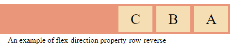
Flex-direction: this property indicates the manner in which flexible elements will be arranged in the flexible container by specifying the direction of the main axis. It may be arranged in two principal directions, namely the horizontal and the vertical columns.
Syntax: row, row-reverse, column, column-reverse
Listing 1. An example for flex-direction – row-reverse
<html>
<head>
<style>
.flex-container {
  display: flex;
  flex-direction: row-reverse;
  background-color: Darksalmon;
}
.flex-container   div  {
  background-color: wheat;
  width: 70px;
  margin: 4px;
  text-align: center;
  line-height: 55px;
  font-size: 30px;
}
</style>
</head>
<body>
<div class="flex-container">
  <div>A</div>
  <div>B</div>
  <div>C</div>
</div>
<p>An example of flex-direction property-row-reverse</p>
</body>
</html>
Flex-wrap: this property indicates whether the flexible elements are arranged in single or multiple lines and the direction in which these new lines are placed. This property also allows you to manipulate the direction in which the lines are stacked.
Syntax: nowrap, wrap, wrap-reverse
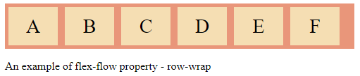
Flex-flow: this property, flex-flox, is an abbreviated property for establishing the flexible direction as well as the flex-wrap properties
Syntax: flex-direction , flex-wrap
Listing 2. An example of flex-flow property – row-wrap
<html>
<head>
<style>
.flex-container {
  display: flex;
  flex-flow: row wrap;
  background-color: Darksalmon;
}
.flex-container > div {
  background-color: wheat;
  width: 70px;
  margin: 5px;
  text-align: center;
  line-height: 55px;
  font-size: 28px;
}
</style>
</head>
<body>
<div class="flex-container">
  <div>A</div>
  <div>B</div>
  <div>C</div>
  <div>D</div>
  <div>E</div>
  <div>F</div>
</div>
<p>An example of flex-flow property - row-wrap</p>
 </body>
</html>
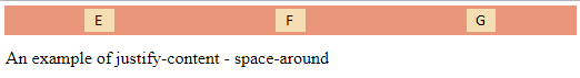
Justify-content: this property distributes flexible objects along the main axis of the current line in the container. Thus, the browser delivers the left free space when the flexible elements on a line are inflexible, or the elements are flexible but have reached the maximum size.
Syntax: flex-start, flex-end, space-around, space-between, space-evenly, center
Listing 3. An example of justify-content – space-around
<html>
<head>
<style>
.flex-container {
  display: flex;
  justify-content: space-around;
  background-color: Darksalmon;
}
.flex-container div {
  background-color: wheat;
  width: 70px;
  margin: 10px;
  text-align: center;
  line-height: 55px;
  font-size: 28px;
}
</style>
</head>
<body>
<div class="flex-container">
  <div>E</div>
  <div>F</div>
  <div>G</div>
</div>
<p>An example of justify-content - space-around</p>
</body>
</html>
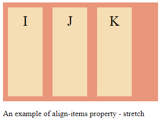
Align-items: this property defines the procedure by which the browser distributes the flexible articles on the transverse axis of the current line of the flexible container. Just like the justification, in the perpendicular direction, establishes the implicit alignment of even the anonymous flexible elements.
Syntax:
normal, stretch, <baseline-position>, <overflow-position>, <self-position>
Where:
<baseline-position> = {first, last} baseline
<overflow-position> = unsafe, safe
<self-position> = center, start, end, flex-start, flex-end, self-start, self-end
Listing 4. An example of align-items property – stretch
<html>
<head>
<style>
.flex-container {
  display: flex;
  height: 200px;
  align-items: stretch;
  background-color: Darksalmon;
}
.flex-container > div {
  background-color: wheat;
  width: 70px;
  margin: 10px;
  text-align: center;
  line-height: 55px;
  font-size: 28px;
}
</style>
</head>
<body>
<div class="flex-container">
  <div>I</div>
  <div>J</div>
  <div>K</div>
</div>
<p>An example of align-items property - stretch </p>
</body>
</html>
Align-content: this property, namely the alignment property, aligns the lines of the flexible container within the flexible container to the extent that there is an additional space on the transverse axis. It is in symmetry with how the justification content aligns the elements along within the main axis.
Syntax: flex-start, flex-end, space-around, space-between, space-evenly, center, stretch
For the child element, these are the properties of the flexbox:
- Order
- Flex-grow
- Flex-shrink
- Flex-basis
- Flex
- Align-self
Now we will take every property of the parent element and discuss each separately.
Order: this order follows the order in which the children of the flexible container appear within the flexible container.
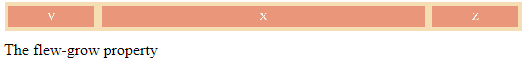
Flex-grow: this property defines the flexible growth element that indicates how much the flexible element will grow in analogy with the other flexible elements in the flexible container when the free space is distributed.
Listing 5
<html>
<head>
<style>
.flex-container {
  display: flex;
  align-items: stretch;
  background-color: wheat;
}
.flex-container > div {
  background-color: darksalmon;
  color: white;
  width: 70px;
  margin: 10px;
  text-align: center;
  line-height: 55px;
  font-size: 28px;
}
</style>
</head>
<body>
<div class="flex-container">
  <div style="flex-grow: 1">V</div>
  <div style="flex-grow: 5">X</div>
  <div style="flex-grow: 1">Z</div>
</div>
<p>The flew-grow property</p>
</body>
</html>
Flex-shrink: this property defines the contradiction element, indicating how much the flexible element will diminish compared to the other flexible elements in the flexible container when the free space is split.
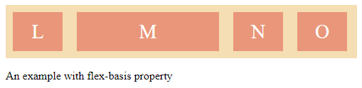
Flex-basis: this property has values similar to the properties of height and width, indicating the initial dimension of the flexible lining, in order for the free space to be divided.
Listing 6. Here is an example of Flex-basis
<html>
<head>
<style>
.flex-container {
  display: flex;
  align-items: stretch;
  background-color: wheat;
}
.flex-container > div {
  background-color: Darksalmon;
  color: white;
  width: 70px;
  margin: 10px;
  text-align: center;
  line-height: 55px;
  font-size: 28px;
}
</style>
</head>
<body>
<div class="flex-container">
  <div>L</div>
  <div style="flex-basis: 200px">M</div>
  <div>N</div>
  <div>O</div>
</div>
<p>An example with flex-basis property <p>
</body>
</html>
Flex: is an abbreviation for the flex-base, flex-grow and flex-shrink properties
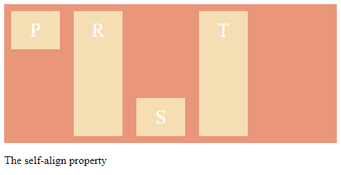
Align-self: this property makes it possible for the initial alignment to be changed for the individual flexible elements.
Listing 7. An example for the align-self property
<html>
<head>
<style>
.flex-container {
  display: flex;
  height: 200px;
  background-color: darksalmon;
}
.flex-container > div {
  background-color: wheat;
  color: white;
  width: 70px;
  margin: 10px;
  text-align: center;
  line-height: 55px;
  font-size: 28px;
}
</style>
</head>
<body>
<div class="flex-container">
  <div style="align-self: flex-start">P</div>
  <div>R</div>
  <div style="align-self: flex-end">S</div>
  <div>T</div>
</div>
<p>The align-self property</p>
</body>
</html>
Conclusion
This article has hopefully shown you how to use the main properties of the flexible box.


