Undoubtedly, graphics are an important source of information, so good systems for creating them are important. In the course of the article, we will learn how to build charts using JavaScript.
Graphics offer some difficulty for construction in any language, but why reinvent the wheel when someone has already done it for us (and very well, by the way)?
With a quick search on the internet we will find some great libraries for this purpose, but for this article we will use a Google library: the Google Chart Tools, as it is considered by many to be the best available nowadays because it is of great clarity, having a small curve of learning and very good documentation.
With it, we can draw the main types of charts: pie, bars, lines, tables, etc.
Drawing the Graphics
Let’s start with a simple pie chart example. But first of all, we need to incorporate the library and import the Google Chart Tools core. Take a look at Listing 1 for that.
Listing 1. Incorporating the library.
<html> <head> <script type="text/javascript" src="https://www.google.com/jsapi"></script> <script type="text/javascript"> google.load("visualization", "1", {packages:["corechart"]}); </script> </head></html>
The listing is quite self-explanatory, we basically imported the Google API and loaded the visualization module of the package corechart.
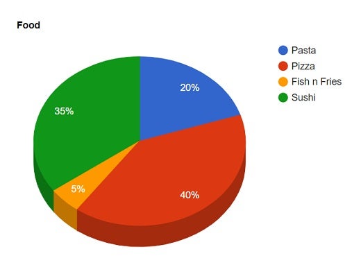
Okay, now we can start the real thing. Let’s implement a pie chart (Listing 2) with the percentages of which foods people like the most.
Listing 2. Drawing the pie chart.
<html>
<head>
<script type="text/javascript" src="https://www.google.com/jsapi"></script>
<script type="text/javascript">
google.load("visualization", "1", {
packages: ["corechart"]
});
function drawChart() {
var data = google.visualization.arrayToDataTable([
['Food', 'How much people like it'],
['Pasta', 20],
['Pizza', 40],
['Fish n Fries', 5],
['Sushi', 35],
]);
var options = {
title: 'Food',
is3D: true
};
var chart = new google.visualization.PieChart(document.getElementById('chart_div'));
chart.draw(data, options);
}
google.setOnLoadCallback(drawChart);
</script>
</head>
<body>
<div id="chart_div" style="width: 900px; height: 500px;"></div>
</body>
</html>
Figure 1 shows how the chart will be presented.

Figure 1. Pie chart in action
Comments have been placed in the middle of the code to make it clearer to follow each step, but many other options can be used. There are so many that we will not be able to include them here, but there will be a link at the end of this article where we can find all the details about them.
Continuing, let’s draw three more types of charts: Lines, Bars and Tables.
Basically, what changes from one type of chart to another with respect to the code is the format of the array of data we pass to it and the object that is instantiated. Let’s look, for example, at the Rows and Bars formats that have the identical data format.
Listing 3. Drawing Bars and Lines Graphics.
<html>
<head>
<script type="text/javascript" src="https://www.google.com/jsapi"></script>
<script type="text/javascript">
google.load("visualization", "1", {
packages: ["corechart"]
});
google.setOnLoadCallback(drawChart);
function drawChart() {
var data = google.visualization.arrayToDataTable([
['Year', 'Sales', 'Expenses'],
['2004', 1000, 400],
['2005', 1170, 460],
['2006', 660, 1120],
['2007', 1030, 540]
]);
var options1 = {
title: 'Performance',
vAxis: {
title: 'Years',
titleTextStyle: {
color: 'red'
}
}
};
var barras = new google.visualization.BarChart(document.getElementById('bars'));
barras.draw(data, options1);
var options2 = {
title: 'Performance',
hAxis: {
title: 'Years',
titleTextStyle: {
color: 'red'
}
}
};
var linhas = new google.visualization.LineChart(document.getElementById('lines'));
linhas.draw(data, options2);
}
</script>
</head>
<body>
<div id="bars" style="width: 900px; height: 500px;"></div>
<div id="lines" style="width: 900px; height: 500px;"></div>
</body>
</html>
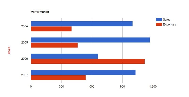
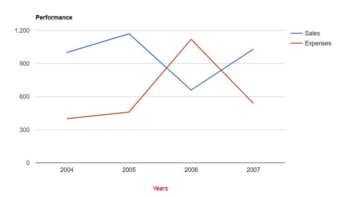
You can follow up how those charts will look like at Figures 2 and 3.

Figure 2. Final result for bar chart

Figure 3. Final result for line chart
The format of the array has changed relatively to the pie chart, but it has code in common with the two in Listing 3. Now, let’s look at the table format that has a slightly different mode than the other three in the array grinding (Listing 4).
Listing 4. Drawing the table chart.
<html>
<head>
<script type='text/javascript' src='https://www.google.com/jsapi'></script>
<script type='text/javascript'>
google.load('visualization', '1', {
packages: ['table']
});
google.setOnLoadCallback(drawTable);
function drawTable() {
var data = new google.visualization.DataTable();
data.addColumn('string', 'Appraisee');
data.addColumn('number', 'Points');
data.addColumn('boolean', 'Approved');
data.addRows([
['Roger', {
v: 10,
f: '10'
}, true],
['Anna', {
v: 8,
f: '8'
}, true],
['Douglas', {
v: 5.5,
f: '5,5'
}, false],
['John', {
v: 7,
f: '7'
}, true]
]);
var table = new google.visualization.Table(document.getElementById('table_div'));
table.draw(data, {
showRowNumber: true,
width: '70%'
});
}
</script>
</head>
<body>
<div id='table_div'></div>
</body>
</html>

Figure 4. Final result for table chart
Although different from the other examples, with regard to importing the table package and the array object type to store the data, it is still very easy to understand the code unfolding. An interesting thing is the second column which, as you can see, is an array that has two positions: one for the value “v: 10” and another for the formatted text.
Conclusion
Here’s the official API link for more details: https://developers.google.com/chart/. There’s a lot more you can do with Google Charts and the flexibility this tool provides front-end software developers today is enormous. Feel free to try yourself.
Well folks, I’m staying here. Comment, share, be at ease and see you next time.
About the Author
Diogo Souza works as a Java Developer at PagSeguro and has worked for companies such as Indra Company, Atlantic Institute and Ebix LA. He is also an Android trainer, speaker at events on Java and mobile world.

