


In my last article, I wrote about how to create form layouts using CSS. I had a few people ask about doing multi-column layouts with CSS, so in this tutorial I will show you how to do just that!p>
The Existing Form
Figure 1 shows the form from the last article. This form is just a basic shipping address form with a single column layout.
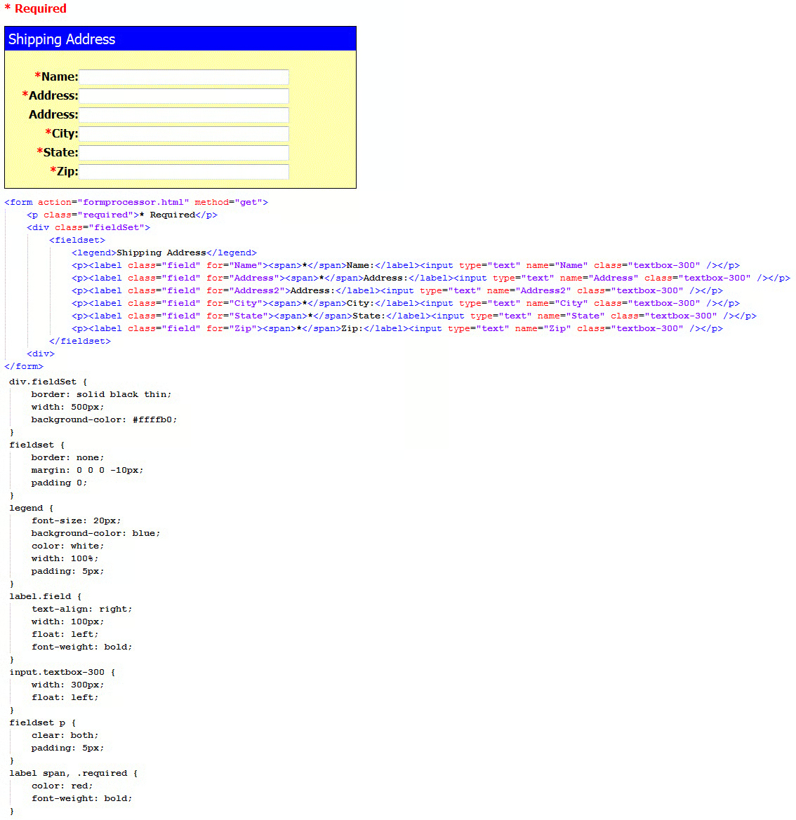
Figure 1
Multi-Column Fields
So how do we make a form with multiple columns? Well, that is actually pretty easy. The form uses the CSS property "float". The paragraph elements clear the float which means it resets it. All we need to do is increase the width of the div container and put the labels and fields on the same line in between the paragraph tags (Figure 2).
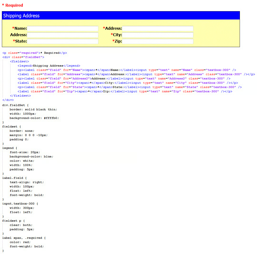
Figure 2
This makes a nice little two column form. Using that technique, you can create several columns on the form.
Multi-Column Form Sections
What if you would rather have a form that has field sections as multi-columns instead? Say you now want the billing address, but you want them to be next to each other. We can do that also. This requires a little more work, but not much.
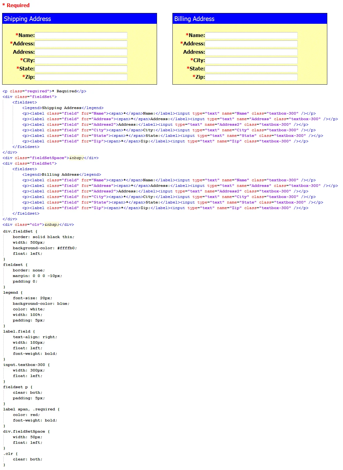
Figure 3
As you can see, we get the multi-column look with the field sections. Now there are a few things to keep in mind. First, you will notice that in order to have the "space" in between the two field sections, I had to put in a character code for "space" in the div element. The reason is that some browsers will ignore and empty div tag.
Second, at the end of the two field sections, there is an extra div tag with a class of "clr". This is an extra clear section for the additional float. If you do not put that in there, the next set of elements will end up against the side of the second box. The clear property resets the floats just like it does with the form lines.
Last, by using this technique, the form sections will scale to the width of the browser. This means that if someone has a browser open at only 700 pixels and the form is set to a width of 1000 pixels (like this one), the right field section will align under the left one. The user will not have to scroll over to fill out the other field section.
Conclusion
I hope you can see that by using CSS with your form layouts, you have many more possibilities. No longer do you have to use tables to layout your forms.
