Wednesday, January 22, 2025

Accessify Quick Form Builder

5/23/13

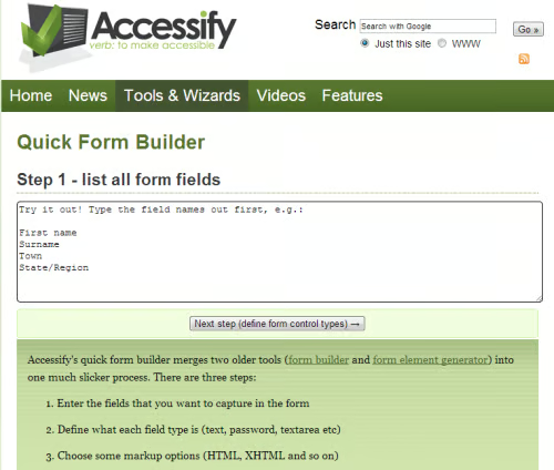
In this article we have a look at the Accessify Quick Form Builder.

As you can see there’s not much to it. For the purposes of this tutorial, I’m going to enter some basic values, similar to what you’d find on a squeeze page. One exception will be the addition of a field for a phone number.

  • First Name
  • Email Address
  • Phone Number

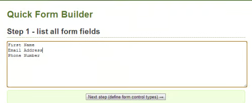
Here’s what this looks like on the interface.

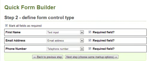
In this step I’ve enabled Mark All Fields as Required. Here are the other settings:

  • First Name: Text Input
  • Email Address: Email address
  • Phone Number: Telephone Number

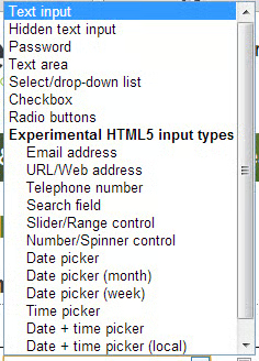
Here’s the popup where you can test out different field options. As you can see, there are many control options you can choose from.

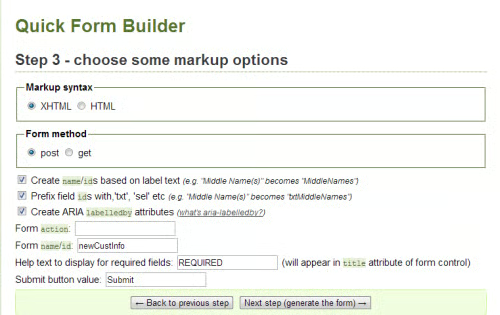
In this step you choose some markup options. In this case I chose to enable Create name/id’s, Prefix field, and Create ARIA. In the Form Name ID I used: newCustInfo and in the Help text area I used the word: REQUIRED.

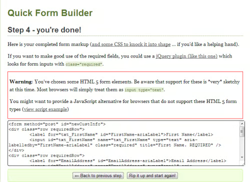
Above is the completed form. Note the warning about the HTML5 options that I’ve chosen and that there may be an issue with some browsers. You’re prompted to provide a JavaScript alternative in case the browser doesn’t support the HTML5 types used in the form.

Below that is the form code you can use in your HTML editor of choice for further styling.

Note that if you’re not satisfied with the results, you can start over. As you can see by the steps above, it only takes a few minutes to create the form.

In addition to the instructions above, here’s a video which explains the process in more detail.

Below, I’ll paste in the code from the form so you can see how it works.

<form method=”post” id=”newCustInfo”>
<div class=”row requiredRow”>
    <label for=”txt_FirstName” id=”FirstName-ariaLabel”>First Name</label>
    <input id=”txt_FirstName” name=”txt_FirstName” type=”text” aria-labelledby=”FirstName-ariaLabel” class=”required” title=”First Name. REQUIRED” />
</div>
<div class=”row requiredRow”>
    <label for=”EmailAddress” id=”EmailAddress-ariaLabel”>Email Address</label>
    <input id=”EmailAddress” name=”EmailAddress” type=”email” aria-labelledby=”EmailAddress-ariaLabel” class=”required” title=”First Name. REQUIRED” />
</div>
<div class=”row requiredRow”>
    <label for=”PhoneNumber” id=”PhoneNumber-ariaLabel”>Phone Number    </label>
    <input id=”PhoneNumber” name=”PhoneNumber” type=”tel” aria-labelledby=”PhoneNumber-ariaLabel” class=”required” title=”First Name. REQUIRED” />
</div>
<div class=”row”>
<input type=”submit” value=”Submit ” />
</div>
</form>

As you can see, the form is pretty straightforward.

Note that in the last step, you have some CSS you can use to stylize the form, which looks like this:

div.row {background:#ffc;border:2px solid #ffc;margin:0 0 5px 0;float:left;width:100%;padding:6px 0;}
div.row label {float:left;display:block;width:15em;font-weight:bold;padding:0 6px;}
div.row label:hover {background:#FFFF66;cursor:pointer;}
div.row fieldset {border:1px solid gray;margin:0 6px;}
div.row fieldset span {display:block;}
div.row fieldset span label {float:none;display:inline;}
div.row fieldset legend {font-weight:bold;}
div.requiredRow {border:2px solid #049;}

Also included on this last page is a link to a jQuery you can use.

In my case, I have Adobe Dreamweaver, so I’m going to transfer the CSS and form to that. Note that you’ll have to make use of the <style> tag for the CSS.

Here’s what the finished form looks like in Google Chrome. The blue highlighted fields are the required fields. As I discovered when testing the form earlier, I discovered that field which weren’t required didn’t have the blue box around them. Note also that the form fills the entire browser window horizontally.

First off, I’m not fond of the blue box for the required text fields, mostly because the purpose isn’t clear. It would be better to see the word: “REQUIRED” in the field itself or some asterisk outside the form field with the word: “REQUIRED” to make it obvious to the user.

As for the blue border, a simple way to remove it is to delete the line of CSS. Another way is to comment it out, which preserves the CSS in case you want to use it later. Here’s the code: /* div.requiredRow {border:2px solid #049;} */

Conclusion

Overall the Accessify Quick Form Builder is easy to use, but I found it to be a bit thin in the instructions. I would have liked to see more information about the various form building controls and how they function in addition to more detailed information about the CSS and styling the form. There was virtually no information at all.

There are many assumptions made by the designers about the ability of users and if you’ve never used forms before you’re likely to be scratching your head in frustration. And while there is a video, it doesn’t give enough in-depth information. If you’re the type of person who has a lot of experience building forms, you’ll probably be fine, but if you’re a beginner, I’d recommend a different approach or tool.

Get the Free Newsletter!

Subscribe to Developer Insider for top news, trends & analysis

Popular Articles

Featured