The very first article I wrote was about related drop-downs. The demo featured three drop-downs for selecting automobiles. The drop-downs contained Makes, Models, and Trim Levels, so that “Honda” -> “Civic” -> “LS” would describe a specific vehicle.
A more modern UX would probably employ a multi-level drop-down, so that each selection opens a new leaf. Angular provides some controls for this purpose, most notably, the MatTree. However, for simple multi-level drop-downs, it’s probably overkill. In fact, you can make one yourself using HTML, JavaScript, and some CSS. In today’s article, we’ll learn how, by adding a level to the Drop-down Menu that we recently transformed into a custom Angular 11 component.
The Data
Chances are, if you’re looking to build a multi-level drop-down, it’s because you’re working with data that goes at least two levels deep. With regards to our original drop-down component, we can add another level by linking each investment type to specific instrument, currency, and what-have-you, i.e. index -> TSX.
To do that, we’ll update the MenuItem interface to include an Array of subMenus:
export interface MenuItem {
  icon: string;
  text: string;
  value: string;
  subMenu: Array<{
    text: string;
    value: string;
  }>
}
Now we can add the subMenu items without incurring compiler errors:
 public investmentClasses: MenuItem[] = [
   {
     icon: "euro_symbol",
     text: "currencies",
     value: "currency",
     subMenu: [
      {
        text: 'CAD',
        value: 'https://ca.finance.yahoo.com/quote/CADUSD=X/'
      },
      {
        text: 'USD',
        value: 'https://ca.finance.yahoo.com/quote/CAD%3DX?p=CAD%3DX'
      },
      {
        text: 'BTC',
        value: 'https://ca.finance.yahoo.com/quote/BTC-CAD/chart?p=BTC-CAD'
      }
    ]
   },
   {
     icon: "local_florist",
     text: "commodities",
     value: "commodity",
     subMenu: [
       {
         text: 'Coffee',
         value: 'https://ca.finance.yahoo.com/quote/KC%3DF/chart?p=KC%3DF'
       },
       {
         text: 'Oil',
         value: 'https://ca.finance.yahoo.com/quote/CL%3DF/chart?p=CL%3DF'
       },
       {
         text: 'Natural Gas',
         value: 'https://ca.finance.yahoo.com/quote/NG%3DF/chart?p=NG%3DF'
       }
     ]
   },
   {
     icon: "insert_chart",
     text: "indices",
     value: "index",
     subMenu: [
       {
         text: 'S&P500',
         value: 'https://ca.finance.yahoo.com/quote/%5EGSPC/chart?p=%5EGSPC'
       },
       {
         text: 'TSX',
         value: 'https://ca.finance.yahoo.com/quote/XIU.TO/chart?p=XIU.TO'
       },
       {
         text: 'DOW',
         value: 'https://ca.finance.yahoo.com/quote/%5EDJI/chart?p=%5EDJI'
       }
     ]
  },
  {
     icon: "business",
     text: "stocks",
     value: "stock",
     subMenu: [
       {
         text: 'APPL',
         value: 'https://ca.finance.yahoo.com/quote/AAPL/chart?p=AAPL'
       },
       {
         text: 'TSLA',
         value: 'https://ca.finance.yahoo.com/quote/TSLA/chart?p=TSLA'
       },
       {
         text: 'MSFT',
         value: 'https://ca.finance.yahoo.com/quote/MSFT/chart?p=MSFT'
       }
     ]
  }
];
If you try the demo at this point, you’ll find that it works exactly the same as before, as the subMenu items are ignored by the application. So, let’s modify the dropdown-menu.component.html template to display them.
Since each subMenu is part of a menu item, it’s best to place the subMenu *ngFor within the menuItems‘ enclosing <A> tag. It also helps with positioning of the subMenu items on the screen. Notice that the onClick handler also needs to be moved into the subMenu element:
<a *ngFor="let mi of menuItems;let i = index">
  <span class="dropdown-menu-container">
    <mat-icon mat-list-icon>{{ mi.icon }}</mat-icon>
    <span class="dropdown-menu-item">{{ mi.value }}</span>
  </span>
  <div class="submenu-container">
    <span *ngFor="let sub of mi.subMenu;let j = index" class="submenu-item"
      (click)="onClick($event, i, j)"> {{ sub.text }}</span>
  </div>
</a>
Without additional styling, the new subMenu items will all appear jumbled together. The .submenu-container rule positions the sub-menu items and defines their general appearance, while the a:hover .submenu-container governs their height transition from 0 to 128 pixels. The transition attribute adds some animation to the proceedings:
.submenu-container {
  position: absolute;
  left: 160px;
  display: flex;
  height: 0;
  overflow-y: hidden;
  transition: height 0.5s ease-out;
  overflow: hidden;
  flex-direction: column;
  align-items: stretch;
  box-sizing: border-box;
  width: auto;
  word-break: keep-all;
  z-index: 1;
  background-color: #2d3a85;
}

a:hover .submenu-container {
  border: 2px solid gray;
  height: 128px;
  transition: height 0.25s linear;
}

.submenu-item {
  padding: 0.3rem 0.8rem;
}
Note that the left position of the subMenu items is hard-coded here because the data is static. Were it dynamic, we’d have to determine the left position at run-time.
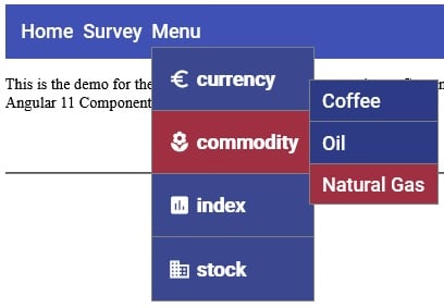
At last we can see the sub-menu items when we hover over a menu item:
Processing Click Events in Angular
The reason that the onClick event originally emitted the menu index to the parent component is because it’s the easiest way to access array elements. This also holds true for the sub-menu items, but now we have a problem because the EventEmitter can only emit a single variable at a time. We can wrap the menu and sub-menu indexes in an object to get around that limitation. We could just emit the subMenu value and avoid the extra lookup, but the DropdownMenuComponent really has no business presupposing what the parent intends to do with the selected item.
export interface MenuIndex {
  menuIndex: number;
  submenuIndex: number;
}

export class DropdownMenuComponent {
  @Input()  public menuItems: Array<MenuItem> = [];
  @Output() public itemSelected = new EventEmitter<MenuIndex>();

  public onClick(
         event: MouseEvent,
         menuIndex: number,
         submenuIndex: number
  ) {
    event.stopPropagation();
    this.itemSelected.emit({
      menuIndex: menuIndex,
      submenuIndex: submenuIndex
    });
  }
}
In the parent’s onItemSelected() function, we can follow the subMenu link using the document’s location’s assign() method:
public onItemSelected(menuIndex: MenuIndex) {
  document.location.assign(
    this.investmentClasses[menuIndex.menuIndex]
        .subMenu[menuIndex.submenuIndex].value
  );
}
The Demo
On codesandbox.io, you’ll find the demo with all of the code that was presented in this article.
Conclusion
In this article we saw how not all multi-level drop-downs necessitate resorting to complex Angular Material Controls such as the MatTree. For standard menus, you can build your own using nothing more that HTML, JavaScript, and some CSS.
One thing that our menu lacks is keyboard accessibility. We’ll add that capability next time.