
The Flex Layout Box model in CSS3 is designed to accommodate different screen sizes and display devices. What makes it easier to use is the absence of floats. The children of a flex container are called flex items and are laid out using the flex layout model.
Note: not all browsers have incorporated all the Flex features.
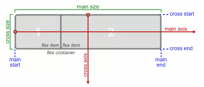
Figure 1. This illustration shows the various directions and sizing items of the flex container.
main axis: The main axis of a flex container is where flex items are laid out. It extends in the main dimension. Note that it is the red line which extends from left to right in the flex container.
main-end: The flex items are placed within the container beginning on the main-start side and going toward the main-end side. In the illustration, you can see two flex items labeled.
main size property: The width or height of a flex container or flex item, is the main size. The main size property is its width or height property, whichever is in the main dimension. You can see the main size designation at the top of the illustration.
cross dimension: The axis perpendicular to the main axis is the cross axis. This is part of the cross dimension.
cross-end: Flex lines are filled with items and placed into the container beginning on the cross-start end of the flex container and moving toward the cross-end location, as seen on the right side of the illustration.
cross size property: The width or height of a flex container or flex item, is the cross size. Its cross-size property is thus either its width or height, whichever is in the cross dimension.
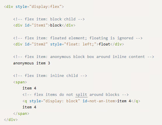
Figure2. An example of flex items.
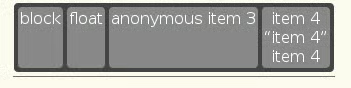
Figure 3. A code block generated from the list items code.
What you have just read is a brief overview of how the Flex Layout Box Model works. There is much more and when you dive into the topic, you will see what this system can do.
About the Author
Nathan Segal has been working as a freelance writer for 18 years. In that time he has published more than 1,000 articles and has written 9 books. You can learn more about him at http://NathanSegal.org.
