Introduction to CSS3 Layout Properties
Even though CSS3 is not supported on all browsers yet, many web developer have started to use some of the techniques that it provides. CSS3 has evolved into a technology which, when combined with HTML5 and JavaScript, may end up being a Flash-killer. In this series of articles, we will cover the key additions to CSS3. Today, we will start with the layout properties.
CSS3 Box-Sizing
When you are given a box that contains a smaller box placed well away from the edges and you are asked to measure the box, what do you measure? The contents of the box or the box from edge to edge? I would measure the box from edge to edge. Unfortunately the W3C team thought otherwise. That is why, in the W3C box model, the width of an element doesn’t include the borders and padding.
The CSS3 box-sizing property allows you to specify the box model that you want to follow: traditional or the W3C one. The illustration below shows the difference between the two models:
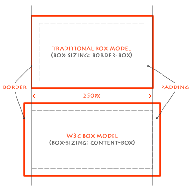 Figure 1: Box Models
The CSS3 Code
The CSS3 code for this is very simple. You just need to add the following property to switch the model for a particular element.
#W3C-model {
box-sizing: content-box;
}
#traditional-model {
box-sizing: border-box;
}
Note: You should also define the Mozilla-specific and Webkit-specific properties like: -moz-box-sizing and -webkit-box-sizing.
Mozilla has taken this one step further by supporting a new value ‘padding-box’ that will cause the width to be applied to the contents and the padding of the element.
Where Would You Use It?
Having understood how box-sizing works, the next question is where can you use it? Well, its very useful when you have two equal columns. If you give them 50% width each and add some padding and maybe a border, the columns won’t show up side by side. This is an ideal scenario where you can set box-sizing to border-box and happily set the width to 50% for both boxes.
CSS3’s Flexbox
Flexbox has to be my favorite addition to CSS3. It lets you create ‘complex’ layouts in a much more sensible way. Until now, the best way for web developers to lay out the page was by using floats and clears. Personally, I find that a “hacky” way of structuring HTML.
Flexbox gives the ‘display’ property a new value called ‘box’, and adds eight new properties:
- box-orient
- box-pack
- box-align
- box-flex
- box-flex-group
- box-ordinal-group
- box-direction
- box-lines
This might seem a little overwhelming, but don’t worry, you will only need 4 or 5 of them; and I will explain them.
How it Works
Here are the important properties that you will need for the flex box:
- display: box
- This new value for the display property switches the element to the box model. This model is also applied to its immediate children.
- box-orient
- Values: horizontal, vertical, inherit.
Specifies how to layout the children.
- box-ordinal-group
- Values: <integer>
Used to reorder elements.
- box-flex
- Values: <integer>
- The flexibility ratio of this child. If a child has 1 and its sibling has 2, any additional space in the parent box will be consumed twice as much by the sibling.
- box-pack:
- Values: start, center, end, justify.
Sets the alignment of the box along the box-orient axis. If box-orient is set to horizontal and box-pack is set to end, the contents of this element will be right-aligned.
- box-align:
- Values: start, center, end, justify.
Sets the alignment of the box in the opposite direction of the box-orient. So if box-orient is set to horizontal and box-align is set to center, the contents of this element will be vertically centered.
Here is an example of how all these properties are applied:
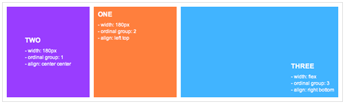 Figure 2: Example layout using the flexbox technique
Conclusion
So far we have covered the additions to CSS3 that facilitate the way content is paid out within HTML. While some browsers do not currently support these features, at least we can be sure that in the future, we can use them to build websites in a much more sensible manner.


