CSS3 Transitions allow you to change properties in CSS values, such as those defined on: hover, : active or: focus, to appear smoothly for a specified length of time. These transition effects can be applied to the CSS property range, namely background color, font, opacity, height, width, and so on.
CSS3 transitions involve a number of properties that are used to specify the transition time, transition sync, delay function, and CSS property to be transitioned.
These properties are as follows:
- transition-property
- the duration of the transition
- transition-timing-function
- transition delay
Transition-Property
The syntax:
transition-propriety: none | all | [ <IDENT> ] [ <IDENT> ]*
Examples:
transient property: all
transition property: none
transition property: background-color
transition property: height, width, background color
Several transitions can be specified, using a comma-separated list.
Example:
<!DOCTYPE html>
<html>
<head>
<style>
div {
    width: 100px;
    height: 100px;
    background: indigo;
    -webkit-transition-property: width;
    -webkit-transition-duration: 3s;
    -moz-transition-property: width;
    -moz-transition-duration: 3s;
    -o-transition-property: width;
    -o-transition-duration: 3s;
    -ms-transition-property: width;
    -ms-transition-duration: 3s;
    transition-property: width;
    transition-duration: 3s;
}
div:hover {
    width: 200px;
}
</style>
</head>
<body>
<div></div>
<p>An example of transition-duration</p>
</body>
</html>
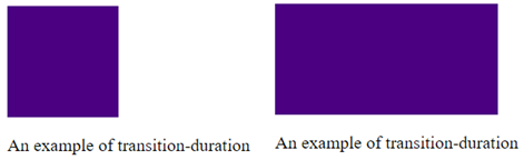
Figure 1. Transition Duration.
Transition-Duration
This property specifies the length of time for transitions. This specifies a list of times, specified in milliseconds or seconds. We can very well specify a single duration that applies to all properties existing during the transition, or several values for each property.
Syntax:
transition time: <time> [, <time>] *
Examples:
transition time: 6s
transition time: 1000ms; 3000ms
Attention! If you enter a negative value, this value makes the statement invalid.
Example:
<!DOCTYPE html>
<html>
<head>
<style>
div {
    width: 100px;
    height: 100px;
    background: goldenrod;
    -webkit-transition-property: width;
    -webkit-transition-duration: 7s;
    -moz-transition-property: width;
    -moz-transition-duration: 7s;
    -o-transition-property: width;
    -o-transition-duration: 7s;
    -ms-transition-property: width;
    -ms-transition-duration: 7s;
    transition-property: width;
    transition-duration: 7s;
}
div:hover {
    width: 200px;
}
</style>
</head>
<body>
<div></div>
<p>An example of transition-duration</p>
</body>
</html>
Transition-Timing Function
This transition-timing property is used to specify how the values used during the transition will be calculated. In practice, a transition to the changeover speed is allowed. It can be done either by specifying a predefined number of words, or by defining the custom synchronization feature. Other synchronization options: linear, ease, ease-in, ease-out, and ease-in-out.
The syntax:
transition-timing-function: <timing-function> [, <timing-function>]*

Default: ease
Example:
transition-timing-function: ease
transition-timing-function: ease, linear
transition-timing-function: ease-in
transition-timing-function: ease- out
transition-timing-function: cubic-bezier(0.6, 0.1, 0.15, 0.8)
transition-timing-function: steps
transition-timing-function: step end
An example of transition timing function:
<!DOCTYPE html>
<html>
<head>
<style>
div {
    width: 75px;
    height: 75px;
    background: coral;
    -webkit-transition: width 3s;
    -moz-transition: width 3s;
    -o-transition: width 3s;
    transition: width 3s;
}
#div1 {transition-timing-function: ease;}
#div2 {transition-timing-function: linear;}
#div3 {transition-timing-function: ease-in;}
#div4 {transition-timing-function: ease-out;}
#div5 {transition-timing-function: ease-in-out;}
div:hover {
    width: 200px;
}
</style>
</head>
<body>
<div id="div1">ease</div><br>
<div id="div2">linear</div><br>
<div id="div3">ease-in</div><br>
<div id="div4">ease-out</div><br>
<div id="div5">ease-in-out</div><br>
<p>An example of transition timing function</p>
</body> </html>
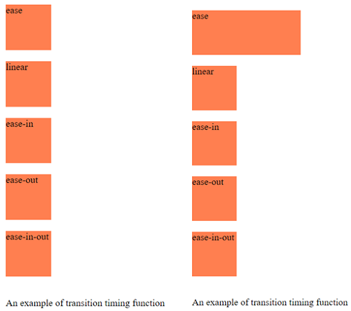
Figure 2. Transition Timing Function.
Another example of transition-timing-function using cubic-bezier:
<!DOCTYPE html>
<html>
<head>
<style>
div {
    width: 95px;
    height: 50px;
    background: limegreen;
    color: black;
    transition: width 3s;
   -moz-transition: width 3s;
   -o-transition: width 3s;
    transition: width 3s;
}
#div1 {transition-timing-function: cubic-bezier(0,0,2,3);}
#div2 {transition-timing-function: cubic-bezier(0.25,0.2,0.45,2);}
#div3 {transition-timing-function: cubic-bezier(0.12,0,3,5);}
#div4 {transition-timing-function: cubic-bezier(0,0,0.45,3);}
#div5 {transition-timing-function: cubic-bezier(0.2,0,0.42,4);}
div:hover {
    width: 150px;
}
</style>
</head>
<body>
<div id="div1">ease</div>
<div id="div2">linear</div>
<div id="div3">ease-in</div>
<div id="div4">ease-out</div>
<div id="div5">ease-in-out</div>
<p>Example of transition-timing-function using cubic bezier</p>
</body>
</html>
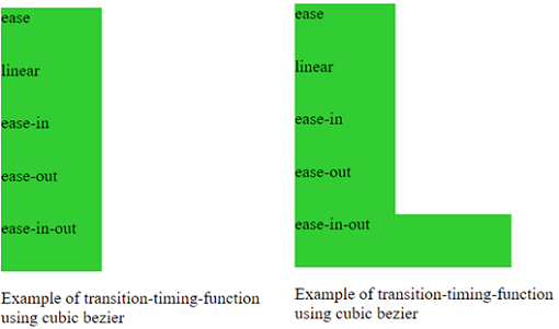
Figure 3. Using Cubic Bezier.
Transition-Delay
Through this property, namely the delay property, we may specify an optional delay. This property accepts a list of times mentioned in seconds or milliseconds, determining the length of time between the triggering of the transition and its commencement. The negative values in this case are accepted.
The syntax:
transition-delay: <time> [, <time> ]*
Example:
transition-delay: 9s;
transition-delay: 2500ms, 5000ms;
transition-delay: -9s;

<!DOCTYPE html>
<html>
<head>
<style>
div {
    width: 75px;
    height: 75px;
    background: dimgrey;
    transition: width 4s;
    transition-delay: 1s;
}
div:hover {
    width: 200px;
}
</style>
</head>
<body>
<div></div>
<p>An example of transition-delay</p>
</body>
</html>
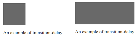
Figure 4. Transition Delay.
The Transition Shorthand
This short property of transition combines all four properties listed above into one property.
The syntax:
transition:  <transition> [, <transition> ]*
   < transition> = < transition-property>  < transition-duration> < transition-timing-function> < transition-delay>
Example:
transition: 10s;
transition: 5s ease-in;
transition: background-color 5s linear 1s;
The next model combines transitions for: height, width, transformation, background color. Move the cursor over the square to apply the transitions.
<!DOCTYPE html>
<html>
<head>
<style>
div {
    border-style: solid;
    border-width: 1.2px;
    display: block;
    width: 100px;
    height: 100px;
    background-color: darkorange;
    -webkit-transition: width 3s, height 3s, background-color 3s, -webkit-transform 3s;
    -moz-transition: width 3s, height 3s, background-color 3s, -webkit-transform 3s;
    -o-transition: width 3s, height 3s, background-color 3s, -webkit-transform 3s;
    -ms-transition: width 3s, height 3s, background-color 3s, -webkit-transform 3s;
    transition: width 3s, height 3s, background-color 3s, transform 3s;
}
div:hover {
    background-color: indianred;
    width: 150px;
    height: 150px;
    -webkit-transform: rotate(180deg);
    transform: rotate(180deg);
}
</style>
</head>
<body>
<div></div>
<p>Multiple animated properties example</p>
</body>
</html>
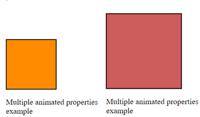
Figure 5. Multiple Animated Properties.
Browser support has grown in most web browsers that support CSS3 transitions, this CSS3 Transition mode being in the build stage. Consequently, you will need to use the different prefixes of vendors, namely: -webkit-, -moz-, -o- , -ms- Chrome, Opera, Firefox, Safari, Edge, IE 10 Transitions.
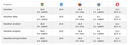
Figure 6. Browser support for transitions.
When you want to print webpages, depending on the browser, interpolation values are ignored, or property values in the current state are printed. In Chrome, for example, if an item has gone from one state to the other, the current status at the time that I press the print button will be the value of the printed page if that property is printable. Styles do not change in print mode, so there are no transitions. There are separate printheads or print media rules that you can take into account.
Conclusion
Transitions are improvements to the user interface. Incomplete support should not prevent you from using them. If one of the browsers does not support the CSS transitions you implement, the changes will still be applied, from the initial state to the final state when the re-composition style occurs. It would be a pity for users to lose some interesting effects.


