The opacity property in CSS specifies how transparent an element is. Through opacity and transparency, we can measure how opaque or how visible the element is on the website. Opacity is a measure of how opaque an item is and transparency is a measure of how transparent it appears. Both work nearly the same way but at 100% transparent, the element will be completely invisible, while with the opacity set to 100% it be fully visible. In this article, we’ll discuss some different ways to get transparent effects using HTML and CSS.
One way to get the transparency that we will be talking about in this article is simply the CSS opacity property introduced in CSS3. This creates an easy way to determine the opacity of an element and its children in CSS, where the value of 0, 0 makes an item and its completely transparent copies and the value of 1.0 makes an item and its completely opaque copies. So, if you want to create a basic division that contains a message in order to be a little transparent, you can use some CSS methods such as the following:
opacity: 0.6
width: 190px
height: 110px
padding: 15px
border: 3px solid black; - A border (for style)
text-align: center
color: grey
background: black; - A grey background
}
This manner of using opacity is quite efficient, but it has some drawbacks that this modern property will not work properly in browser versions. It can be solved in many ways – in some versions of Firefox before 0.9, the vendor prefixed -moz-opacity: 0.6; property can achieve opacity, in Safari 1.X versions, -khtml-opacity: 0.6; will do the trick, and in IE 5+, the following special IE ‘filter’ should work: filter: alpha (opacity = 60).
Here is an example with opacity:
<!DOCTYPE html>
<html>
<head>
<style>
.box >
div {
display: inline-block;
height: 80px;
width: 90px;
background: indigo;
}
div.opacity100 {
opacity: 1;
}
div.opacity90 {
opacity: 0.9;
}
div.opacity80 {
opacity: 0.8;
}
div.opacity70 {
opacity: 0.7;
}
div.opacity60 {
opacity: 0.6;
}
div.opacity50 {
opacity: 0.5;
}
div.opacity40 {
opacity: 0.4;
}
div.opacity30 {
opacity: 0.3;
}
div.opacity20 {
opacity: 0.2;
}
div.opacity10 {
opacity: 0.1;
}
div.opacity0 {
opacity: 0;
}
</style>
</head>
<body>
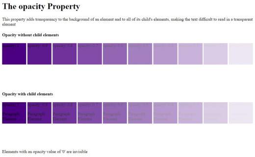
<h1>The opacity Property</h1>
<p>This property adds transparency to the background of an element and to all of its child's elements, making the text difficult to read in a transparent element</p>
<div class="box">
<h4>Opacity without child elements</h4>
<div class="opacity100">opacity: 1</div>
<div class="opacity90">opacity: 0.9</div>
<div class="opacity80">opacity: 0.8</div>
<div class="opacity70">opacity: 0.7</div>
<div class="opacity60">opacity: 0.6</div>
<div class="opacity50">opacity: 0.5</div>
<div class="opacity40">opacity: 0.4</div>
<div class="opacity30">opacity: 0.3</div>
<div class="opacity20">opacity: 0.2</div>
<div class="opacity10">opacity: 0.1</div>
<div class="opacity0">opacity: 0</div>
</div>
<div class="box">
<h4>Opacity with child elements</h4>
<div class="opacity100">
opacity: 1
<p>Paragraph Element</p>
</div>
<div class="opacity90">
opacity: 0.9
<p>Paragraph Element</p>
</div>
<div class="opacity80">
opacity: 0.8
<p>Paragraph Element</p>
</div>
<div class="opacity70">
opacity: 0.7
<p>Paragraph Element</p>
</div>
<div class="opacity60">
opacity: 0.6
<p>Paragraph Element</p>
</div>
<div class="opacity50">
opacity: 0.5
<p>Paragraph Element</p>
</div>
<div class="opacity40">
opacity: 0.4
<p>Paragraph Element</p>
</div>
<div class="opacity30">
opacity: 0.3
<p>Paragraph Element</p>
</div>
<div class="opacity20">
opacity: 0.2
<p>Paragraph Element</p>
</div>
<div class="opacity10">
opacity: 0.1
<p>Paragraph Element</p>
</div>
<div class="opacity0">
opacity: 0
<p>Paragraph Element</p>
</div>
<p>Elements with an opacity value of '0' are invisible</p>
</div>
</body>
</html>
Transparency is one of those CSS properties that needs a lot of different properties and values to ensure browser compatibility. Fortunately, adding transparency is not a big problem. Here is an example with transparency:
<!DOCTYPE html>
<html>
<head>
<style>
div {
background-color: Navy;
padding: 10px;
}
div.first {
opacity: 0.1;
filter: alpha(opacity=10);
}
div.second {
opacity: 0.3;
filter: alpha(opacity=30);
}
div.third {
opacity: 0.6;
filter: alpha(opacity=60);
}
</style>
</head>
<body>
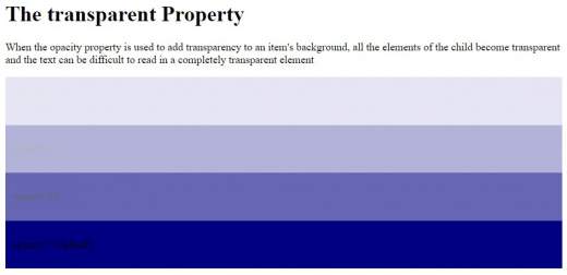
<h1>The transparent Property</h1>
<p>When the opacity property is used to add transparency to an item's background, all the elements of the child become transparent and the text can be difficult to read in a completely transparent element</p>
<div class="first"><p>opacity 0.1</p></div>
<div class="second"><p>opacity 0.3</p></div>
<div class="third"><p>opacity 0.6</p></div>
<div><p>opacity 1 (default)</p></div>
</body>
</html>
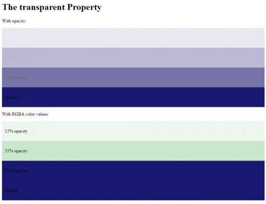
If an element is given a certain opacity, then its elements inherited it by default. To prevent the opacity of an item’s contents or copies from changing, you can use the RGBA color values to change the opacity of the background color. You can use RGB as the color value, but you can use a TGB color with an alpha channel (RGBA) that specifies the opacity of a color. An RGBA color value is specified in red, green, blue, and alpha. The alpha parameter is a number between 0.0 (completely transparent) and 1.0 (completely opaque).
<!DOCTYPE html>
<html>
<head>
<style>
div {
  background: rgb(25, 25, 112);
  padding: 10px;
}
div.one {
  background: rgba(76, 175, 80, 0.1);
}
div.second {
  background: rgba(76, 175, 80, 0.3);
}
div.third {
  background: rgba(25, 25, 112);
}
</style>
</head>
<body>
<h1>The transparent Property</h1>
<p>With opacity:</p>
<div style="opacity:0.1;"><p>15% opacity</p></div>
<div style="opacity:0.3;"><p>35% opacity</p></div>
<div style="opacity:0.6;"><p>65% opacity</p></div>
<div><p>opacity 1</p></div>
<p>With RGBA color values:</p>
<div class="one"><p>15% opacity</p></div>
<div class="second"><p>35% opacity</p></div>
<div class="third"><p>65% opacity</p></div>
<div><p>default</p></div>
</body>
</html>
We will create another example in which once the mouse moves over the image, it will become opaque
<!DOCTYPE html>
<html>
<head>
<style>
img:hover {
opacity: 0.6;
filter: alpha(opacity=60);
}
</style>
</head>
<body>
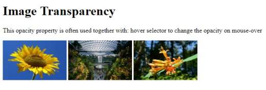
<h1>Image Transparency</h1>
<p>This opacity property is often used together with: hover selector to change the opacity on mouse-over</p>
<img src="https://upload.wikimedia.org/wikipedia/commons/4/41/Sunflower_from_Silesia2.jpg" alt="FLOWER" width="160" height="100">
<img src="https://upload.wikimedia.org/wikipedia/commons/e/e9/JewelSingaporeVortex1.jpg" alt="GARDEN" width="160" height="100">
<img src="https://upload.wikimedia.org/wikipedia/commons/6/6f/Lonicera_ciliosa_13330.JPG" alt="FLOWER" width="160" height="100">
</body>
</html>
Another example with text in a transparent container:
<!DOCTYPE html>
<html>
<head>
<style>
div.background {
  background: url(https://upload.wikimedia.org/wikipedia/commons/6/6f/Lonicera_ciliosa_13330.JPG) repeat;
  border: 2px solid black;
  padding: 10px;
}
div.box {
  margin: 35px;
  background-color: #ffffff;
  border: 3px solid black;
  opacity: 0.5;
  filter: alpha(opacity=50);
}
div.transbox p {
  margin: 5%;
  font-weight: bold;
  color: #000000;
}
</style>
</head>
<body>
<div class="background">
  <div class="box">
    <p>This is an example with text in transparent box</p>
  </div>
</div>
</body>
</html>

Conclusion
There are many possibilities for using opacity and transparency, whether it’s aesthetics or just accentuating elements on your web page. It’s a cheap alternative to using Photoshop or other photo editing software.