Working with text in CSS3 allows for a lot of control. Not only are you able to use a wide variety of fonts, you are able to set the way the fonts are viewed. In this article, you will learn how to set single line spacing with text.
The property that allows you to choose single line spacing is line-height. There a few options available to you with this approach. You can control the line-height property with the following:
<number><length><percentage>the keyword normal
normal
Many desktop browsers use a default value of roughly 1.2, depending on the element’s font-family.
<number>
This value <number> is multiplied by the element's own font size. This is the recommended way to set the line-height because it avoids problems with inheritance.
<length>
This is used to calculate the line box height.
<percentage>
The computed value is the <percentage> multiplied by the element's computed font size. Note: percentage and em values can create unintended results.
Here is an example of the code you would use:
<!doctype html>
<html>
<head>
<meta charset="utf-8">
<title>Untitled Document</title>
<style>
p.smaller {
    line-height: 1.1;
}
p.bigger {
    line-height: 2.2;
}
</style>
</head>
<body>
<p>
This is a paragraph without line-height applied. <br>
This is a paragraph without line-height applied.<br>
</p>
<p class="smaller">
This is a paragraph with a small number for the line-height.<br>
This is a paragraph with a small number for the line-height.<br>
This is a paragraph with a small number for the line-height.<br>
This is a paragraph with a small number for the line-height.<br>
</p>
<p class="bigger">
This is a paragraph with a bigger number for the line-height.<br>
This is a paragraph with a bigger number for the line-height.<br>
This is a paragraph with a bigger number for the line-height.<br>
This is a paragraph with a bigger number for the line-height.<br>
</p>
</body>
</html>
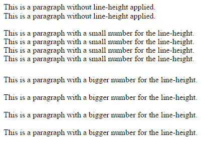
And here is what the finished text looks like. As you can see, you have a lot of control over the text and spacing. This is particularly important when working with mobile devices, where text spacing issues could easily become a problem.

Outside of single line spacing, there are many other things you can do, such as changing the font size, the font itself, styles, set upper/lower case, change font color, get text to wrap around images, text overflow, word wrapping and more, which we will cover in future articles.
About the Author
Nathan Segal has been working as a freelance writer for 18 years. In that time he has published more than 1,000 articles and has written 9 books. You can learn more about him at http://NathanSegal.org.


