Let’s explore the process by which we can transform a standard HTML element into a spatial transformation module to 2D and 3D. Thus, you can model the standard HTML element by shrinking coordinates, expanding coordinates or moving them.
Careful! Do not confuse transitions (which are used to animate an element between two states) with transformations (used to create effects).
2D variants are more often used than 3D variants because they are easier to write, and most browsers accept them for viewing. So, the CSS3 2D module facilitates the following transformations:
- translate: we can change the position of the element along the X axis and the Y axis using the translated function, the positive values move the element straight or down, and the negative values move the element to the left or up.
- rotate: you can rotate the item using the rotated function, the values are degrees (e.g.: rotated (90deg.))
- scale: we can increase the size of the element using the scale function; if the scale is <1, the size will decrease / if the scale is> 1, the size will increase
- matrix: we can combine 2D transformation (translation, rotation, scale, matrix and skew) into one statement
- skew: we can change the element angle along X axis and Y axis; skewX will change the angle of the element along the X axis, and skewY will change the angle along the Y axis
- transform: skewX (value)
- transform: skewY (value)
Translate
div {
    -o-transform: translate(50px,10px);
    -ms-transform: translate(50px,10px);
    -webkit-transform: translate(50px,10px);
    - moz-transform: translate(50px,10px);
    transform: translate(50px,10px);
}
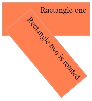
Rotate
Here is an example:
<!DOCTYPE html>
<html>
<head>
<style>
div {
    width: 300px;
    height: 100px;
    background-color: coral;
    border: 3px solid DarkSalmon;
    font-size: 30px;
    text-align: right;
    padding: 10px;
}

div#Div1 {
    -o-transform: rotate(50deg);
    -ms-transform: rotate(50deg);
    -webkit-transform: rotate(50deg);
    -moz-transform:rotate(50deg);
     transform: rotate(50deg);
}
</style>
</head>
<body>
<div>
Ractangle one
</div>
<div id="Div1">
Rectangle two is rotated
</div>
</body>
</html>
Scale
div {
    -o-trnasform:scale(3,5);
    -ms-transform:scale(3,5);
    -webkit-transform: scale(3,5);
    - moz-transform: scale(3,5);
    transform: scale(3,5);
}
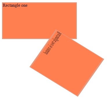
Matrix
Here is an example:
<!DOCTYPE html>
<html>
<head>
<style>
div {
    width: 270px;
    height: 130px;
    background-color: coral;
    border: 3px solid DarkSalmon;
}
div#myRectangle {
    -ms-transform: matrix(-0.35,0.50,1.3,0.80,100,20);
    -webkit-transform: matrix(-0.35,0.50,1.3,0.80,100,20);
    transform: matrix(-0.35,0.50,1.3,0.80,100,20);
}
</style>
</head>
<body>
<div>
Rectangle one
</div>
<div id="myRectangle">
Rectangle two is rotated
</div>
</body>
</html>
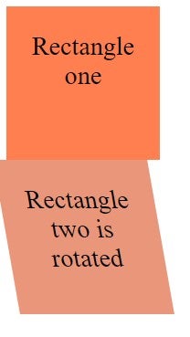
Skew
Here is an example:
<!DOCTYPE html>
<html>
<head>
<style>
div {
  width: 120px;
  height: 120px;
  background-color: coral;
  padding: 30px;
  font-size: 30px;
  text-align: center;
}

div#myRectangle {
    transform: skew(10deg);
    background-color: darksalmon;
}
</style>
</head>
<body>
<div>
Rectangle one
</div>
<div id="myRectangle">
Rectangle two is rotated
</div>
</body>
</html>
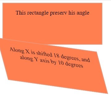
Another example is when the div element is shifted 18 degrees on the X axis and 10 degrees on the Y axis:
<!DOCTYPE html>
<html>
<head>
<style>
div {
    width: 300px;
    height: 100px;
    background-color: coral;
    border: 2.5px solid darksalmon;
    font-size:20px;
    text-align: center;
    padding: 20px;

}
div#Div2 {
    -ms-transform: skew(18deg,10deg);
    -webkit-transform: skew(15deg,8deg);
    transform: skew(15deg,8deg);
}
</style>
</head>
<body>
<div>
This rectangle preserv his angle
</div>
<div id="Div2"> Along X is shifted 18 degrees, and along Y axis by 10 degrees</div>
</body>
</html>
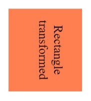
Turning property in 3D transformations has added a new axis, namely the Z axis.
The syntax is:
transform: rotateX (value);
transform: rotateY (value);
transform: rotateZ (value);
The positive value will rotate the element clockwise and the negative value counterclockwise. The preserve-3D property helps us modify the nested elements in a unique way.
If we want the transformations to be applied to the parent element and not to the nested element, then we use this function.
Here is an example :
<!DOCTYPE html>
<html>
<head>
<style>
div {
     width:100px;
     height:70px;
     background-color:coral;
     font-size:15px;
     text-align: center;
     padding-top: 20px;
     transform:perspective(350px) rotateZ(90deg)
translateX(30px)
translateY(-35px) translateZ(150px);
-webkit-transform: perspective(350px) rotateZ(90deg)
translateX(30px)
translateY(-35px) translateZ(150px);
}
</style>
</head>
<body>
<div>Rectangle transformed</div>
</body>
</html>
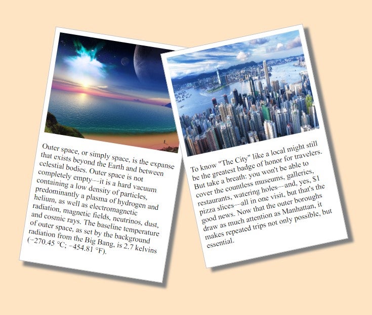
Another example with pictures rotated:
<!DOCTYPE html>
<html>
<head>
<style>
body {
  margin: 80px;
  background-color: Bisque ;
}
div.picture {
  width: 284px;
  padding: 10px 10px 20px 10px;
  border: 1px solid #BFBFBF;
  background-color: white;
  box-shadow: 10px 10px 5px grey;
}
div.rotate_right {
  float: left;
  -ms-transform: rotate(9deg);
  -webkit-transform: rotate(9deg);
  transform: rotate(9deg);
}
div.rotate_left {
  float: left;
  -ms-transform: rotate(-12deg);
  -webkit-transform: rotate(-12deg);
  transform: rotate(-12deg);
}
</style>
</head>
<body>
<div class="picture rotate_right">
  <img src="http://www.kinyu-z.net/data/wallpapers/263/1221040.jpg" alt="Picture from space" width="284" height="213">
  <p class="caption">Outer space, or simply space, is the expanse that exists beyond the Earth and between celestial bodies. Outer space is not completely empty—it is a hard vacuum containing a low density of particles, predominantly a plasma of hydrogen and helium, as well as electromagnetic radiation, magnetic fields, neutrinos, dust, and cosmic rays. The baseline temperature of outer space, as set by the background radiation from the Big Bang, is 2.7 kelvins (−270.45 °C; −454.81 °F).</p>
</div>
<div class="picture rotate_left">
  <img src="http://www.kinyu-z.net/data/wallpapers/262/1202342.jpg" alt="New York City" width="284" height="213">
  <p class="caption">To know "The City" like a local might still be the greatest badge of honor for travelers. But take a breath: you won't be able to cover the countless museums, galleries, restaurants, watering holes—and, yes, $1 pizza slices—all in one visit, but that's the good news. Now that the outer boroughs draw as much attention as Manhattan, it makes repeated trips not only possible, but essential.</p>
</div>
</body>
</html>
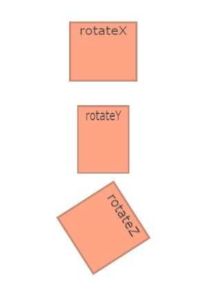
Another example using rotateX, rotateY and rotateZ functions:
<!DOCTYPE html>
<html>
<head>
<style>
.element {
  display: inline-block;
  background-color: coral;
  height: 100px;
  width: 100px;
  color: black;
  text-align: center;
  opacity: 0.7;
  font-family: Verdana, sans-serif;
  border: 3px solid rgba(0,0,0,.3);
  margin-bottom: 30px;
  font-size: 20px;
}
.one {
  transform: rotateX(40deg);
  animation: one 3s infinite;
  animation-direction: alternate;
}
.two {
  transform: rotateY(40deg);
  animation: two 3s infinite;
  animation-direction: alternate;
  background-color: coral;
}
.three {
  transform: rotateZ(100deg);
  animation: three 3s infinite;
  animation-direction: alternate;
  background-color: coral;
}
@keyframes one {
  0% {
    transform: rotateX(0);
  }
  100% {
    transform: rotateX(50deg);
  }
}
@keyframes two {
  0% {
    transform: rotateY(0);
  }
  100% {
    transform: rotateY(70deg);
  }
}
@keyframes three {
  0% {
    transform: rotateZ(0);
  }
  100% {
    transform: rotateZ(100deg);
  }
}

body, html {
  height: 100%;
}
body {
  display: flex;
  flex-direction: column;
  align-items: center;
  justify-content: center;
}
</style>
</head>
<body>
<div class="element one">
  rotateX
</div>
<div class="element two">
  rotateY
</div>
<div class="element three">
  rotateZ
</div>
</div>
</body>
</html>
Conclusion
CSS transforms change the way we approach the web design canvas. It is worthwhile to research and experiment with these transformations, as this is the perfect time to start using CSS transforms in our future projects.


