
Adding Patterns and Animations to HTML5 Progress Bars
The addition of the Progress element to the HTML5 spec has opened a whole new avenue for providing visual feedback on long-running tasks. In the Using CSS to Make a Visually Consistent Cross-browser HTML5 Progress Bar article, I demonstrated how to turn off the browser’s default styling in order to give the Progress Bar element a consistent appearance across browsers. Beyond that, we went as far as to introduce different color schemes and even gradients to our progress bars. In today’s article, we’ll see how advanced CSS3 properties can be employed to do things that Web developers could once only dream of.
Progress Element Basics
The Progress element itself is quite simple to use; just include the
<progress value="0.2"></progress>Candy Striping
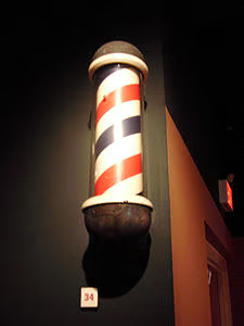
Now that we’ve got the basics out of the way, here’s a type of progress bar that emulates the look of a candy cane, or that of a classic barber shop pole. You may not remember these, but here’s what they look like:
This time we’ll set the value at 0.5 so that it’s half full:
<progress value="0.5"></progress>Every part of the progress bar element, including the element itself, meter, and background, may be altered using CSS. This particular example goes further than applying candy stripes to the meter bar by adding shadows, rounded borders, and padding to give it a more three dimensional appearance:
/* This example works best over a dark background */
body {
        background: #322c35;
}

/* This sets the dimensions of the Progress Bar element */
progress {
  width: 300px;
  height: 17px;
        display: block;
        /* turn off defaults */
        -webkit-appearance: none;
        border: none;
}

/* This rule sets the appearance of the progress bar background */
progress::-webkit-progress-bar {
        background: black;
        border-radius: 50px;
        padding: 2px;
        box-shadow: 0 1px 0px 0 rgba(255, 255, 255, 0.2);
}

/* This rule sets the appearance of the progress bar meter */
progress::-webkit-progress-value {
    border-radius: 50px;
          box-shadow: inset 0 1px 1px 0 rgba(255, 255, 255, 0.4);
    background-size: 30px 30px;
    background-image: linear-gradient(135deg, rgba(255, 255, 255, .15) 25%, transparent 25%,
                      transparent 50%, rgba(255, 255, 255, .15) 50%, rgba(255, 255, 255, .15) 75%,
                      transparent 75%, transparent);

}
The stripes are achieved using the CSS3 linear-gradient. It accepts a direction parameter as well as a series of color stops:
background: linear-gradient(direction, color-stop1, color-stop2, ...);Colors may be defined in several ways, including by named colors or the rgba() function, which provides a fourth transparency parameter.
Here is the resulting Progress Bar:
Adding Animation
Our second example includes a couple of extra effects, including a left-to-right gradation as well as animation. The animation is achieved using the CSS3 webkit-animation and @-webkit-keyframes selectors.
progress::-webkit-progress-value {
        border-radius: 50px;
        box-shadow: inset 0 1px 1px 0 rgba(255, 255, 255, 0.4);
        background:
                -webkit-linear-gradient(45deg, transparent, transparent 33%, rgba(0, 0, 0, 0.1) 33%, rgba(0, 0, 0, 0.1) 66%, transparent 66%),
                -webkit-linear-gradient(top, rgba(255, 255, 255, 0.25), rgba(0, 0, 0, 0.2)),
                -webkit-linear-gradient(left, red, #ba7448);

        background-size: 25px 14px, 100% 100%, 100% 100%;

        /*This sets up the animation */
        -webkit-animation: move 5s linear 0 infinite;
}

@-webkit-keyframes move {
        0% {background-position: 0px 0px, 0 0, 0 0}
        100% {background-position: -100px 0px, 0 0, 0 0}
}
The -webkit-animation rule is actually a shorthand for several properties including the -webkit-animation-name, -webkit-animation-duration, -webkit-animation-timing-function, -webkit-animation-delay, and -webkit-animation-iteration-count. The @-webkit-keyframes “move” acts as a function that sets the start and end point of the animation. In our case the left top x coordinate is being set to -100 pixels.
Unfortunately, the following jpeg does not do the animation justice. To see that. you’ll just have to try out the code yourself!
Note that today’s code will work in most, but perhaps not all browsers. All code was run on Chrome v37 on Windows 7. To support every browser, you’ll need to use the equivalent CSS rules for those.
Going Forward
It’s hard to believe that an animated candy stripe progress bar can be created without resorting to anything other than CSS! And it certainly doesn’t end with candy striping; if Lea Verou’s CSS3 pattern gallery is any indication, we could be seeing a lot more creative progress bars in the near future. Maybe you’ve built one yourself. If so, I’d love to hear from you!
