Using CSS to Make a Visually Consistent Cross-browser HTML5 Progress Bar
Got to get back to zero
Got to erase, rewind
Just bring it back to zero
Go back in time – Back to Zero, John Perinbam (c) 2009
Just a short time ago, I wrote how to show progress reports for long-running PHP scripts. In that article, we were introduced to an HTML5 addition called the Progress Bar element. It’s a great leap forward for us developers, but some people have pointed out – quite fairly might I add – that the Progress Bar element looks very different across browsers, O/Ses and platforms. In today’s article, we’re going to learn not only how to give the Progress Bar element a consistent appearance across browsers, but how to make it look awesome as well!
A Style for Every Occasion
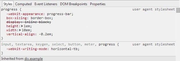
Although you may not know it, browsers apply their own styles to every page element, including Progress Bars. That’s why they look so different from browser to browser. We can see the browser’s native styles in the debugger – Google Chrome in this case:
Here is how your browser might present a Progress Bar:
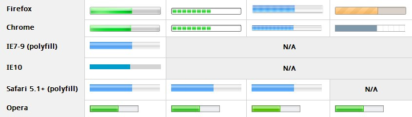
Does the progress bar below look like any of those in the picture above?
Obviously, we have to take control of the situation if we want our Progress Bar to look a certain way for everyone.
Getting Back to Zero
The first order of business is to turn off the default styling. It might sound easy, but the plethora of selectors and attributes involved makes it anything but! If you’ve never heard of polyfills, an explanation follows in the next section.
progress,
progress[role]
{
appearance: none;
-moz-appearance: none;
-webkit-appearance: none;
border: none;
background-size: auto;
width: 400px;
height: 60px;
}
progress[role]:after {
background-image: none;
}
progress[role] strong {
display: none;
}
#test_bar {
-webkit-appearance: none;
border: solid 1px black;
width: 200px;
height: 20px;
}
What is a Polyfill
The term polyfill is attributed to Remy Sharp and was popularized by people like HTML guru Paul Irish. Unlike a shim, which usually comes with its own API, a polyfill replicates an API using a variety of tools, including JavaScript, CSS, or Flash, if the browser doesn’t support a feature natively. With respect to the HTML5 Progress Bar, Lea Verou has written a polyfill using a combination of JavaScript and CSS called HTML5 <progress> polyfill. It is this polyfill that the above css overrides.
Setting the Background and Foreground Colors
Now that we’ve got a clean slate to work with, we can make our progress bar look the way we want it to. The easiest parameters to play with are the dimensions, border, as well as the background and foreground colors. We’ve already sized our progress bar and given it a border, so let’s turn our attention to its color scheme. Normally, the CSS background property sets an element’s background color, while the color property sets its foreground. Not so with progress bars. The same lack of consistency between browser vendors that prompted us to override their individual style settings again forces us to employ a number of selectors and properties. Oddly, in some cases, the background property in fact sets the foreground color! Should we question that? Probably. In the mean time, try out the following CSS that sets the background color to navy blue, using the HEX value, and sets the foreground color to Cyan, using the named constant:
/* Background Colors  */
progress,                          /* Firefox  */
progress[role][aria-valuenow] {    /* Polyfill */
   background: #000066 !important; /* !important is needed by the polyfill */
}

/* Chrome */
progress::-webkit-progress-bar {
    background: #000066;
}

/* Foreground Colors   */
/* IE10 */
progress {
    color: Cyan;
}

/* Firefox */
progress::-moz-progress-bar {
    background: Cyan;
}

/* Chrome */
progress::-webkit-progress-value {
    background: Cyan;
}

/* Polyfill */
progress[aria-valuenow]:before  {
    background: Cyan;
}
Here is the result in my Chrome browser:

Gradients
CSS supports gradients, so why not use them in our progress bars? Just be sure to include each browser’s specific implementation of the gradient property:
progress.test_bar::-moz-progress-bar {
background-image: -moz-linear-gradient(
center bottom,
rgb(43,194,83) 37%,
rgb(84,240,84) 69%
);
}
progress.test_bar::-webkit-progress-value {
background-image: -webkit-gradient(
linear,
left bottom,
left top,
color-stop(0, rgb(43,194,83)),
color-stop(1, rgb(84,240,84))
);
background-image: -webkit-linear-gradient(
center bottom,
rgb(43,194,83) 37%,
rgb(84,240,84) 69%
);
}
progress.test_bar[aria-valuenow]:before {
background-image: -moz-linear-gradient(
center bottom,
rgb(43,194,83) 37%,
rgb(84,240,84) 69%
);
background-image: -ms-linear-gradient(
center bottom,
rgb(43,194,83) 37%,
rgb(84,240,84) 69%
);
background-image: -o-linear-gradient(
center bottom,
rgb(43,194,83) 37%,
rgb(84,240,84) 69%
);
}
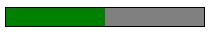
The above code produces a green progress bar with a gradient that progressively lightens from the bottom up:

Conclusion
Some people haven’t been content to just give their progress bars a consistent appearance across browsers. In the quest for the most eye-catching design on the Web, these intrepid developers have incorporated the most cutting-edge CSS3 selectors and properties to create progress bars of animated patterns! We’ll see how that’s done next time!