


I recently wrote about liquidx‘s PlotKit in an article entitled Easy HTML5 Charting with PlotKit. It’s a JavaScript charting library that includes support for both the HTML5 Canvas and SVG via Adobe SVG Viewer as well as an emulated canvas for Internet Explorer. I came a across it while looking for a tool to help me produce charts for a Web application project I was working on. In doing so, I learned that some elements were easier to customize than others. This is not to say that the possibilities were lacking. Rather, I found that there were enough similar properties to make it a challenge to figure out exactly which of them I needed to tweak. One such element is the chart axes. While there are more than enough properties to set up your axes how you like, getting there may take some experimentation. So, in order to make your task a little easier, I’d like to describe some pertinent properties that contribute to the axes layout.
Sticking with the Defaults
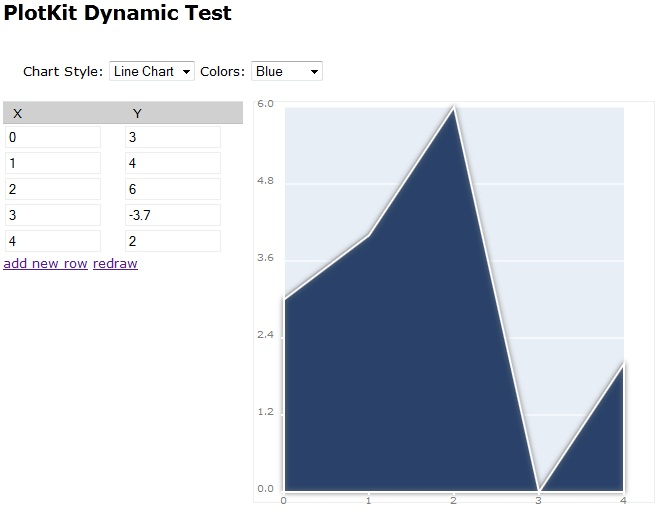
As long as your chart is not too complex, relying on the defaults for the X and Y axes will work just fine. Your X Ticks will be used as is and your minimum and Maximum Y values will be used in rendering the chart. For instance, if your Y started at zero and contained a maximum value of six, then the Y Axis of the chart would also start at zero and go to six:

Notice that there are five Y Ticks by default.
Accommodating Negative Values
The default settings won’t work as well with negative values, as the following line chart will attest to:
The Y axis remains at zero and the line does not dip below the X axis either.
The solution is not a difficult one. Simply add the yOriginIsZero property to the layout options and set it to false:
var options = PlotKit.Base.officeBlue();
var layout = new Layout("line", options);
var renderer = new SweetCanvasRenderer($('canvasTest'), layout, options);
layout.options.yOriginIsZero = false;
MochiKit.Base.update(layout.options, options);
MochiKit.Base.update(renderer.options, options);
Now the minimum Y value of -3.7 is set as the Y axis minimum:
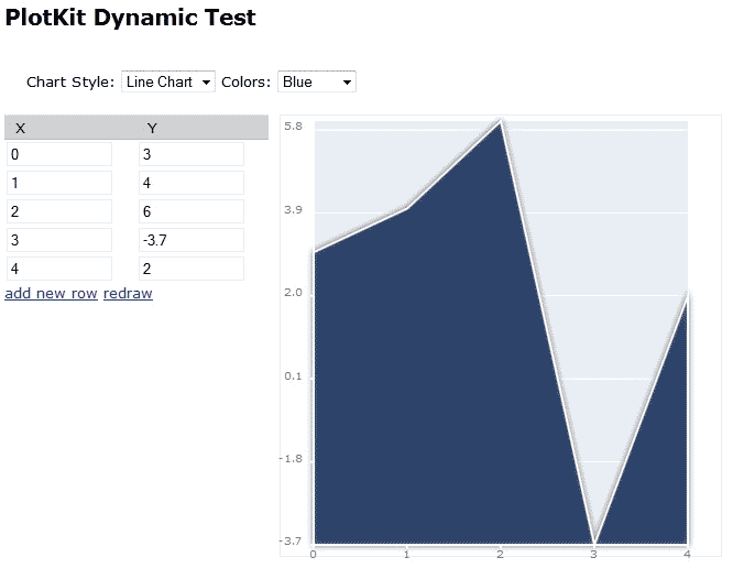
There is a corresponding xOriginIsZero property for the X axis.
Adding a Buffer Above and Below the Chart
As a matter of personal preference, I don’t like when the dataset elements (such as lines or bars) go right to the edge of the charting area. I prefer to see a bit of buffer. That can easily be set using the xAxis and yAxis layout properties. Let’s take that last chart and introduce some space at the top and bottom. Both the xAxis and yAxis properties accept an array of two floating point numbers: the first sets the minimum and the other is for the maximum value:
var options = PlotKit.Base.officeBlue();
var layout = new Layout("line", options);
var renderer = new SweetCanvasRenderer($('canvasTest'), layout, options);
layout.options.yOriginIsZero = false;
layout.options.yAxis = [-4.0, 6.5];
MochiKit.Base.update(layout.options, options);
MochiKit.Base.update(renderer.options, options);
Presto, instant buffering!

Setting the Number of Ticks
I find that as a chart’s data ranges grow larger, the more ticks are required to read the data values with any precision. As I said earlier, Plotkit draws only five yTicks be default, which is far from enough in many cases. To include a greater number, set the yNumberOfTicks to an integer value:
var options = PlotKit.Base.officeBlue();
var layout = new Layout("line", options);
var renderer = new SweetCanvasRenderer($('canvasTest'), layout, options);
layout.options.yOriginIsZero = false;
layout.options.yAxis = [-4.0, 6.5];
layout.options.yNumberOfTicks = 10;
MochiKit.Base.update(layout.options, options);
MochiKit.Base.update(renderer.options, options);
Here is the same chart again with a yNumberOfTicks value of ten:

Working with Floating Point Numbers
Our final example shows how to incorporate fractional values into axis ticks. To some extent, the Y axis includes floating point numbers automatically as a result of dividing the Y axis into five even sections. We can control the precision – that is the number of decimal points – via the xTickPrecision and yTickPrecision layout properties. Let’s say that I wanted to display quarterly data for the one year and the first quarter of the second one whereby quarters are displayed as 1.00, 1.25, 1.75, and 2.00. Likewise, I would also like the Y axis ticks to display 2 decimal points. Setting the yTickPrecision to 2 will indeed yield better precision, but the effect of setting xTickPrecision on the X axis really depends on what you want. As a general rule, Plotkit will make each bar of a bar chart less wide in order to accommodate the greater precision. Unless you have a large data set and would like to show the relative distance between each X axis point, you may find unsightly gaps on the X axis:

Setting the xNumberOfTicks and/or bar widths will not fix this issue. In my opinion, the best way to exert control over your axis ticks is to set each of them using the layout.options.xTicks property. It accepts an array of objects, each containing a v (value) and label property:
layout.options.yOriginIsZero = false;
layout.options.yAxis = [-4.0, 6.5];
layout.options.yTickPrecision = 2;
layout.options.yNumberOfTicks = 10;
layout.options.xTicks = [
  {v:0,  label:"1.00"},
  {v:1,  label:"1.25"},
  {v:2,  label:"1.50"},
  {v:3,  label:"1.75"},
  {v:4,  label:"2.00"}
];
options.padding = {left: 50, right: 0, top: 10, bottom: 30};
MochiKit.Base.update(layout.options, options);
MochiKit.Base.update(renderer.options, options);

The options.padding property will often have to be adjusted to accommodate the longer tick labels.
Conclusion
Today we saw how to customize Plotkit axes using some of the layout and renderer options. There are many other options available for changing the look of the chart, including the color scheme, background, bar width, fill, and many others. We’ll be delving into those soon.
