


A common problem when building a website is when the layout looks just great on your computer but when the client views it on their system, the design appears to be “off.” By using Dreamweaver’s Multiscreen Preview panel, you can solve those issues before your client ever sees their site!
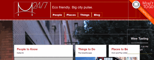
To get started, we’ll look at a default site that comes with Dreamweaver as a starting point. As you can see, it’s designed for a desktop browser and that’s obvious by the width of the three column layout. Now if we want to change the look and feel, the first thing we need to do is to look at the Multiscreen Preview panel and we get to that by clicking on the Multiscreen icon at the top center of the page.
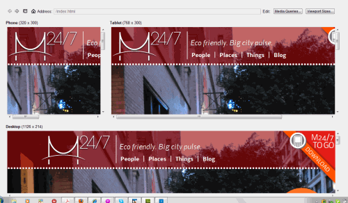
In the Multiscreen Preview, you see three different layouts: Desktop, tablet and phone. To have more control over the layouts we need to add individual CSS media queries so that each is a separate interface.
Note: To learn more about Media Queries, visit the section near the end of this article.
Click on the Media Queries button at the top right of the Multiscreen Preview window.
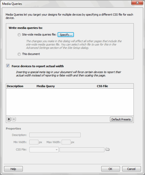
In the media queries dialog box, you have several options. In the Write Media Queries to area you can choose Site-wide Media Queries file (and choose the file you want to use), or keep it simple and use This document if your changes are minor.
The next option is to leave the checkmark beside Force Devices to report actual width and click on the Default Presets button at the lower right of the window so insert default resolutions for the Phone, Tablet and Desktop resolutions.
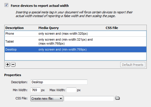
As you can see, the Phone resolution is set to a maximum of 320 pixels. the Tablet layout is in a range from 321-768 pixels and the Desktop layout is set to 769 pixels and above. Clicking on each one of these will allow you add more information in the Properties area below.
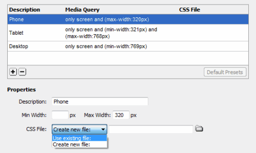
To get more control over these layouts, we’ll attach CSS profiles to them, which have been pre-built and will serve as our baseline for manipulations later. To do so, go to the Properties area at the bottom of the dialog. Click on the button beside CSS File and choose “Use existing file,” then navigate to the CSS directory to find the appropriate file for each layout. For the phone it’s mobile.css, for the tablet it’s tablet.css and for the desktop it’s main.css.
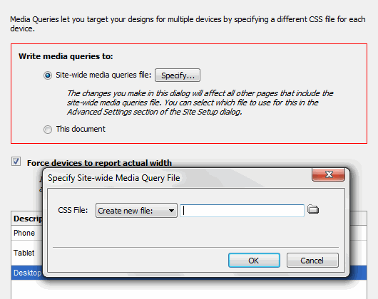
After that, if you try to click on the OK button, you’ll get a message informing you that you have to specify a site-wide media queries file. You’ll also notice that the Write media queries to section has a red box around it and you now can choose a specific file or to use the current document. I named it M247 to match the current document and Dreamweaver saved the file: M247.css. Now you can click on OK to exit the Media Queries dialog box and close the Multiscreen Preview dialog as well.
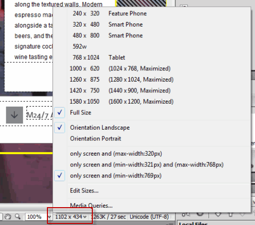
Now we can work with each individual layout without it affecting the others. At moment, we’re still in preview mode which isn’t giving us much information. To preview what the layout will look like as a finshed product, make sure that the Live View button is enabled, otherwise the preview won’t work properly. Next. go to the bottom of the working window and click on the Window Size button. This opens a popup as you can see in the screen shot above. In this case, I’m going to choose 320×480 Smart Phone.
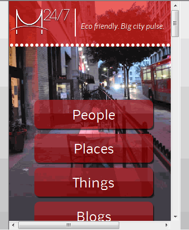
And here’s the result which gives you a rough idea of what it will look like. Of course, this will vary from phone to phone. Now that you have these layouts, you can modify them as necesary to meet the demands of your clients.
About Media Queries
Media queries are necesary to deliver content using specific style sheets for a variety of devices. This allows users to have the best overall experience. Since each device, such as smartphones, tablets, etc. have different resolutions, it’s important that the designer ensures that their websites appear correctly on each one of these devices. Before this can happen, the device has to support media queries. Currently, media queries are supported in Firefox 3.5+, Safari 3+, Opera 7+, Internet Explorer 9 and on most new smartphones.
Here’s a sampling of some of the properties which you can expect to see:
* Width: The width of a specific area of the screen
* Height: The height of the specific screen area
* Color: The denotes a number which is the bit depth of each color.
* Resolution: This refers to the dpi or number of pixels in a given space on the screen.
* Orientation: This refers to the portrait or landscape position.
Other Notes
* Media queries can be used in a similar way as CSS properties and can be defined as rules within a style sheet.
* The usual way of using media queries is to create external style sheets.
* Be aware of the differences between smartphones and tablets, which have a completely different layout than a standard website. As an example, for a smartphone, a single column layout design is often the preferred way to go. Another option is to set up a main layout using a variety of easy-to-see icons, each of which directs to its own page.
For an in-depth understanding on media queries, visit Adobe’s Media Queries page.
