


This is part two of a three part series on using Mobile Joomla!, which is a very powerful component for Joomla! web sites. Part one provided a background on Mobile Joomla! along with installation information and how to apply the Elegance template. Part three will cover how to do advanced customizations. In this article, we will look at the Template Manager, updating the logo image, working with theme colors and how to use the modules. You can download Mobile Joomla! here. This article focuses on working with the Elegance premium template, which was provided to the author from the developer.
For examples, please see GoozerNation.com and FSCgroup.com while on a smartphone. In the first article, I stated that the standard version of the site appeared when viewed on an Amazon Fire. I must update that and say that the mobile version is now appearing when I view FSCgroup.com on my Fire. However, Goozernation.com still displays the standard version when viewed on my Fire. I’m not sure what is causing the difference, but both views look very good. So, no harm, no foul.
Using the Template Manager
Let’s continue on with some basic stuff and look at the options under the Template Manager.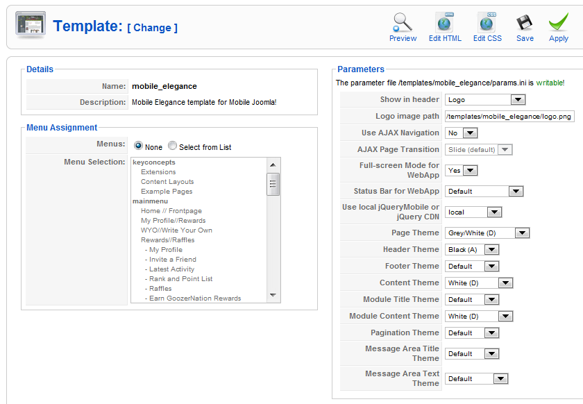
I personally didn’t do anything with the left column, but you might want to make some adjustments in the right column. First, you’ll see a drop down arrow called, Show in header. This is where you can display a logo image, the Site title or both. I chose to use the Logo option. If you also choose the logo option, then you’re going to want to change the logo, which Mobile Joomla! makes it very easy to do.
Updating the Logo Image
Directly under Show in header, you’ll see Logo image path. I suppose you could do two different things to update the logo image. You could either update the path shown in the box, or you could dive into your FTP and simply replace the logo.png file. That’s what I did. I chose that option because I wanted to see what the size of the default logo was so that I could match it. That way, the logo doesn’t become distorted when it displays on a phone. The correct dimensions of the logo should be 284 pixels wide by 84 pixels high.
Turning Off Ajax Navigation
If you have gone this far without seeing what your Elegance template looks like on a phone yet, then you’re a better developer/designer than I am. If you have checked it, you might have realized that not all of your pages load correctly, or you see only large banner ads, or you navigated to your contacts page and you saw nothing but a long string of email addresses. If this is happening to you, then there is an easy way to fix your navigation issues. In the Template Manager, in the right column, directly below Logo image path, there’s an option to turn off Use Ajax Navigation. Setting this option to No made dramatic improvements to the behavior and layout of my mobile content.
If you’re still having troubles, then another possibility is that you have {loadpositions} within your articles that don’t play well with Mobile Joomla!. I did have to remove my banner ads at the bottom of articles because they were simply too big. However, {loadpositions} that pointed to Most Read and Newest display very nicely in both the standard and mobile versions.
Changing the Elegance Theme Colors
One other customization that you can configure in the Template Manager are the colors in the template. You can individually change the Page Theme, Header Theme, Footer Theme, Content Theme, Module Title Theme, Module Content Theme, Pagination Theme, Message Area Title Theme and the Message Area Text Theme.
Your choices for each of these themes are basically the same, you can choose: Black, Blue, White, Grey or Yellow.
Understanding the Elegance Modules
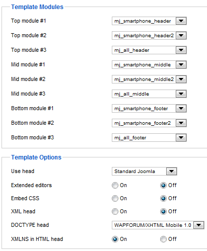
Let’s now turn our attention back to the Mobile Joomla! Settings under the Component menu to dive into a more intermediate-level understanding of Mobile Joomla!. I say that because it took me a little while to wrap my head around the concept that the the mobile template does have its own modules. That is, you can create modules that only appear in the Elegance template and they have no bearing on your standard template. The figure below shows the default settings for the Smartphone, which is basically the same for iPhone and the others.
Some of these modules are blank and you can turn them off with no change in appearance. Other modules have a significant impact on what appears in the mobile version of your site.
- Top module #1: mj_smartphone_header = Your site title will appear
- Top module #2: mj_smartphone_header2 = Blank
- Top module #3: mj_all_header = Your Main Menu will appear
- Mid module #1: mj_smartphone_middle = Blank
- Mid module #2: mj_smartphone_middle2 = Blank
- Mid module #3: mj_all_middle = Blank
- Bottom module #1: mj_smartphone_footer = Blank
- Bottom module #2: mj_smartphone_footer2 = Originally blank, but I updated mine to display Google adsense ads
- Bottom module #3: mj_all_footer = link to standard version
For my site, I turned most of these off except for the header, footer2 (which I customized; this is discussed in the next section of this article) and all_footer, because I think that’s a very powerful feature to allow the visitor to view the standard version if they so wish.
Customizing the Elegance Template Modules
Let’s now turn our attention to the Module Manager. If you already have a ton of modules, you can filter out everything but the Elegance positions through the Select Position drop down arrow. This is shown in the below figure.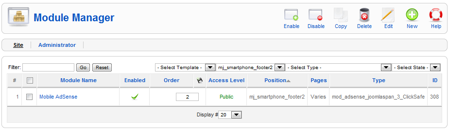
First, a couple of notes. You can name the module whatever is appropriate, and you can use most any type (I say that in theory, not actually tested). The important part is the position, which is mj_smartphone_footer2. I named the module Mobile AdSense and the Type is my Google AdSense plug in.
You can then go in and configure this module per normal. In this case, because I wanted an ad size that would fit a mobile layout, so I chose the 234 x 60 half banner ad size.
Now that you have a customized (and enabled) module, go back to the Mobile Joomla! Settings under the Component menu. If you want this module to appear at the top and the bottom of the page, you can do so by setting the module in two locations as shown in the below figure.
With this configuration, I now have a mobile ad appearing at both the top and the bottom of each of my pages.
Stay tuned for part three to appear soon.
