

By Konstantin Kichinsky
We’ve been exploring the basics on how to use CSS3 shadows: box-shadow and text-shadow. Today we are going to improve our skills and will look into how to build some amazing text-shadows.
Some of the ideas for shadows, I found in various tutorials for Photoshop — and I was interested whether I can achieve similar effects by using just text-shadow.
Internet Explorer and Windows 8
To try all these samples yourself and express your creativity with the text-shadow, try downloading Internet Explorer 10. All mentioned techniques will also work with metro style apps for Windows 8 built using html and javascript. May The Shadow be with you!
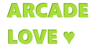
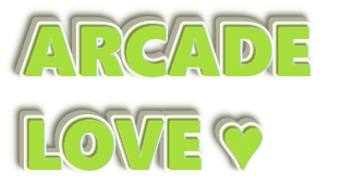
Arcade Love
In our first sample we will try to draw some cool embossed text. We will start with a simple lime color text:

color: hsl(80, 70%, 55%);
Next let’s add some embossed effects by adding few shadows with 1px diagonal offset (note how the shadows color is defined comparing with the text color!):
text-shadow: –1px –1px 0 hsl(80, 70%, 35%),
–2px –2px 1px hsl(80, 70%, 35%);
Now we will add some nice details — a light white blurred shadow around the text and a dark shadow on the bottom to soft transitions:
text-shadow: 0 0 2px #fff,
–1px –1px 0 hsl(80, 70%, 35%),
–2px –2px 1px hsl(80, 70%, 35%),
–2px –2px 2px hsl(80, 10%, 15%);
Next let’s add a substrate for our text. To make it happen we need to expand our shadow (here we are using the fourth parameter of the text-shadow rule — spray-distance):
text-shadow: …
–3px –3px 0 7px hsl(60, 10%, 65%),
–4px –4px 0 7px hsl(60, 10%, 65%),
–5px –5px 0 7px hsl(60, 10%, 65%),
–6px –6px 0 7px hsl(60, 10%, 65%);
Finally to place our text on the background lets add a dark blurred shadow on the bottom of the substrate:
text-shadow: …
–7px –7px 4px 8px hsl(60, 10%, 40%),
–8px –8px 6px 9px hsl(60, 10%, 55%);
Final result

color: hsl(80, 70%, 55%);
text-shadow: 0 0 2px #fff,
/* embossed text */
–1px –1px 0 hsl(80, 70%, 35%),
–2px –2px 1px hsl(80, 70%, 35%),
/* transition to substrate */
–2px –2px 2px hsl(80, 10%, 15%),
/* substrate */
–2px –2px 0 7px hsl(60, 80%, 95%),
–3px –3px 0 7px hsl(60, 10%, 65%),
–4px –4px 0 7px hsl(60, 10%, 65%),
–5px –5px 0 7px hsl(60, 10%, 65%),
–6px –6px 0 7px hsl(60, 10%, 65%),
/* shadow for substrate */
–7px –7px 4px 8px hsl(60, 10%, 40%),
–8px –8px 6px 9px hsl(60, 10%, 55%);
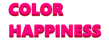
Color Happiness
In the second sample we will reuse some ideas of the first one: we a going to build multiple colorful substrates making a pyramid of them. We will start with a very simple pink text:

color: hsl(330, 100%, 50%);
First of all let’s make it embossed. This time our “shadow” looks to the bottom and is really small, so I can reduce a number of applied rules by omitting intermediate 1px offsets — but on case of diagonal shadow such approach will result an aliasing effect. Also I will add some blurring to soft the transition to the next substrate:

text-shadow: 0 2px 0 0px hsl(330, 100%, 25%),
0 3px 2px 0px hsla(330, 100%, 15%, 0.5);
Next let’s add one more expanded substrate with a different hue-value (note that I’m changing only vertical offset, hue and spread-distance):
text-shadow: 0 2px 0 0px hsl(330, 100%, 25%),
0 3px 2px 0px hsla(330, 100%, 15%, 0.5),
0 3px 0 3px hsl(350, 100%, 50%),
0 5px 0 3px hsl(350, 100%, 25%),
0 6px 2px 3px hsla(350, 100%, 15%, 0.5);
Now we just need to repeat the same trick few more times increasing the size of substrates and moving the hue in a right direction:

text-shadow: …
0 6px 0 9px hsl(20, 100%, 50%),
0 8px 0 9px hsl(20, 100%, 25%),
0 9px 2px 9px hsla(20, 100%, 15%, 0.5),
…
0 15px 0 45px hsl(90, 100%, 50%),
0 17px 0 45px hsl(90, 100%, 25%),
0 17px 2px 45px hsla(90, 100%, 15%, 0.5);
Final result
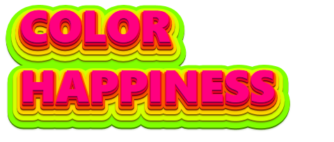
color: hsl(330, 100%, 50%);
text-shadow: 0 2px 0 0px hsl(330, 100%, 25%),
0 3px 2px 0px hsla(330, 100%, 15%, 0.5),
/* next */
0 3px 0 3px hsl(350, 100%, 50%),
0 5px 0 3px hsl(350, 100%, 25%),
0 6px 2px 3px hsla(350, 100%, 15%, 0.5),
/* next */
0 6px 0 9px hsl(20, 100%, 50%),
0 8px 0 9px hsl(20, 100%, 25%),
0 9px 2px 9px hsla(20, 100%, 15%, 0.5),
/* next */
0 9px 0 18px hsl(50, 100%, 50%)
0 11px 0 18px hsl(50, 100%, 25%),
0 12px 2px 18px hsla(50, 100%, 15%, 0.5),
/* next */
0 12px 0 30px hsl(70, 100%, 50%),
0 14px 0 30px hsl(70, 100%, 25%),
0 15px 2px 30px hsla(70, 100%, 15%, 0.5),
/* next */
0 15px 0 45px hsl(90, 100%, 50%),
0 17px 0 45px hsl(90, 100%, 25%),
0 17px 2px 45px hsla(90, 100%, 15%, 0.5);
Chocolate
The third sample I built while experimenting with alternating shadows. As usually lets start with a simple brown text:

color: hsl(20, 100%, 20%);
The first step is to implement a classic 3d-text effect:

text-shadow: –1px 1px 0 0 hsl(20, 100%, 16%),
–2px 2px 0 0 hsl(20, 100%, 16%),
–3px 3px 0 0 hsl(20, 100%, 16%),
–4px 4px 0 0 hsl(20, 100%, 16%),
–5px 5px 0 0 hsl(20, 100%, 16%),
–6px 6px 0 0 hsl(20, 100%, 16%);
Next I decided to dark my shadows by decreasing the lightness and to add some space between the shadows by increasing diagonal offset:

text-shadow: –0px 0px 0 0 hsl(20, 100%, 16%),
–2px 2px 0 0 hsl(20, 100%, 14%),
–4px 4px 0 0 hsl(20, 100%, 12%),
–6px 6px 0 0 hsl(20, 100%, 10%),
–8px 8px 0 0 hsl(20, 100%, 8%),
–10px 10px 0 0 hsl(20, 100%, 6%);
The next step is to contract the shadows. By using contraction you can reduce the shadow to just some pieces of original symbols (it also depends on the font, font size and other attributes). As a result you will get a ragged shadow effect. Also note that as diagonal offsets and spread-distances differ for each of the shadows as a result we get a light twisting effect:

text-shadow: –0px 0px 0 0 hsl(20, 100%, 16%),
–2px 2px 0 –1px hsl(20, 100%, 14%),
–4px 4px 0 –2px hsl(20, 100%, 12%),
–6px 6px 0 –3px hsl(20, 100%, 10%),
–8px 8px 0 –4px hsl(20, 100%, 8%),
–10px 10px 0 –5px hsl(20, 100%, 6%);
Let’s soft a little bit our shadows (also by using various blur-radius and color you can add some intermediate lines):

text-shadow: –0px 0px 1px 0 hsl(20, 100%, 16%),
–2px 2px 2px –1px hsl(20, 100%, 14%),
–4px 4px 2px –2px hsl(20, 100%, 12%),
–6px 6px 3px –3px hsl(20, 100%, 10%),
–8px 8px 2px –4px hsl(20, 100%, 8%),
–10px 10px 2px –5px hsl(20, 100%, 6%);
Finally after playing with this sample some more minutes I got the following result…
Final result

color: hsl(20, 100%, 20%);
text-shadow: 0 0 1px hsl(20, 100%, 18%),
–1px 1px 0 hsl(20, 100%, 16%),
–2px 2px 2px –1px hsl(20, 100%, 14%),
–4px 4px 2px –2px hsl(20, 100%, 12%),
–6px 6px 3px –3px hsl(20, 100%, 10%),
–8px 8px 2px –4px hsl(20, 100%, 9%),
–10px 10px 3px –5px hsl(20, 100%, 8%),
–12px 12px 2px –6px hsl(20, 100%, 7%),
–14px 14px 2px –7px hsl(20, 100%, 6%),
–15px 15px 2px –8px hsl(20, 100%, 5%),
–15px 15px 0 –8px hsla(20, 50%, 10%, 0.25);
Cream Cake
In the fourth sample we will build a cream-text effect for some cake. Just text:

color: hsl(35, 100%, 30%);
background: hsl(35, 60%, 80%);
Let’s start with blurring. I added two shadows: the first one (upper) is made with the same hue-value as the text, but with less saturation, and the second one (lower) is more blurred, more lighted and half-transparent and I also moved its hue-value to the red:

text-shadow: 0 0 2px 1px hsl(35, 70%, 30%),
0 0 4px 4px hsla(30, 100%, 55%, 0.5);
Now let’s add some cream-color substrate (the hue-value is moved to the yellow and the lightness is increased):

text-shadow: …
–1px 1px 2px 7px hsl(45, 60%, 95%);
On the next step we should add some volume to the substrate: I added a new shadow with diagonal offset of the same color as text but less saturated. Note that this shadow is less expanded than the substrate (4px vs 7px):

text-shadow: …
–3px 3px 1px 4px hsl(35, 70%, 30%);
And one last step: blurring substrate to soft the transition to the background:

text-shadow: …
–3px 3px 4px 8px hsla(30, 90%, 55%, 0.5);
Final result

color: hsl(35, 100%, 30%);
background: hsl(35, 60%, 80%);
text-shadow: 0 0 2px 1px hsl(35, 70%, 30%),
/* transition to substrate */
0 0 4px 4px hsla(30, 100%, 55%, 0.5),
/* substrate */
–1px 1px 2px 7px hsl(45, 60%, 95%),
/* adding volume */
–3px 3px 1px 4px hsl(35, 70%, 30%),
/* transition to background */
–3px 3px 4px 8px hsla(30, 90%, 55%, 0.5);
Plastic
I was playing with the last one sample thinking what I can do on top of it… As in many other samples final results depends on both: the text itself (size, font and so on) and applied shadow effects. In my fifth sample I’m using the CabinSketch font. So here is what we have — it is just text without any special effects:

color: hsl(65, 60%, 20%);
background: hsl(65, 60%,95%);
First of all I added some blurring around the text (note that the shadow is lighter than the text and as a result the text looks brighter and more saturated):
text-shadow: 0 0 3px 2px hsl(65, 60%,75%);
Next let’s add some outlining with blurring effect (note that I’m using expansions and decreased lightness):

text-shadow: 0 0 3px 2px hsl(65, 60%,75%),
0 0 1px 9px hsl(65, 60%, 20%);
Yeah, it looks too dark — I will add and intermediate shadow to light up my text:

text-shadow: 0 0 3px 2px hsl(65, 60%,75%),
0 0 1px 5px hsl(65, 60%,95%),
0 0 1px 9px hsl(65, 60%, 20%);
Now the most interesting step — actually I don’t need the full outlining (substrate) but only some it’s pieces. To hide excess details I will draw few shadows on top of the substrate (note that these shadows are less in size, but have bigger diagonal offsets):
text-shadow: 0 0 3px 2px hsl(65, 60%,75%),
0 0 1px 5px hsl(65, 60%,95%),
6px 6px 4px 7px hsl(65, 60%,95%),
–4px –6px 4px 6px hsl(65, 60%,95%),
0 0 1px 9px hsl(65, 60%, 20%);
You may also try to add some softening details.
Final result

color: hsl(65, 60%, 20%);
background: hsl(65, 60%,95%);
text-shadow: 0 0 3px 2px hsl(65, 60%,75%),
/* light substrate */
0 0 1px 5px hsl(65, 60%,95%),
/* blurring */
0 0 4px 4px hsla(65, 100%, 30%, 0.4),
/* cutting substrate pieces */
6px 6px 4px 7px hsl(65, 60%,95%),
–4px –6px 4px 6px hsl(65, 60%,95%),
/* dark outlining */
0 0 1px 9px hsl(65, 60%, 20%);
Painting
The following two samples will open for you some technics on how to use the transparency. Think on it: how would you use the text-shadow to draw something inside the text? Actually you can’t use the text-shadow to draw inner shadows. All the shadows you apply to the text are composed into a stack and are drawn one on top of another, and the text is drawn on top of all of them. So you need to make the text to disappear somehow… and to make it happen you can just make the text transparent!

color: transparent;
background: hsl(0, 75%,45%);
Now the way is clear. Note that I’m going to draw with the white color (so the only thing that really matters is the 100% lightness). To draw something inside the text just decrease the size of shadow:

text-shadow: 3px 3px 1px –8px hsla(0, 60%, 100%, 0.75);
Let’s add some more details by varying transparency, offset and size:

text-shadow: 3px 3px 1px –8px hsla(0, 60%, 100%, 0.75),
–1px –1px 1px –4px hsla(0, 60%, 100%, 0.65),
1px 1px 1px –4px hsla(0, 60%, 100%, 0.65);
To strengthen the shape you can add an expanded and blurred shadow:

text-shadow: …
0 0 1px 2px hsla(0, 60%, 100%, 0.65);
You may add extra details if you wish.
Final result

color: transparent;
background: hsl(0, 75%,45%);
text-shadow: 3px 3px 1px –8px hsla(0, 60%, 100%, 0.75),
–1px –1px 1px –4px hsla(0, 60%, 100%, 0.65),
1px 1px 1px –4px hsla(0, 60%, 100%, 0.65),
/* background */
0 0 1px 2px hsla(0, 60%, 100%, 0.65),
/* additional details */
–3px –3px 1px 2px hsla(0, 60%, 100%, 0.25),
3px 3px 1px 2px hsla(0, 60%, 100%, 0.25);
Up & Down
And the final sample! I’m going to continue playing with transparency. I will start with white text (I just have selected it to make visible):

color: transparent;
First of all let’s add a classic 3d-text effect (you can play here with the transparency). Note the increased lightness-value in the middle shadow — I found it to be a nice way to emphasize the volume (try to increase the lightness to make it more visible):

text-shadow: 1px –1px hsla(0, 0%, 30%, .6),
2px –2px hsla(0, 0%, 30%, .7),
3px –3px hsla(0, 0%, 32%, .8),
4px –4px hsla(0, 0%, 30%, .9),
5px –5px hsla(0, 0%, 30%, 1.0);
Now to add more volume I will a shadow on top repeating the form of the original text:

text-shadow: 0px 0px hsla(0, 0%, 50%, .5),
1px –1px hsla(0, 0%, 30%, .6),
…
Finally similar to the bottom part I will add upper 3d-shadows but more transparent and with more lightness (to make this part more sharpen the most upper shadow is drawn with less transparency):

text-shadow: –4px 4px hsla(0, 0%, 70%, .4),
–3px 3px hsla(0, 0%, 60%, .2),
–2px 2px hsla(0, 0%, 70%, .2),
–1px 1px hsla(0, 0%, 70%, .2),
…
Final result

color: transparent;
text-shadow: –4px 4px hsla(0, 0%, 70%, .4),
–3px 3px hsla(0, 0%, 60%, .2),
–2px 2px hsla(0, 0%, 70%, .2),
–1px 1px hsla(0, 0%, 70%, .2),
0px 0px hsla(0, 0%, 50%, .5),
1px –1px hsla(0, 0%, 30%, .6),
2px –2px hsla(0, 0%, 30%, .7),
3px –3px hsla(0, 0%, 32%, .8),
4px –4px hsla(0, 0%, 30%, .9),
5px –5px hsla(0, 0%, 30%, 1.0);
Note
The ‘text-shadow’ property discussed in this article is defined in the CSS3 Text module which is currently in the Working Draft status. Meanwhile it seems to be quite stable it still can change in details.
Spread-distance value for text-shadows is currently defined in the ED for css4-text.
<<<>>>
About the Author
Konstantin Kichinsky is a developer evangelist focusing on HTML5 and CSS3 web development at Microsoft. Read his blog.
This article was reprinted with permission from Microsoft Corporation. This site does business with Microsoft Corporation.
