


Introduction
Even though CSS3 is not supported on all browsers yet, many web developer have started to use some of the techniques that it provides. CSS3 has evolved into a technology which, when combined with HTML5 and JavaScript, may end up being a Flash-killer. In this series of articles, we will cover the key additions to CSS3. In the previous article, we learned about the RGBA color model and gradients in CSS3; and today we will look at 2D transformations.
CSS3 Transforms
One of my favorite additions with the coming of CSS3 is transformations. They allow you to apply vector modifications to HTML elements on your page. You can skew, scale and rotate any element on the page. Modern browsers also support 3D tranforms, but that is beyond the scope of this article and we will look at it in a later article. Before we dive into seeing how each one is implemented, I would like to tell you that while I am very excited to use these properties, I would still go with images instead of doing these transforms because browsers don’t quite anti-alias the rotated or skewed text very well. It makes the text look jagged and that is something that is not acceptable to many people.
Skew
Skewing is like twisting an element. It is an effect that can be applied to an object as a style or to give the impression of it being in perspective. With CSS3, it is very simple to skew any element. Here is an example of a skewed section:
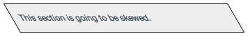
Transform: Skew
Here is the code that was used to generate the above example:
width: 100px;
height: 60px;
font-size: 32px;
border: 1px #900 solid;
margin: 0 20px 20px 0;
text-align: center;
padding-top: 40px;
float: left;
z-index: 1;
position: relative;
text-decoration: none;
color: #900;
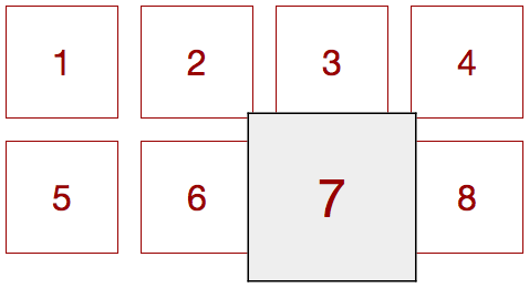
-webkit-transform:scale(1);
-moz-transform:scale(1);
-o-transform:scale(1);
-ms-transform:scale(1);
transform:scale(1);
}
.grid a:hover {
border: 1px #000 solid;
background: #eee;
z-index: 2;
-webkit-transform:scale(1.5);
-moz-transform:scale(1.5);
-o-transform:scale(1.5);
-ms-transform:scale(1.5);
transform:scale(1.5);
}
Rotate
Rotation is probably the transition that you will find most useful. Having said that, remember that rotated text might not render very well on most browsers. So be wary of using it too often. As mentioned above, I still prefer going with images instead of rotating text. Here are a couple of examples of useful implementations of rotate transformation.
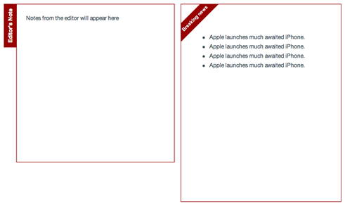
Transform: Rotate
Click here to see a working demo of the above.
Here is the code that was used to generate the above example:
-webkit-transform:rotate(-90deg);
-moz-transform:rotate(-90deg);
-o-transform:rotate(-90deg);
-ms-transform:rotate(-90deg);
transform:rotate(-90deg);
}
.badge {
-webkit-transform:rotate(-45deg);
-moz-transform:rotate(-45deg);
-o-transform:rotate(-45deg);
-ms-transform:rotate(-45deg);
transform:rotate(-45deg);
}
Combined Transformations
Sometimes you want to combine more that on transformation. You can either define each one in a separate line or shorten the definition and define them in the same line like below:
transform:skew(30deg) scale(.5,.5) rotate(40deg);
}
Browser Compatibility
The transform property is supported on the following browsers:
- Internet Explorer 9+
- Firefox 3.5+
- Safari 3.2+
- Chrome 10.0+
Conclusion
So that’s it about 2 dimensional transitions. While being powerful, I would say that there is still some time before that can really be used because of multiple reasons. First, as I mentioned anti-aliasing is not great; so I would not recommend rotating and skewing text. Secondly, positioning rotated text is a bit of a problem. If you look at the source code for the rotation example, you will notice how much we have to tweak the positioning to align rotated objects. However, I am really happy to see transforms being included in this version of CSS3.